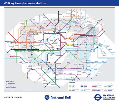
The London Underground has since published an official walking map, and they published an updated version this week, which they released in association with a two-day conference, "Walking Summit" that opened earlier today ("TfL releases new 'Walk the Tube' maps to get Londoners out on foot," London Evening Standard).
(Also see "NHS could save £1.7 billion if Londoners walked or cycled for 20 minutes a day," LES.)
They actually published two different maps. One is by time, the other by the number of steps. I suppose the latter map is nice to have but the former, listing times, is much more useful.
I must say it is very informative blog as well as interesting
ReplyDeleteSuch clever blog work, Keep doing this kind of post, I support you
ReplyDeleteContinue for sharing such a excellent post here. Keep on sharing
ReplyDeleteThis is a tremendous post Keep up the great work. Sharing is nice
ReplyDeleteContinue the good work! It is exciting to read article. Keep it up
ReplyDeleteGreat! thanks for sharing it was very informative blog.
ReplyDeleteYou should proceed your writing. I am confident, you’ve a great readers’ base already!
ReplyDeleteIt’s really a great and useful piece of information.
ReplyDeleteHi there, You have done an excellent job.
ReplyDeleteThanks for sharing with us this important Content.
ReplyDeleteI am so blessed to discover this. thank you
ReplyDeleteYou’re a very skilled blogger. thank you
ReplyDeleteI really like your technique of blogging.
ReplyDeleteI book marked it to my bookmark website list and will be checking back soon.
ReplyDeletePlease visit my web site as well and let me know your opinion.
ReplyDeleteHi there, I log on to your new stuff daily.
ReplyDelete