Getting around with another perspective
There is an excellent piece in the Moscow News, "Moscow’s Main Street Through the Eyes of a Woman With a Pram," about getting around the city with a child.
Going around your community in the shoes/or with the eyes of another is always a good thing to do.
It's why I complain as a bicyclist when locking things are removed without providing replacements, because I think as a bicyclist, because I am one. (E.g., this piece from the Boston Globe,"Hub cyclists feeling like fifth wheels" about the impact of going to multiple-space, computerized meters. I have the same complaint myself in DC.)
But there are other people with other needs as well, and developing our commercial districts as destinations require that we be conscious of this.
E.g., In July when Elise Bernard and I gave a tour of the Florida Market, we had two or three families with young children in carriages. It forced us to revise how we conducted the tour because we needed to use ramps. (Not to mention the regular issues of the Market -- not having many [clean] restrooms, wayfinding, etc.)
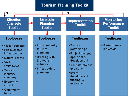
There is an excellent publication from the New Zealand Ministry of Tourism that I came across last week, the Tourism Planning Toolkit, because a NZ news site reported on the results of a Ministry study on visitor perceptions and problems identified by travelers to and within New Zealand. The story, "Toilets, parking imperil NZ tourism" stated:
According to a new visitor satisfaction survey, international tourists still love New Zealand's scenery and friendly people, but our campervan and carparking facilities are viewed as woeful. The findings are part of a survey of six regions carried out by the Tourism Ministry and Tourism New Zealand.
It asks visitors to give marks out of 10. International visitors ranked scenery most highly at 8.2, but campervan parking ranked 5.6. Domestic visitors ranked food and wine and scenery both at 7.6, but campervan and car parking dragged in at 5.2 and 5.9 respectively.
In its commentary, the report said a lack of attention to such basic amenities, such as street cleaning, public transport, toilets, street signs, car parking and campervan parks, had the potential to significantly undermine visitors' satisfaction. Feedback suggested there was "much to be done" to bring things in line with visitor expectations.
Without assessing where you are, you're not likely to improve. I put my money on New Zealand. Of all developed countries, the U.S. federal government has the weakest tourism promotion program, although many states are quite sophisticated in this arena. So is New York City, which according to this article from Adweek, "BBH Wins NYC Tourism," gets 43 million visitors annually. They are working to increase this to 50 million!
 Image from the Tourism Planning Toolkit, New Zealand Ministry of Tourism.
I like the tourism development framework because it's focused on making great places, and great places are great for residents and for visitors. (Note that I also like this item from Nova Scotia, the Tourism Destination Assessment Workbook.)
Then again, it can all be a matter of perspective. This is from an article in the New Yorker about the Philip Johnson house, "Department of Preservation: Still Modern," referring to the architectural photographer, Julius Shulman:
MacLear had arranged for a golf cart to get Shulman around the property, but he barely used it. He had brought with him a fold-up metal walker onto which he had Scotch-taped a Mercedes-Benz logo. Each time MacLear offered to get the golf cart, he said, “No, I think I’ll take the Mercedes.”
Index Keywords: urban-design-placemaking; tourism


0 Comments:
Post a Comment
<< Home