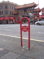
Chinatown double happiness bicycle rack, Victoria, BC
Washcycle, the region's unparalleled blog about bicycling issues, blogged this photo about a place-appropriate bicycle rack installed in Chinatown in Victoria, BC. The rack has Chinese language characters saying "double happiness" and is the new standard design for that section of the city.
I feel strongly that rather than standardize street furniture and other place accoutrements across a city, that there needs to be room for different treatments calling attention to different places, to help strengthen the unique characteristics of place.
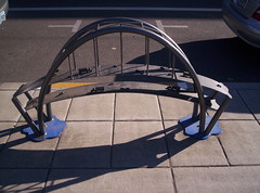
Bicycle rack in the Pearl District, Portland, paying homage to Portland's bridges crossing the Willamette River.
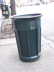
Art deco styled trash can in the vicinity of Rockefeller Plaza, New York City.
Why not have bus shelters more appropriate for historic districts located in historic districts, different kinds of pole standards for streetlights, not just "historic old" streetlight styles but what about Art Deco, etc., different kinds of benches and trash cans, and street signs.
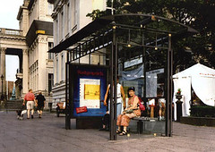
This bus shelter is in Berlin, but has a design comparable to the old carriage and trolley waiting stations on the grounds of the U.S. Capitol abutting 1st Street SE.
E.g., I am big on street signs that identify neighborhoods and/or historic districts, to help strengthen the spatial qualities of place.
This is an example of an ordinary street sign in Pittsburgh at an intersection, but generally these signs identify the neighborhood, in this case Highland Park.
This is one in Alexandria, showing a neighborhood historic district.
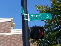
And this one, in Brooklyn, does the same, but a little more distinctively.
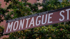
This is from Petersburg, Virginia, which also color codes the signs according to the historic district. For example, the Courthouse district has powder blue signs and the Poplar Lawn district has green signs.
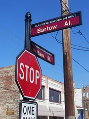
Prescott, Arizona
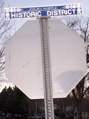
Chinatown, Vancouver. Flickr photo by Madame Lemon
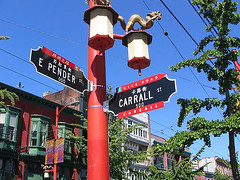
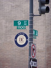
I hate the DC historic district sign. It's unmemorable. And the sign isn't placed on every block as a matter of course (but considering the design, that's a good thing).


0 Comments:
Post a Comment
<< Home