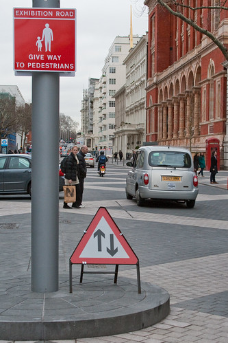
"Complete Streets" London style
Today the Metropolitan Washington Council of Governments bicycle and pedestrian committee has an all-day two-part workshop on developing complete streets policies across the metropolitan area's jurisdictions.
From the article:
Its big idea, which originated with Moylan, was to create a "shared space" whereby pedestrians, cyclists and vehicles all occupy the same surface, without kerbs or barriers to separate them. It seems risky, but the theory is that if walkers and drivers can see that they are occupying the same space, they will behave more responsibly. The concept was the invention of the Dutch traffic engineer Hans Monderman, who used to walk backwards into dense traffic to demonstrate that drivers would be sufficiently human not to run him over. Exhibition Road is the largest example of such a space in Britain, although it is not the purest, as there is some slight differentiation between carriageway and footway.
Dixon and Jones's main contribution has been direct and has two elements. They have arranged the new paving into a broad diamond pattern of pale granite on dark, put all the street lighting on to a row of tall, silvery masts. This gives a unity to the various characters of the street, which at different places has cafes, grand museums, colleges and terraced houses.
It also allows the architecture of the different buildings, which runs from the declamatory to the discreet, to speak for itself. One virtue of Dixon and Jones's design is its lack of rhetoric, which, if anything, could go even further – the marching lighting masts are arguably a little too intrusive.
The overall effect is of generosity and calm. Crowds can flow more happily over the paving and the route from South Kensington tube to the great museums, which was always a tricky one unless you took a long subway, is now a pleasure. The road is a place where you might want to be, rather than just a means of getting someone else. It is not fussy and prescriptive, as public space improvements often are. A particular joy is that there is no pointless public art; it was rightly decided that, with sculptures both outside and inside the museums, there was already enough art to go round.
Note that "Complete Streets" as a movement isn't enough--is incomplete.
Labels: "streets as places", transportation planning, urban design/placemaking


0 Comments:
Post a Comment
<< Home