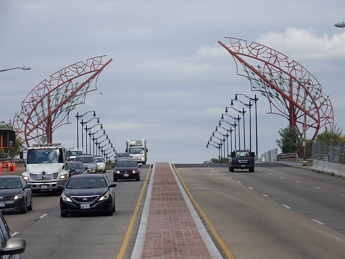
I think this is hideous: metal sculpture on the New York Avenue bridge
I already wrote about this, but a celebratory press release on the finishing of the New York Avenue bridge reconstruction project in DC reminds me that this sculpture isn't very impressive and that we need a public art element within the master transportation plan.

Gateway Wings, New York Avenue Bridge Gateway, designed by Kent Bloomer Studio.
From the press release:
Obviously others didn't agree with my assessment, because I expect that the Commission of Fine Arts and the National Capital Planning Commission, both federal bodies, weighed in, in addition to the DC government agencies.As part of the project, DDOT partnered with the D.C. Commission on the Arts and Humanities (DCCAH) to commission a new public-art installation titled Gateway Wings, New York Avenue Bridge Gateway, designed by Kent Bloomer Studio. The installation is the District’s largest public-art commission to date. Two visually stunning, 50-foot assemblages and a programmable lighting component were commissioned by DCCAH through a competition to produce a signature project that would highlight the bridge, a popular entry point to the District from the northeast along U.S. Highway 50. The artwork serves as a striking invitation to the District and signals a passage into the Nation’s Capital and the NoMa Business Improvement District.
Right: image of the two lion statues at one end of the Connecticut Avenue bridge in Washington DC by Oren Photography.
Maybe I'm just old fashioned. While I recognize the socialization elements of the City Beautiful Movement for what they were, there's something to be said about statuary and sculpture.
-- Washington Sculpture: A Cultural History of Outdoor Sculpture in the Nation's Capital, by James Goode
Labels: public art, transportation infrastructure, urban design/placemaking


9 Comments:
First things that comes to mind when I see that arch:
http://en.wikipedia.org/wiki/File:Swords_of_qadisiyah.jpg
agreed- I too find this a monstrosity and ugly as sin
1. Just because it's ugly doesn't mean it's art. Art is an expression and doesn't always have to be attractive. You're thinking of decoration.
2. I think it is boring, but not ugly.
I mean "it's not art"
I didn't say it isn't art. I did say it isn't attractive.
Earlier I wrote about the need for better guidance on art and sculptural elements in transportation infrastructure projects.
I think this project proves the need.
I am still amazed it was approved.
Then again, I can think of two other DCCAH projects that I was involved in concerning Greater H St. and they both had Soviet towering elements, not unlike this.
Crappy stuff. Not deserving of placement in Washington. But still art.
Oh, wrt the other two projects, one was scuttled by an ANC person, and I didn't end up challenging the process, because the result was so bad, even though an individual Commissioner lacked standing to scuttle a project.
The other had to do with the H St. Streetscape project, and I did help to scuttle that other misguided artistic direction.
http://urbanplacesandspaces.blogspot.com/2013/10/dcs-bad-urban-design-as-it-relates-to.html
I drove through it last night. I think it looks pretty good, but I'm not sure its lighted on both sides. It is more 3-dimensional than the photo indicates. Its an interesting gateway to a new and rapidly changing part of town.
This is a great post.
This post is about New York sculpture.
The New York Avenue Sculpture Project was started as an association between the National Museum of Women in the Arts and the DowntownDC BID, presently including the D.C. Office of Planning, the District Department of Transportation and other neighborhood organizations.
Visit here-"reputable online pharmacy"
This art is an expression and doesn't always have to be attractive. You're thinking of decoration.
Post a Comment
<< Home