WMATA and buses as rolling billboards
For many years I've argued that WMATA could do a much better job of branding bus transit with better livery design. The basic design is still pretty dowdy, but an upgrade from the design that was in place when I first moved to DC about 30 years ago.
Pittsburgh, Orlando, and Boulder are noteworthy for how they use the liveries on their buses to call attention to transit as an option, and a preferred way to travel. Similarly, many bus systems in the UK brand buses by routes, and include map graphics, listing destinations served and information about frequency.
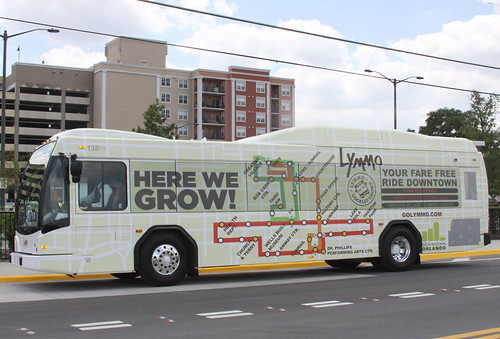
Lymmo Bus Wrap Design, Orlando, by Tinsdale Oliver Creative Services.
Each of those systems has the disadvantage of being all bus, whereas systems like WMATA have subway service too, which is seen as the premium service.
But over the past year, and especially in the last couple months, I've noticed three specific examples of marketing and/or design forward WMATA bus liveries promoting choosing transit.
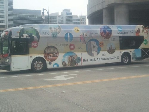
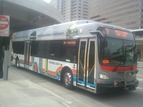
I first saw this one last year, but at the time didn't have a camera with me. This design promotes the subway system. (I saw it a few weeks ago at the Silver Spring Transit Center.)
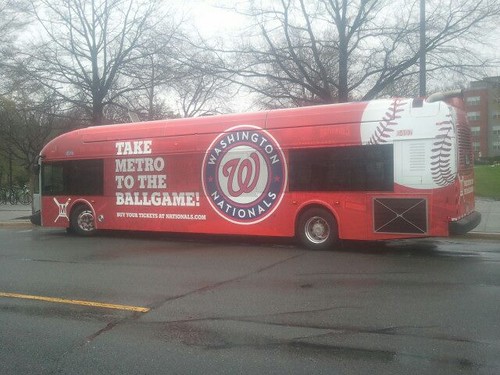
This livery promotes taking transit to Washington Nationals baseball games. (It was running on the 62/63 line last week.) The stadium is one short block from the Half Street SE exit of the Navy Yard-Nationals Green Line Metrorail Station.
Note that while the bus promotes transit and the baseball team, the facade of the ground floor building that "wraps" the Navy Yard Station could be used to market transit too, and it doesn't do so at all.
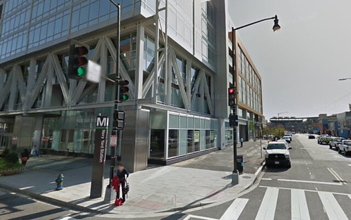
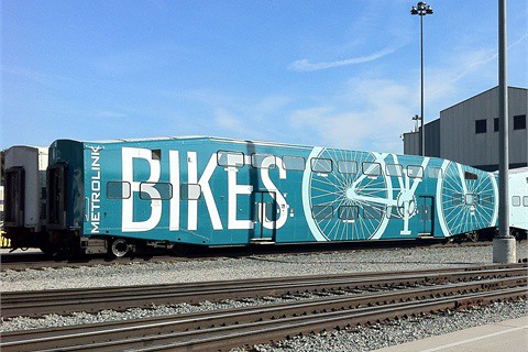
While it's a different "vehicle," the Metrolink train cars with a bike promotion wrap show a way to rethink this station entrance in terms of a pro-transit graphic treatment.
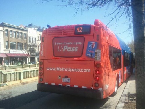
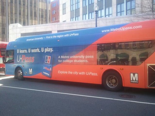
The third I happened to see on Saturday, when I was in Dupont Circle. It promotes a special university transit pass for American University students.
Labels: transit marketing


0 Comments:
Post a Comment
<< Home