Rebuilding Place in the Urban Space

"A community’s physical form, rather than its land uses, is its most intrinsic and enduring characteristic." [Katz, EPA] This blog focuses on place and placemaking and all that makes it work--historic preservation, urban design, transportation, asset-based community development, arts & cultural development, commercial district revitalization, tourism & destination development, and quality of life advocacy--along with doses of civic engagement and good governance watchdogging.

Saturday, February 21, 2026

DC Metrorail transit ridership by station, daily boardings

WMATA and other transit agencies make data available about ridership for rail systems and bus lines.  

It would be easy for them to also produce it as a matter of course like in the graphic below.  

Similarly, such data could be presented by bus stop for bus lines.

Having such data easily presented makes it a lot easier to have discussions about transit stations and bus stops, whether or not bus stops could be cut in order to speed service, and what stations to invest in to improve user experience and increase ridership.


Labels: , , , ,

Thursday, November 08, 2018

Canada has a "Municipal Benchmarking Network"

-- Municipal Benchmarking Network Canada
-- 2017 MBNCanada Performance Measurement Report

Its most recent report draws attention to the fact that Montreal spends a lot more money on roads than other cities, yet the quality of the roads does not match the spending.

===
I point out frequently that municipal dashboards in many cities aren't particularly robust, don't provide actionable information, and lack comparison information so that one can figure out whether or not the functioning of a particular agency is better or worse.

Labels: , , , , ,

Wednesday, October 24, 2018

WMATA/Transit Service #2: Why don't metropolitan areas with multiple agencies create one combined scorecard?

Larger transit authorities, like WMATA or MBTA in Boston, tend to provide information on boardings by transit station for fixed rail, and by bus line.

Many of the area agencies provide various forms of ridership data, but usually it isn't broken down by line.  It's mostly aggregated by month.  It definitely isn't amalgamated into one combined site.

Graphic from Philadelphia.

That could be one of the duties of a metropolitan focused "Sustainable Mobility Advocacy Campaign" for the DC metropolitan area.

This data, but aggregated, is reported to the National Transit Database.

The American Public Transportation Association publishes quarterly reports using this data, for the major transit agencies across the nation, by mode (railroad, subway, light rail, bus, trolley bus).

This graphic was produced by an advocate, based on data made available by the Toronto Transit Commission.  Red lines show higher ridership.

Labels: ,

Thursday, July 26, 2018

Village Voice makes the point that signaling upgrades rather than the Second Avenue Subway would have made the most difference for problems on the Lexington Avenue Line (4/5/6)

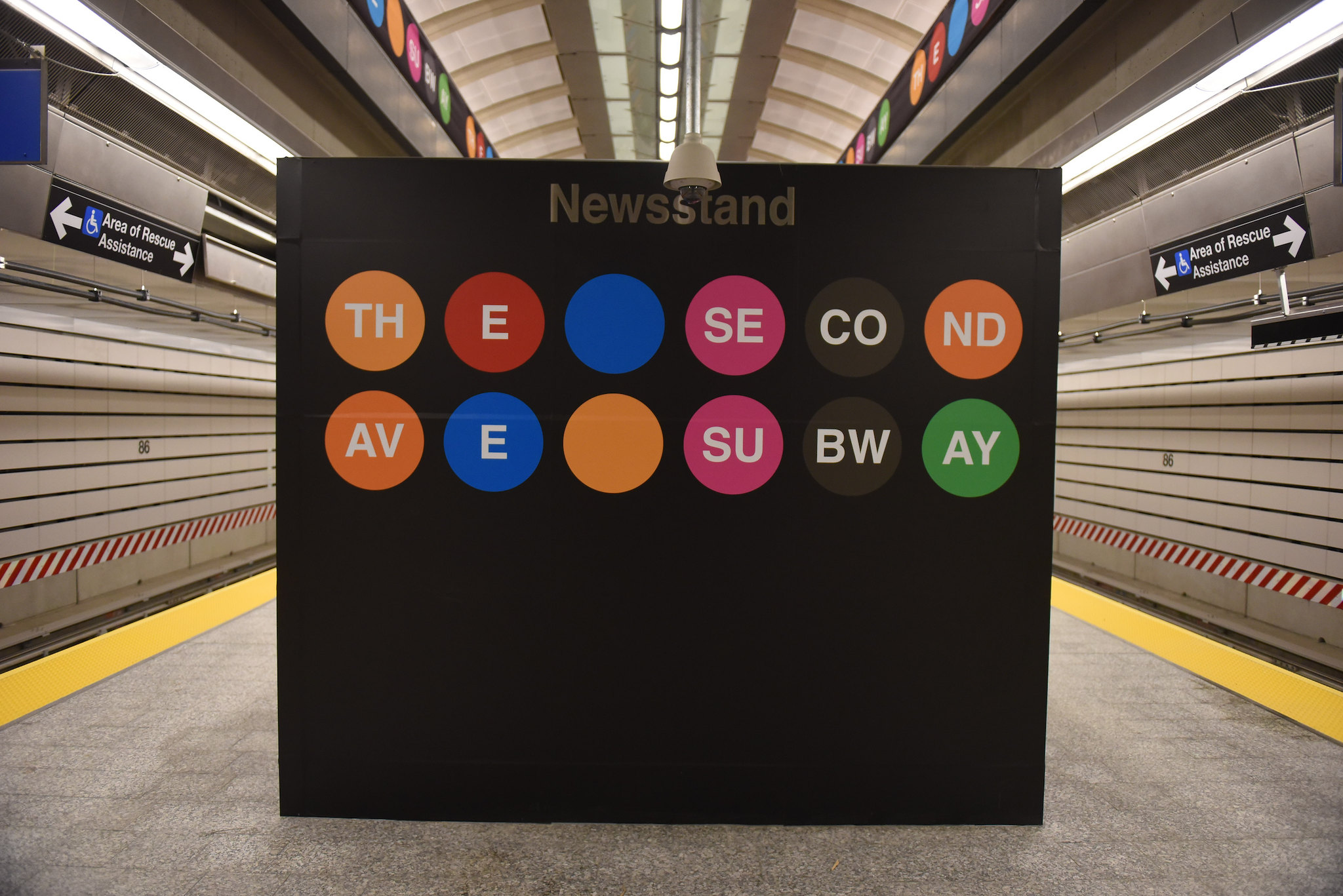
86th Street Second Avenue Subway StationWhile those of us into train-based transit are most likely always going to push for extensions of existing lines as well as new lines, the Village Voice points out that investments in signaling improvements on the 4/5/6 Lexington Line would have cost a lot less and had a lot more impact building the so far very truncated Second Avenue Subway.

-- "Maybe We Didn't Need the Second Avenue Subway"

From the article:
With last week’s release of station-by-station ridership figures for 2017, we can finally learn the impact this long-awaited subway extension had on the system. As it turns out, the Second Avenue Subway is undoubtedly a benefit, but at $4.5 billion for just the three stations built so far, a very expensive one. And the stats also tell us much more about the problem the line was built to solve — and raise the question of whether that $4.5 billion would have been better spent elsewhere.

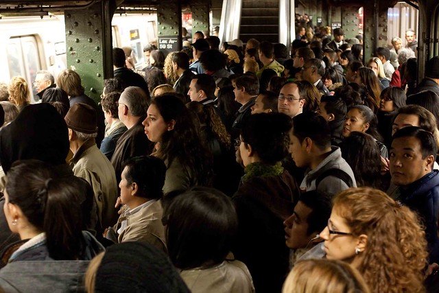
287/365 I hate the subwayThe Second Avenue Subway’s primary reason for existence was to lighten the load on the overburdened 4/5/6 Lexington Avenue line, the busiest subway corridor in North America … This was a worthy goal, and to some degree, the new line accomplished this: The five Lexington Avenue stops closest to the subway extension — 96th Street, 86th Street, 77th Street, 68th Street–Hunter College, and Lexington Avenue–59th Street — saw 17,377,828 fewer swipes into those stations last year, or about 47,600 per day.

Meanwhile, the three new Second Avenue Subway stations experienced almost 21.7 million trips last year, or just a hair shy of 60,000 per day. After factoring in large ridership changes at other nearby stations — the Lexington Avenue–63th Street F/Q station saw a 1.3 million bump in trips, while the Fifth Avenue–59th Street N/R/W had 560,000 fewer — the total change in ridership after the Second Avenue line opened nets out to just a hair more than 5 million additional subway riders in 2017, or about 14,000 per day. …

18.MTA.AstorPlace.NYC.30March2017We know now that the Second Avenue Subway could not possibly have been the most cost-effective way to relieve crowding on the Lexington Avenue line. That would be upgrading the signals to Communications-Based Train Control, or CBTC. One of the first lines Byford wants to tackle is, in fact, the 4/5/6 from 149th Street–Grand Concourse in the Bronx to Nevins Street in Brooklyn. Doing so would allow the MTA to run trains much more efficiently, increase capacity, and turn those ghost trains into real trains. 
This project alone would provide a benefit to Lexington Avenue line orders of magnitude greater than the Second Avenue Subway for a fraction of the cost.
While I don't always agree with the argument that it's better to forgo expansions and extensions in favor of "fixing what we have" because sometimes certain kinds of extensions and additions can improve throughput and network reliability as well as access (for example, this photograph of a c. 1989 NYC Subway map tells the story of a missing connection in the system, the need to connect one line the last 1500 feet to two othersy reduced throughput until the connection was made in 2001), this kind of question:
how to achieve maximum throughput?
is the most important one to ask. And it needs to be answered in an objective way.

More generally, the argument for the Second Avenue Subway is reasonable, in terms of its full and complete eventual routing, which will serve other areas of the city that are underserved.

But in this case, construction of the Second Avenue Subway should have been pursued separately rather than positioning it as a congestion reduction measure for the Lexington Avenue Line.

=====
The problems with transit service in DC are different from Boston and different from NYC.

The problems in NYC are five fold:

1.  An increase in demand
2.  Antiquated signaling systems ("Meet the century-old technology that is causing your subway delays")
3.  Old cars which are more likely to break down.
4.  A decrease in operating speed for trains.

The last problem wasn't acknowledged by the system, until the Village Voice broke the story a few months ago ("The trains are slower because they slowed the trains down").

In each situation--DC, NYC, and Boston--what happened is that a system that had been at equilibrium experienced some sort of exogenous shock which exceeded the capacity of the equilibrium state to function normally.

With DC it was the failure to invest in maintenance and signaling problems leading to crashes combined with the Silver Line extension.  With Boston--disinvestment combined with snowpocalypse.  In NYC, increased ridership.

Labels: , , , , ,

Tuesday, April 03, 2018

"Strange": internal investigation of inadequate response to fire will result in changes, disciplinary actions in Orange County, California

Because it is so rare that there are consequences meted out for failure to act wrt avoidable failures, I was surprised to see this article in the Orange County Register ("Orange County probe finds Canyon 2 Fire response rife with human error and complacency, calls for disciplinary action"). From the article:
Concluding that the fire agency’s response during the early minutes of the Canyon 2 Fire was rife with “human error and potential complacency,” an 80-page report from the county obtained by the Register — slated to be presented publicly later this month — says the findings present “an important case study in how miscalculations and missteps in small but critical areas can result in significant damages… to a community.”

The investigations by the county and the OCFA both say fire personnel essentially ignored early reports of flames on Oct. 9, 2017, the day the fire started. Both also say fire officials were too slow to send equipment and personnel to contain a blaze that burned for eight days, charred 9,200 acres, destroyed 15 houses and 10 other structures, and displaced thousands of residents of Anaheim Hills and North Tustin.

Specifically, the two reports say OCFA officials downplayed a 911 caller’s reports of flames in a canyon at 8:32 a.m. Instead of following protocol, which would require sending personnel and equipment to the scene, they directed firefighters at a station more than a mile away to look outside and report on what they saw.

Those firefighters dismissed the reported flames as wind-blown ashes, an error that prompted an OCFA dispatcher to tell CHP officials that fire reports were “unfounded.” Firefighting equipment wasn’t deployed for another 71 minutes.

=====
Separately, in going through mounds of old stuff I haven't read, I came across this article, "Pittsburgh Uses Data to Predict Fire Risk," in Government Technology Magazine, discussing the use of data analysis in fire agency organizations, better matching resources and fire inspection processes to ward off the potential of problems like the Ghost Ship building fire in Oakland, California or the disaster of Grenfell Tower in London.

Among other cities, fire departments in New York City ("New York City Fights Fire with Data," GT) and Austin ("Austin Fire Department Extracts Value From Data," GT) aim to use data analytics and programs to improve performance.

Some time ago, Philadelphia created a "Fire Vulnerability Index" for buildings, to be able to be proactive in reducing risks and the likelihood of fire by "scor[ing] every household in Philadelphia on its propensity for a fire" ("Philadelphia Fire Department uses data to stop fires before they start," Urgent Communications). From the article:
From this index, the PFD now knows which households to focus fire-prevention efforts on and can pinpoint fire vulnerability households in the city that are more likely to have a future fire event. Fackel said it also can use the data for several efforts, such as to provide those households with fire alarms or to send them direct-mail flyers about fire safety.

Labels: , , , ,

Sunday, February 11, 2018

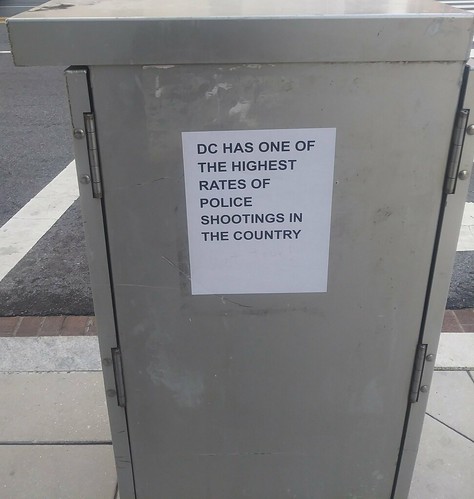
Um, no, DC doesn't have one of the highest rates of police shootings (flyer posted on traffic control box, 6th Street and Pennsylvania Avenue NW)

Actually, DC doesn't have one of the highest rates of police shootings (flyer posted on traffic control box, 6th Street and Pennsylvania Avenue NW)

This style of flyer is posted pretty frequently across the city. There is no identification on the flyers of the group putting them up.

I took the photo, forgot about it, and then when uploading some photos today, looked up some data. While of course, one killing is too many, and DC has a fair amount of violent crime, which means it's more likely that there will be some police killings, according to the most recent data I could find, from the Mapping Police Violence website (2015 data), DC ranks 46th of the nation's 60 largest cities.

Is that "one of the highest rates"?

Probably not. It definitely is a misuse of data.

Labels: , ,

Wednesday, July 23, 2014

Show us the data! DC Government metrics (and comparing DC's presentation to the City of Los Angeles)

DC's Department of Transportation is not happy that an infrastructure investment campaign website for the White House says that 95% of DC's roads are in poor condition.

There's no question that the White House data is wrong, as a bicyclist I have a pretty good sense of road quality.  While there are many high quality roads in the city in terms of pavement quality, there are many roads in seriously poor condition--which can be hyper dangerous for bicyclists, compared to the ride capabilities of a typical motor vehicle.

DDOT counters the White House with a statement based on data using an industry standard measurement system, the Pavement Condition Index (PCI), that says 75% of DC's roads are in fair, good, or excellent condition. See their blog entry, "Three-Quarters of District Roads Are in Fair to Excellent."

First, fair grades, generally considered to be from 26% to 50% aren't considered passing grades.

Second, DDOT isn't providing access to the underlying data, except for summary data, which at least through 2010, doesn't support the DDOT statement, except for the fact that DDOT includes "fair" grades now, when the grades for "good" and "excellent" for most of the city's roads (1016 miles out of 1030) didn't top 58% as of 2010.

I've been meaning to write about this general topic, because of my frustration with the DDOT Dashboard.

While two of the buttons do a great job on providing access to a great deal of information, the other four do not. (I first wrote about this in 2010, in "DC DDOT transportation access portal doesn't really say anything.")

One of the "other four" buttons concerns road pavement quality.  It lists a summary quality score of 64%, but the only data provided to support the claim is four years old, and doesn't back up the claim if you do a calculated weighted average of the reported data.

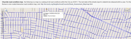
On the other hand, the City of Los Angeles has a very good metrics webpage, much better than DC's, and for road pavement quality data too.

You can even drill down within the Los Angeles data on a block by block basis, which is far more useful than the data presented by DDOT.

This comes up too, because for awhile there, I was thinking about running for Ward 4 position on DC City Council, figuring that Muriel Bowser will win the Mayoral election, and that I might have a shot in a special election, because the voting conditions are much different than normal, where I would have no chance.

Anyway, I decided not to do it (meeting with people reminded me how much I dislike the people who are into campaigns, plus other people, even those who hold or have held elective office told me it's very difficult to "move a Council to better decision making" and that I could have more effect doing other things), but I had been developing an ideal ward-focused Councilmember platform, and one of the elements would be developing and publicizing ward-specific metrics, including road pavement quality, sidewalk gaps, bike path pavement quality, litter survey data, etc.
Pavement condition measurement on a street in Los Angeles
Pavement condition measurement for a particular street in Los Angeles, from the City of Los Angeles Performance Metrics website.

(That ward-specific platform is only in outline form now.  I will expand it into a position paper of some sort.)

Labels: , , , ,

Wednesday, April 16, 2014

Getting better transportation usage data: Alliance for Walking and Biking release 2014 benchmarking report

One of the problems with getting good data for the use of sustainable transportation modes, is that most metropolitan areas aren't gathering the data every year. 

(I think this is a real problem in DC proper.  DC DOT should begin collecting this data, and do special research projects on sustainable transportation behavior, parking, etc., by different types of households and spatial conditions.)

It's tough too because you need to oversample to ensure that you get enough walkers and bicyclists as respondents (in other communities it would also be for transit users, where transit use is low), because they make up a small portion of the total population.

The complete American Community Survey form from the US Census Bureau that collects data on transportation is only a sample, and it's difficult to be able to drill down to the neighborhood level because the sample size is too small. 

The same goes for the National Household Travel Survey.  It is an intermittent survey, without the ability to go deep. 

So these studies create limits on the quality and utility of data on walking and biking, even though the Alliance for Walking and Biking creates useful reports, based on this data.

Plus you need more detailed information and better information, because the ability to promote sustainable transportation modes varies according to urban form, density, and distance to major activity centers, which is difficult to capture in traditional study techniques.

-- Download the 2014 Benchmarking Report

2.  I was very surprised to come across the very interesting City Clock blog, and it has a feature on the neighborhoods across Canada with the highest use of bicycling for transportation ("Top 10 cycling communities in Canada"), the highest being 21.15% of trips, in the Studio District neighborhood in Toronto. 

Sadly, conservative forces in Canada have led the nation to drop the collection of Census data, which face it, is an insanely stupid decision.

3.  And in Helsinki, they've been collecting data on transit use for 50 years, and this past year was the first where more trips were conducted by transit than the automobile.  See "Historic transport shift as capital dwellers switch from cars" from YLE.

Labels: , ,

Wednesday, July 18, 2012

Countdown to Civic Data Challenge Deadline

The Civic Data Challenge, a project of NCoC (the National Conference on Citizenship), in partnership with the John S. and James L. Knight Foundation and others, is designed to help turn the raw data of civic health into useful community tools. The deadline for submission is July 29th.  Cash prizes will be given to various winners who will be selected from each category — health, economy, safety, and education.
Participants in the Challenge will turn the raw data of “civic health" into beautiful, useful applications and visualizations, enabling communities to be better understood and made to thrive. NCoC is providing its civic health data, as well as other data on the important topics of health, safety, education, and the economy.
You’re invited to collaborate with others, analyze the data, and create something amazing to showcase what you find. Designers, data scientists, researchers, and app developers are especially encouraged to join the challenge.

-- Join the Google Group for participants in the Challenge
Winners will be announced at the 67th Annual National Conference on Citizenship on September 14 in Philadelphia.

Labels: , , , , ,

Saturday, June 16, 2012

Civic Data Challenge Invites Entrants to Turn Civic Health Data Into Useful Applications and Visualizations

From email:

Presented by the National Conference on Citizenship in partnership with the John S. and James L. Knight Foundation, the Civic Data Challenge invites participants to turn existing civic health and community attachment data into applications and visualizations that make the information more valuable and accessible to decision makers and the public. 

The challenge seeks participants who can turn the raw data of "civic health" into beautiful, useful applications and visualizations, enabling communities to be better understood and positioned to thrive. The challenge's organizers hope that it will lead to new findings that illuminate why community engagement and attachment are critical to the development of thriving communities.

Challenge participants who analyze and create visual representations of data will be eligible for various prizes. Designers, data scientists, researchers, and app developers are especially encouraged to participate. 

Challenge participants will be provided with civic health and community attachment data, as well as data on health, safety, education, and the economy. Participants will analyze the data, identify connections and correlations, and create visual representations and interactive products to showcase their findings. These may include infographics, apps, animations, videos, or other products.

For more information, check out the Civic Data Challenge webpage.

--------
It wouldn't be particularly scintillating in terms of data-based graphic interpretation, but four big issues for me in terms of so-called "civic health" are:

(1) presence of traditional (print, broadcast, etc.) community media in communities and the access that residents, citizens, and people with alternative perspectives have to these vehicles.

So in DC, I'd say that neighborhoods (Georgetown, Dupont Circle, Upper Northwest, etc.) are better served because they have access to--and in some neighborhoods it's delivered door-to-door--the Current Newspapers, which are published weekly.  This is better compared to Greater Capitol Hill, because there the Hill Rag is published only once/month.  But many neighborhoods lack this kind of vehicle.

In Mount Pleasant, they have a community radio station, Radio CPR.  Technically, there is also cable access television, which people can use, but there is limited information about what it is, how to use it, and what's being broadcasted.

Also see the work by community media scholar Robert McChesney, who teaches at the University of Illinois.

By comparison, in city-wide media, citizens have a bit more access to the Washington Times, the free Washington Examiner, and the alternative weekly, the Washington City Paper, than they do to the Washington Post and the free daily Express.  While the broadcast television stations mostly don't cover community news, just murders, accidents, and fires, and politicians.  However, the NewsChannel 8 24-hour cable channel does provide a few more options for community involvement, as do the programs on the local public radio station, WAMU.

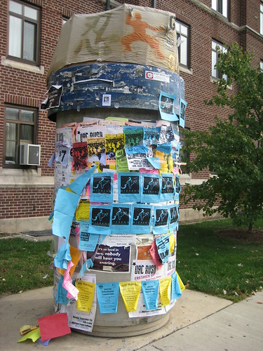
(2) Presence of community bulletin boards and kiosks, where people can independently post flyers and other information.
Kiosk
On the campus of the University of Michigan in Ann Arbor, so-called kiosks (an element of the underground steam heating system) are used by individuals and groups to post flyers and information.  Flickr image by NYC Comets.

(3) Presence and relative health of civic organizations, at two or three scales: the neighborhood and community-wide scale (e.g., the differences between what the Capitol Hill Restoration Society, a neighborhood group addresses and the DC Preservation League, which is a city-wide organization), along with the political district level (ward, councilmanic district, borough, etc.).  For example, the London Cycling Campaign and the Toronto Cyclists Union support organizing at the ward-borough level.

(4) Measures for substantive citizen connection to local government decision-making, such as the existence of Community Boards in New York City, Neighborhood Planning Unit organizations in Atlanta, the designated community planning groups in San Diego, the Neighborhood Councils in Los Angeles or Seattle, DC's Advisory Neighborhood Commissions, etc. AND measures of substantive access and input that these organizations have.

Labels: , , , , ,

Thursday, December 16, 2010

More thoughts on what gets measured gets done

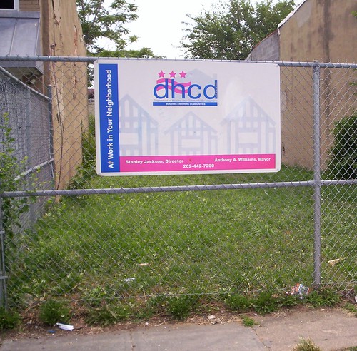
DHCD sign, Florida Avenue NW
This DC Government owned property on Florida Avenue NW has been vacant for decades.

Someone wrote to me and pointed out that DC Government does have a reasonably extensive performance measurement webpage, Track DC. I hate to admit I wasn't familiar with this offering (there is too much to keep track of). It's definitely a start.

For example, in the entry on the relative uselessness of the DDOT Dashboard, I mentioned that 5 of the 6 buttons on the dashboard do not provide the means to drill down more deeply to more detailed information, and that the 6th button provided inadequate and incomplete info.

So I just looked at the Parks Department tab on Track DC. I think the site is somewhat clunky, but it does provide some interesting information, and the ability to go down one level to a summary of each subcategory of the data (e.g., on performance indicators). But it doesn't go deeper than that. E.g., what about a master table of all the maintenance requests, and then the ability to look at the data say and determine all the individual requests of a certain duration, and make some of your own assessments, etc.

It's great you can download GIS data files on their assets, but for those of us without a GIS program, why not just have the map links?

The website doesn't mention current planning activities or the reality that the #$%^&* Parks and Recreation Department doesn't have a master plan (well one was done in 2005 and never released to the public). Maybe this should be an overall indicator on these pages, about the status of agency master plans, links to them, along with detailed data about capital improvement planning.

How they rate themselves on spending their budget is somewhat interesting.

My criticism of performance indicators during the Williams administration was that there were pretty "gross" and easy to achieve because they weren't all that significant in terms of what they measured.

Granted I don't know what I'd want to measure, the things that most citizens think are important.

I mentioned in the blog entry a database on road conditions.

Here's some indicators I think are important generally, and these kinds of indicators should be focused on overall, rather than providing "too much" information by organizing metrics the way they are organized right now, at the agency level, on the Track DC website.

Some performance indicators that probably matter to residents:

-- litter rates by block (we don't collect this information)
-- accident data for peds, bicyclists, and cars
-- pavement quality conditions by block
-- participation rates in recycling
-- crime statistics by police district and block, what's going up, what isn't
-- incarceration statistics
-- number of neighborhoods with plans (none, we don't do neighborhood plans)
-- use rates for parks and rec centers
-- statistics for transportation mode split (walking, biking, transit, car) by neighborhood (we'd need a good research program...)
-- number of automobiles in DC, by size and weight class
-- breakdown of parking spaces by neighborhood, commercial district, structure
-- vacant buildings, by neighborhood/commercial district, how long they've been vacant
-- nuisance property and environmental crimes (i.e., dumping)
-- number of ideas offered by citizens, and the take up rate, database listing of ideas
-- graffiti -- reports and eradication
-- sidewalk conditions and planting strip maintenance (e.g., I've shown photos in my blogs of things that don't get corrected for years)
-- school data (enrollments, success, etc.) + for private and charter schools too
-- graduation data for DCPS students
-- data on success rates of DCPS students in college
-- number of special education students in private school/costs
-- absenteeism rates in school
-- suspension/expulsion statistics, by individual school/grade level
-- snow removal -- not just from streets, but from pedestrian areas, bus stops and transit stations, public buildings, etc.
-- time to open a business (this is really hard, but would be interesting to measure)
-- business retention and failure rates
-- grass cutting records for various public sites/installations (such as schools and various public reservations)
-- status data on all publicly owned properties
-- status data on community development corporations and companies like David Wilmot's cash cow of group homes for the developmentally disabled
-- youth crime statistics and status
-- water main breaks and repair status

My issue with the DC Government call center (311/online) is I never see any reports on what people call about. Do they sift out stuff and identify (and address) structural problems?
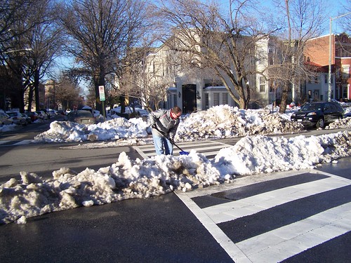
A committed resident clearing the crosswalk median on his block
A committed resident clearing the partially blocked crosswalk median on his block of Maryland Avenue NE.

Labels: , , ,

Tuesday, December 14, 2010

While we are on the topic of public information: web redesigns should increase access to information not reduce it

The redesign of the DC Government website sucks.

At least, it sucks if you want to find plans and studies and reports, or easy links to agencies from the homepage.

Before, such would be listed in a very retrievable link, mostly on the front page of the agency website.

Now you have to dig and dig.

If you can find it, the link is graphicized and it can take forever to find the report you want.

If you can't find it, you have to resort to looking up an archived version of the agency website at Archive.org.

How does this help the public?

How is this forward moving?

Why should this change be heralded if in fact it reduces access to important public information rather than improving access?

For planning, you can use the "in your neighborhood" tab to eventually find reports, although the old version of the website was much easier. I haven't figured out how to find Thrive or Trans-Formation yet, except through archive.org:
For transportation, I have no idea how to find the reports (except through archive.org), although a couple weeks ago DDOT said that they would restore a link to these reports.

This is !@#$%^&*()_ frustrating.

Labels: , , ,

DC DDOT transportation access portal doesn't really say anything

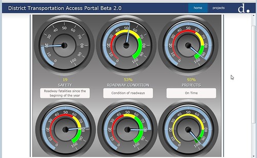
DDOT Transportation Access Portal, screen shot
One of the problems with all the hype about Web 2.0 is that people too often focus on the attractive graphics, and not the depth and breadth of what is provided. Some apps are great. Some apps seemingly pump out and disclose data, but communicate little of substance.

Such is with the heralded DC Transportation Access Portal.

By publishing only a gross number/statistic, and not providing a way to drill down deeper into the data, little actionable information is provided.

In the DDOT TAP only one of the six buttons, projects (the other five are safety, roadway condition, transit, finance, and customer service), allows the ability to drill down for additional information.

What it provides is a start. It could be great, but there is no question that the data for active DDOT construction projects, organized by Ward, is incomplete. I know it's incomplete because on 3rd Street NW there has been a sidewalk and roadway improvement program going on (I have been meaning to write about it), funded by ARRA, and it isn't listed.

Plus there is an issue of quality of the finished project. For the most part, the ones I've seen are good. But there are other issues.

Still, this is a model for what should be happening with each of the other buttons. For example, with the roadway conditions button, you ought to be able to drill down into a master database of road condition information for every block of every street on which the data has been collected.

With safety, since one of the buttons is for traffic fatalities, there is no way to drill down to three different additional layers of vehicle fatalities, pedestrian fatalities, and bicyclist fatalities--actually the data should be for accidents overall, not just fatalities.

This information is collected, it's just not disclosed. And if there are places where multiple accidents occur, then it is likely that there are potential "countermeasures" that can be employed to address structural/design problems that may contribute to fatalities. That's the purpose of the FHWA Pedsafe and Bikesafe programs--used for analysis of particular types of categorizable accidents, with proposed responses.

DCist and GGW have been mapping this information, but it isn't actionable...

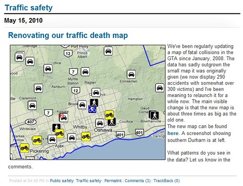
In the past I wrote about an online mapping project that was conducted by the Toronto Star ("Mapping bicycle-car and pedestrian-car accidents"). Sadly, they have discontinued the project, but it was quite pathbreaking, and a model for what DDOT could be doing with its dashboard, and for "Apps for Democracy" as well -- more data of significance and less fluff and hype.

-- Toronto Bike Accident Map, 2008

Toronto Star traffic death map

FWIW, I have been writing about this issue, the disclosure of information to the public, measurements and metrics, for longer than I have been blogging. Below is something I wrote in themail in 2004:

What Gets Measured Gets Done
Richard Layman, rlaymandc@yahoo.com

In the classic business book In Search of Excellence, the authors coined the famous phrase "what gets measured gets done" to refer to companies that outperform their peers because of a greater focus on what matters. Of course, being sure that organizations focus on what matters is always a problem, as is a focus on accountability. Today's Austin American-Statesman talks about how the City of Austin updates 4,000 different performance measures weekly, from library circulation statistics to how the city is meeting its goals, and it posts this data to the city website. This is an expansion of their public communication of such data, which since the mid-1990s had been published quarterly. (See http://www.ci.austin.tx.us/budget/eperf/index.cfm for the website.)

Similarly, the Citistat program in Baltimore is a finalist in Harvard's Ash Institute annual program highlighting governmental innovation. The program is written about by syndicated columnist Neal Peirce. Citistat marries data tracking and analysis with accountability for improvement, comparable to the CompStat program initiated by Jack Maple and William Bratton in NYC, a program which led to big change in policing strategies and tactics, and a concomitant reduction in crime. Peirce quotes Mayor O'Malley stating that “success comes only with constant and intense executive pressure, plus relentless follow-up with departments.”

I looked at the government services section of http://www.dc.gov, but I haven't been able to locate similar data sets. We need them

Labels: , ,

Monday, November 08, 2010

3 kinds of lies: lies, damn lies, and statistics

New graphic scheme for Montgomery County Maryland RideOn buses
Not that I think bus service can't be improved, but the short in yesterday's Examiner, about how RideOn bus service in Montgomery County receives the most complaints of all county services, is incredibly misleading.

(Note, I can't find the article through the Examiner search function. It appeared on page 5 of the Sunday edition. It stated that RideOn had 1,551 complaints from June 17th through October 31st, with the next highest number of complaints being 128 for housing-related matters.)

On a day in day out basis, the RideOn bus service serves about 80,000 people/day, far more than any other county service.

Of course it is going to have more complaints on a volume basis.

The issue is whether or not the level of complaints, the problems with service, are out of line compared to other comparable services.

According to this report, Overview of Local and Regional Transit Systems Serving the Washington Metropolitan Area, from MWCOG, RideOn delivers 29,280,000 trips/year (see slide on page 8).

That ought to put 1,551 complaints over 4.5 months in perspective.

I'm not trying to provide excuses, merely provide some context for the data.

(It kind of reminds me of the column by Robert McCartney complaining that there aren't many articles about the education functions of colleges and universities in the region, but there are plenty of articles in the paper about college sport teams. I merely pointed out that the Post assigns writers to cover the sports teams of the regional colleges, but that they don't assign writers to cover these institutions as institutions of higher education. Hence, only occasional articles about their non-sports functions.)

Labels: , , , ,