Dr. Transit "Quick" Roundup
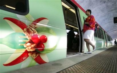 Train commuter Keinah Perry, boards a wrapped Metro rail car, sporting a McDonald's ad, at the New Carrollton station, Monday, May 9, 2005. Metro unveiled the wrapped passenger rail car, as part of its continuing effort to generate non-passenger revenue through specialized advertising initiatives between Metro and McDonald's family restaurants of Greater Washington. (AP Photo/Manuel Balce Ceneta)
1. McDonald's advertising wraps on subway cars discussed in "D.C. Transit System Gets Wrapped Up in Ads". This advertising will bring $54,000 to the Metro system.
2. The Post's editorial "Sounds of Silence" isn't critical of subway car ad-wrapping, but cautions against sound on subway cars and buses, which is the official Dr. Transit position--no sound-based advertising on the METRO system! And, Dr. Transit really prefers to deal without the televisions. It is enough that we are assaulted by advertising and images throughout our days and nights, this incursion in the public space is too much. Here is the editorial in full:
______
IF YOU'VE GOTTEN this far through this newspaper's A section, you may have noticed that we have nothing against advertising. So, far be it from us to sniff at Metro's effort to squeeze income from McDonald's or any other business that cares to advertise in tunnels, stations, rail cars or buses draped in sales pitches. But television on Metro trains and buses? Let's take a deep breath.
As it happens, the rationale for installing TVs where riders can see them is as simple as Willie Sutton's rationale for robbing banks: That's where the money is. Whatever additional revenue Metro may be able to generate through advertising -- and certainly the cash-strapped system badly needs it -- most of it will come from television. Metro is planning a pilot program of TVs in its buses and trains, possibly as soon as this year. And while there are plenty of uncertainties at this juncture concerning the specific programming and technology that will eventually be used, it's a safe bet there will be TV monitors showing, and selling, something before long.
But please: No sound. Metro is by no means perfect, but it does offer, at least on its better days, some peace and quiet to commuters preparing for work or winding down at the end of the day. Recognizing that it provides such a sanctuary, the system's policy is to require anyone listening to a tape, CD or the radio to use earphones. If TVs on trains and buses are the inevitable wave of the future, fine; but let riders read closed captions if they want to tune in, and snooze or read if they don't.
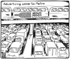
3. Tom Tole's take on subway advertising.
4. Tuesday's papers were full of the results of the Texas Transportation Institute's annual survey of congestion (the Urban Mobility Report), which finds DC ranked third, and Baltimore ranked 17th. In Death and Life of Great American Cities, in the chapter "Erosion of cities or attrition of automobiles" Jane Jacobs noted that cars aren't a problem for cities; too many cars are the problem. So the real question is not that there aren't enough roads, but "why are there so many cars?"
Commentator E.M. Risse, on the Bacon's Rebellion blogsite about Virginia politics and government, has trenchantly discussed what he calls the Private-Vehicle Mobility Myth:
Regardless of where they live, work, seek services and participate in leisure activities, citizens believe that it is physically possible for the government to build a roadway system that allows them to drive wherever they want to, whenever they want to go there and arrive in a timely and safe manner.
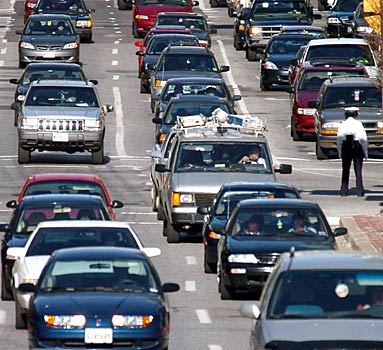 Traffic on Lombard Street in Downtown Baltimore, from the Baltimore Sun's article on the Urban Mobility Report. Here's a link to the Post article, "D.C. Traffic Creeps Toward Nation's Worst: Area Drivers Spend Almost 69 Hours in Gridlock a Year."
5. While I was in Baltimore at the National Main Street Conference earlier in the week, I noticed a few things about transit and mobility in Baltimore that we can learn from. (a) They have traffic officers (so does DC and NYC) that direct traffic during the day, in high count pedestrian areas such as the Inner Harbor. I presume that this reduces pedestrian-vehicle mishaps signficantly. (You can see a traffic officer in the Sun photo above. It also helps get people around, although except on the National Mall, in Georgetown, and along Connecticut Avenue we don't have places in DC where pedestrians are so highly concentrated as in the Inner Harbor area.
(b) MTA provides a free transit map distributed in hotels, at the LiveBaltimore center, at the Baltimore Visitor Center, and other places, that has a laminated cover and folds up into a square about 2.5 inches by 2.5 inches.
(c) MTA doesn't seem to do a good job promoting the day pass and they miss a big opportunity to "sell" transit and transit passes at the Baltimore Visitor Center and maybe at Penn Station (I forgot to look at the transit vending machines when I was at the LR part of Penn Station).
6. Poor Amtrak.
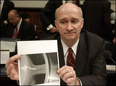 Fred E. Weiderhold Jr., Amtrak's inspector general, shows an X-ray of a brake. (By Jay Mallin -- Bloomberg News).
Amtrak is getting hammered at the Congressional hearings. Clearly Acela was designed to be too heavy compared to the European trains that it was modelled upon. (There was an article about this two Sundays ago in the New York Times but I never got around to writing about it.) They bet the farm on Acela out of desperation, and made some decisions that have come back to haunt them. Today's Post article, "Amtrak Faces Serious Cash Crunch, Senators Told," reports that long distance Amtrak rides are subsidized to the point of $400/passenger. My sense is that the brakes weren't built strongly enough to withstand the extra-normally heavy trains. Another example that it's better to use proven technology than to innovate sometimes...
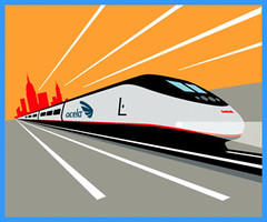 From Amtrak advertising for the Acela. Note to marketers: the best way to market is to have great products.
7. Speaking of the National Main Street Conference, one of the exhibitors was Graphic Solutions, an environmental graphic design firm.
While they haven't done work with full-scale transit systems, they have done some work with connector type systems (comparable to Silver Spring's "VanGo" or DC's "Georgetown Connector" or the coming "Downtown Circulator"). While they don't have some of the bus examples on their website, the Marketing person I spoke with, Raeanon Hartigan talked about how after they redesigned the logos and signage for one connector system, ridership increased by 400%.
This got me thinking about something I have written about before, that if we had great bus shelters, it would communicate to people that the bus system, that transit, is important and matters.
The same goes for signage. Image Metrobus signs something like this:
 An example from the "Civic" design portfolio of work produced by Graphic Solutions.
Rather than this example from WMATA (see signpost in the photo):
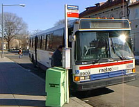 This sign is pretty typical of bus stop signage across the country. WMATA is not the only organization approaching graphic design from a very institutional-traditional thinking mindset.


0 Comments:
Post a Comment
<< Home