Downtown Circulator

Yesterday the Examiner reported, with accurate ridership numbers, about the one year anniversary of the Downtown Circulator, in "D.C. Circulator bus meeting ridership goals at first anniversary." Steve Eldridge's Sprawl and Crawl column did a follow up piece today, "Happy birthday, DC Circulator."
The ridership number is 7,000 people/day. Granted I think there is a great deal of room for improvement, as marketing is enhanced. WMATA has introduced new bus maps which I've been meaning to write about but I'm holding off until I figure out how to download a photo of one from a borrowed camera...
But that isn't all that I mean. The subway stations along the routes need to have enhanced "wayfinding" explanatory signs that explain how to use the bus system. WMATA's bus maps are a start, but not easy for a novice, and certain stations require more information, that can better explain the available options to visitors.
E.g., a few signs at Union Station need to explain the difference between publicly-provided services such as regular Metrobus service, subway, and the Downtown Circulator, as well as the tourist-directed services like the Tourmobile and Old Town Trolley, which allow for on-off usage for an entire day, and the driver provides information about the various sites.
Something on the scale of this Metrorapid sign from LA.

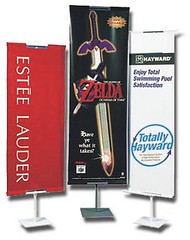
 Stand up banner holders like these could work in office building lobbies.
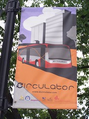
  Downtown Circulator banner on K Street NW.
 But smaller easels with posters could work in office building lobbies also.
Lately I've been thinking about maybe the best way to market transit to people who work in DC office buildings: restrooms.
You see, the Downtown BID doesn't feel that it is its job to figure out how to market to individuals that work downtown--to my way of thinking it is via placards in office lobbies and on elevators, but since everyone goes to the restroom sooner or later, and they often go unprepared (meaning nothing to read), restroom stalls might be good places to put transit marketing materials.
It's not sexy, but I think it could work.
Getting back to Steve's column, he makes the point that:
These Belgium-made buses are sleek and have a big window in the back unlike the current Metro buses that have nothing more than an engine cover and, more often than not, an ad for some all-news radio station. I understand that Metro is talking with the company that makes its buses about adding a window to the back, which would make the buses more airy and open. Unfortunately, because Metro gets a subsidy from the feds they can’t just go out and buy the foreign-made VanHool buses.
Like my idea to build streetcars in DC (see "DC as a center of streetcar manufacturing excellence?" and "Use it or lose it or you have to recreate it (US streetcar technology and expertise)" perhaps Van Hool needs to consider building buses in the U.S. so that their buses could be acquired with Federal Transit Administration monies.
Index Keywords: transit


0 Comments:
Post a Comment
<< Home