The Bigness Complex and Big Urbanism
(Reprinted from 12/2006)
The Bigness Complex is a book by economics professors about how business giants are not more efficient but in fact undermine national economic productivity. The authors also claim this "endangers our democratic freedoms, and exacerbates our economic problems and challenges." Kirkpatrick Sale's Human Scale makes similar arguments. With either book, why aren't the arguments extendable to the built environment? In fact, Death and Life of the Great American City by Jane Jacobs precedes these publications, and made similar arguments about the principles of vibrant cities.
Yet the prevailing development paradigm, urban or suburban, is one of "bigness." Large developers assemble large tracts of land and develop large projects or large buildings.
Superbuildings begat superblocks, designed to enhance automobility and the speed of traffic flow, and the pedestrian and the walking city have been significantly harmed as a result.
![cover[1].395](http://static.flickr.com/130/321203709_86528daa17_m.jpg) What do you say when the latest big idea in urbanism is 70-110 years old?
What do you say when the latest big idea in urbanism is 70-110 years old?So the piece in last Sunday's New York Times Magazine, "Big Urbanism," which argues that "little plans have been the signature creations of the American city" for the last 40 years, strikes me as somewhat flawed.
Maybe governments haven't done all that much, a view with which I would significantly disagree (while there is no question that the big projects of the City Beautiful movement are atypical, although there is still plenty of government participation in the construction of airports, convention centers, and sports stadiums and arenas), but developers have--everything from the Mall of America to 6,000 house subdivisions to the redevelopment of Stapleton Airport in Denver to the Columbus Circle above-ground mall in New York--is pretty typical of big urbanism.
While these projects are not on the scale of gigantic urban renewal projects, but they have tremendous significance in terms of making over commercial and neighborhood subdistricts and in concert with other similar nearby projects, are remaking cities into places far different from their architectural roots in the 19th and early 20th centuries.
From the article:
Taken together, these projects represent a new confidence among designers, as well as developers and public officials, in reshaping the American city. In part, this can be attributed to mechanics like “tax increment financing,” a newly popular device that allows municipal governments to issue bonds on the expected tax-revenue windfall upon a development’s completion. (TIF development projects are able to receive public support without threatening to dip into city coffers.)
But more important, the cautionary lessons of Jane Jacobs, who died in April, have been reinterpreted by a new generation of designers, developers and civic officials who hope to bring a vibrant urbanism to large, new developments. Skeptics wonder whether tall towers and developer-engineered neighborhoods can truly create the lively streetscapes Jacobs loved. Even so, it would have been difficult to predict 40 years ago that the legacies of Robert Moses and Jane Jacobs would one day find common cause.
Thus far, the hope that big developers will create vibrant urbanism with big projects hasn't been met by reality, and the commodification of most public places, be it by developers or BIDs roots out much of the "messy vitality" that Steve Pearlstein seems to find in Tyson's Corner Center. (See this blog entry, "Lesson in Urban Design--to the Post, from the Post.")

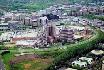 (Image sources unknown.)
Inside or outside, Tysons Corner, Virginia has little to offer when considering the principles of creating active spaces and places for people, within and outside of commerce.
Roger Lewis writes, in last Saturday's Post Real Estate section:
"Messy vitality" can refer to physical characteristics, matters of aesthetic design and form. However, it more commonly describes economic, social and cultural characteristics of places with a rich mix of contrasting uses, retail trade and civic amenities. Messy vitality implies demographic diversity and round-the-clock activity in public streets, squares and parks. It implies an environment where walking not only is enabled but also is a stimulating and enjoyable experience.
The reality is that unless done well, most of these projects end up not being great places for people. Unless it's a road, people activate spaces, not cars.
In fact, if it weren't for the transit connections (trains, subway, bus) and the staging aspects of tourism (Tourmobile, Old Town Trolley, etc.), Washington's wonderful Union Station--one of the first buildings constructed as part of the "City Beautiful" movement, would be merely another white elephant--as it was for decades after the decline of the railroad as the leading mode of travel.
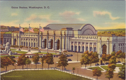
If urban renewal was so great, why 40 years or so after, is so much of it having to be rebuilt? The answer is simple. It's not working.
Even the great Rockefeller Center wouldn't be working nearly as well if it didn't go through practical re-engineering by the Project for Public Spaces, which helped make the places at the ground level work far much better for people.
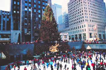 Ice skating at Rockefeller Center. Photo from the Rockefeller Center.
 Cy Paumier, in Creating the Vibrant City Center, writes that the pattern of downtowns (central business districts) as comprised of pedestrian-scaled streets, blocks, and buildings came about because of:
Concentration and Intensity of Use: "The intensity of development in the traditional central area was relatively high due to the value of the land. Maximizing site coverage meant building close to the street, which created a strong sense of spatial enclosure. Although city center development was dense, construction practices limited building height and preserved a human scale. The consistency in building height and massing reinforced the pedestrian scale of streets, as well as the city center's architectural harmony and visual coherence." (p. 11)
Organizing Structure: "A grid street system, involving the simplest approach to surveying, subdividing, and selling land, created a well-defined, organized, and understandable spatial structure for the cities' architecture and overall development. Because the street provided the main access to the consumer market, competition for street frontage was keen. Development parcels were normally much deeper than they were wide, creating a pattern of relatively narrow building fronts that provided variety and articulation in each block and continuous activity on the street." (p. 12)
The street grid, transportation practices and construction technology of the times, and the cost and value of the land led to a particular form of development on city blocks that focused attention on the streets and sidewalks, creating a human-scaled, architecturally harmonious built environment.
As construction technology advanced and taller buildings could be constructed, and as the walking and transit city was supplanted by the automobile, the scale of block development changed significantly, with a focus away from the pedestrian and towards the car.
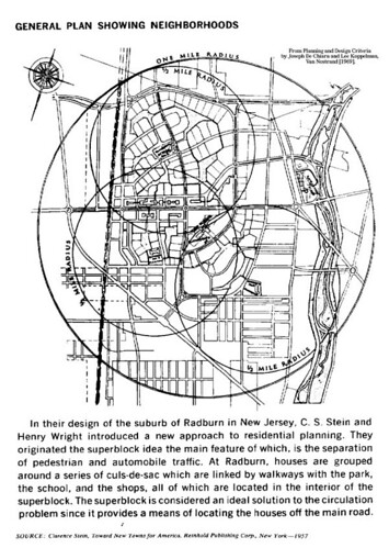
Taking a class on planning theory this fall has been an eye-opener, because the way that developers and architects design projects turns out to be based pretty closely on concepts of the anti-city contingent, developed as much as 100 years ago in the concept of the "Garden City", a kind of city-rural idyll. The idea of the superblock and refashioning the city developed as an academic concept by the "Chicago School" of sociologists before 1930. (And there were reactions by sociologists against these concepts in the late 1940s, although their opposition was muted, and these concepts significantly shaped the direction and planning of federal and local "urban renewal" programs.)
E.g., in the meeting with an architect on Sunday, referring to the development of a 8-9 story mostly housing building in NE, I bristled when he described the design in terms of how it would look to someone driving. In areas of the city with strong urbanism (Capitol Hill, Dupont Circle, Adams Morgan, Columbia Heights, Georgetown, and once again, 7th Street NW, etc.) people walk.
While the intent of the superblock was to separate pedestrians and automobiles, what happened is that places were made over for the car, and the walking experience, especially in center cities, was debilitated.
Interestingly enough, where are the urban places people like to visit? Places where people can walk, be they authentic mixed use places like Charleston, SC, or manufactured urban-like places that are mostly places for shopping and entertainment such as Bethesda Row, or City Walk or The Grove in California.
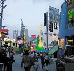 City Walk (created by Jon Jerde) photo by Janee. As Alex Wall, author of Victor Gruen: From Urban Shop to New City says, "commerce is the engine of urbanism."
The thing is that we have to fight like hell to ensure that the kind of vitality that Jane Jacobs remains in the face of tremendous developer desire to commodify every aspect of the experience, in ways that make it more like a shopping mall than an authentic place. (See this piece from April, "Commerz in the 'hood... (aka "Commerce as the engine of urbanism").")
The Cordish process that creates the various "Live" experiences-places (based on Power Plant Live in the Inner Harbor in Baltimore) has to constantly be reinvented, because without authenticity, they get old and patronage drops. See "Batter up, "M Street Live." Is inauthenticity on the horizon for the Anacostia SE Waterfront?"
 Fourth Street Live, Louisville. Photo from Blogography.
Developing "a retail destination" isn't about creating a great place, but a successful location for consumption.


0 Comments:
Post a Comment
<< Home