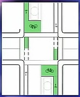
Painted bike (and bus) boxes
Image from Jym Dyer, who writes:
Here's the planned configuration for new "bike boxes" in Portland, Oregon. The bike lane leading up to it will be a high-visibility green, as will the bike box itself. A segment of bike lane will jut out into the intersection, as well.
Portland's existing bike boxes don't have any green paint, and are similar to the ones currently in San Francisco (as can be seen in the previous image).
(I grabbed this from a screenshot of a TV news segment. I can't find this diagram on the City of Portland's website or at any Portland-based advocacy group websites.)
---------------------
I think the bike box idea also needs to be expanded to include ASLs to accomodate the wide turning radii needed by buses. As pointed out in an email on the worldcitybikes list, ASLs--advanced stop lines--tend to be ignored.
HOWEVER, ASLs would likely not be ignored if: (1) ASLs were converted into ASBs--advanced stop boxes; (2) ASBs were painted a la Portland; (3) signs were posted explaining the rule and enforcement; (4) enforcement occurs including tickets/fines for violators.
If ASLs were eliminated in favor of painted ASBoxes, then likely proper utlization would increase greatly.


0 Comments:
Post a Comment
<< Home