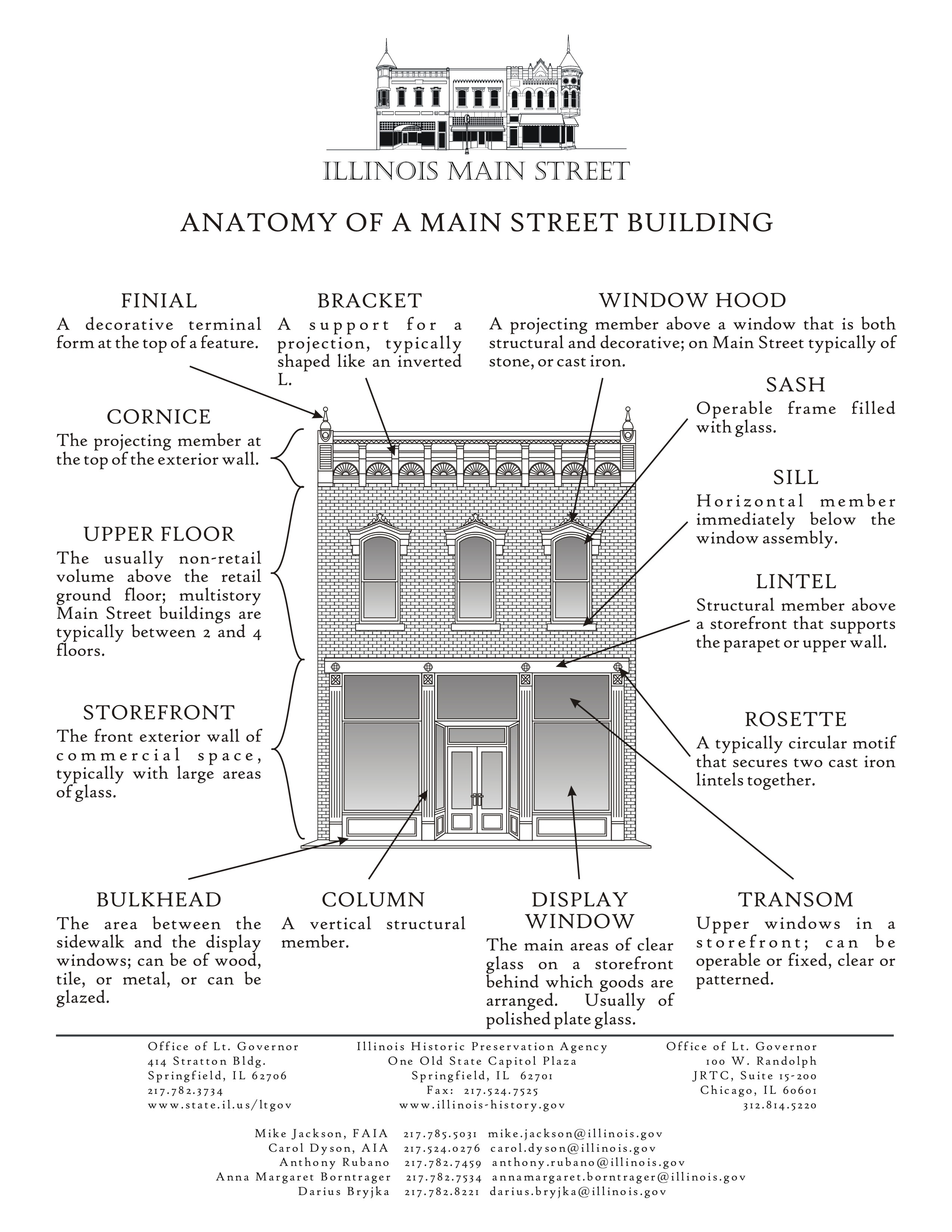
One of my biggest learnings in transit planning is the necessity of separating planning from budgeting.
I understand why this happens, but if there were true "mass transit planning," we would define the breadth and depth of the network that we want. And then come up with the funding to make it happen.
Transit operators would come back and say: you've defined the network's
- breadth: the area you serve and how you do it, with various modes) and
- depth: level/frequency of service)
as X. But the funding you're providing won't support that.
Then there would have to be a discussion of how to address funding shortfalls in terms of raising revenues or cutting service.
Andy Larsen, the data-based beat (and also Utah Jazz) reporter for the
Salt Lake Tribune, has a great article ("
Need help deciding where to live? These maps can help") on the Utah Transit Authority's services, with some great graphics that with some tweaking illustrate the concepts of transit network breadth and depth.
They use the organizing principle of how far you can travel in 30 minutes, by car, bus, bike or train. From the article:
Isochrones are maps that depict areas accessible from points within certain times using certain modes of travel.
Think
about them as kind of reversing the questions asked in your typical
Google Maps search. There, you want to figure out how many minutes it
will take to get from point A to point B. Isochrones show you how many
point B’s you can get to in so many minutes from point A. ...
In my exploration, probably the most user-friendly website where you can create your own isochrones is app.traveltime.com.
Simply type in your starting point, choose how much time you have, and a
preferred mode of transport. You can also layer different maps to
compare and contrast.
We've seen these kinds of graphics before, but I hadn't thought about it in terms of illustrating network breadth--where you can get to regardless of time, and depth--where you can get to quickly.
The point being that transit's "killer app" is being able to get somewhere reasonably quickly for not too much money.
While both maps focus on what I call depth or frequency of service, the second map illustrates the point especially well, in terms of tranches of time.
A basic network depth map would show the transit shed of all the areas served by the transit agency. UTA is somewhat unusual in that it is the primary provider of transit in Salt Lake (Salt Lake City), Utah (Provo), Weber (Ogden), and Davis Counties, which are the primary population centers in the Salt Lake Valley region, as well as more rural counties. (Logan--Cache County, and Summit County--Park City, provide transit service separately).
UTA, the Utah Transit Authority, provides light rail in Salt Lake County, railroad in Utah, Salt Lake, Davis, and Weber Counties, streetcar in Salt Lake City and South Salt Lake, and local, commuter, and rapid bus services.
The article includes a third map, comparing neighborhoods in terms of how much area can be reached without owning a car, but depending on sustainable modes.
FWIW, I think this map is a bit "misleading" because it only focuses on transit. It doesn't take into account proximity of amenities, and perhaps most important in Salt Lake, topography. The Avenues neighborhood has intense hills and the farther up you live, the steeper it is. In fact, for biking, I've suggested that they get a version of the Trampe Bike Lift.
For example, I think that the Sugar House neighborhood now, and maybe Fairpark over the next 30 years, have the opportunity to be walkable communities as more intense multiunit housing is added, along with transit service. Fairpark has light rail, and Sugar House has streetcar service, which is much more minimal. But as density is added, there is retail, and at least in Sugar House, a tighter street grid can support walkability and cycling. And best of all, both neighborhoods are flat.
Labels: neighborhood transportation planning, sustainable mobility platform, transit planning, transportation planning, urban design/placemaking


0 Comments:
Post a Comment
<< Home