Proposed Nationals Stadium Design
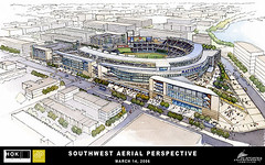
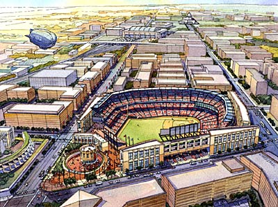
 Text from the Washington Post. The stadium designers had three goals with the ballpark. The first was to create an addition to the city's "monumental core" that would anchor the skyline to the south of the federal mall. Architects were working with a 20-acre plot whose southern nexis was sharply angled by South Capitol Street and Potomac Avenue. In this picture, you can see clearly how the design team used of the space -- creating a hard-edged facade along South Capitol Street that ends in a sharp, knife-edge at the intersection. This linear form is cut through by the curve of the stadium bowl. The idea was to create a visual element of lines and curves that is unique and will allow the ballpark to be identified immediately on a postcard as "D.C.'s ballpark," architects said. The use of glass and pre-cast concrete (limestone was eliminated to save money) make the ballpark look modern and breaks from the popular red-brick throwback stadiums. A final note -- the sign that says Nationals in blue will be substituted for in reality by the name of a corporate sponsor -- such as FedEx Field for the Redskins.
 As Dan M. mentioned in a comment yesterday, today is the day for the now released renderings of the Washington Nationals Baseball Stadium. The designs for each of the perspectives (looking to the NE, NW, SE, and SW) are online here.
Note that they don't look a lot different (imo anyway) from renderings produced and distributed last year.

Index Keywords: stadiums-arenas


0 Comments:
Post a Comment
<< Home