Banners and identity development
My business partner and I met as volunteers for H Street Main Street. I was a strong proponent for developing and executing a banner program (we didn't manage to pull such off). He can still be pretty derisive about banners.
His point is that banners for the sake of showing some action aren't that great, if you have "nothing" to sell.
I think it's important to use banners to develop identity, to show a sense of ownership over the space, etc.
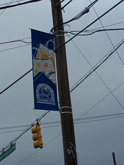
This banner from the Takoma-Langley Park area shows a problem with banners.
First, you need big images, not a lot of text, because these items are mostly viewed from vehicles. Since people are passing the banner quickly, the image has to be strong, direct, and easily consumed.
If they were going with this size, they probably should have done two banners, on each side of the pole, to maximize the image area.
Second, you need to spend the time to develop your own image and promote it. Generic designs on a banner don't work too well in helping to define and extend your own identity.
I'm not sure what images I would use to communicate identity and brand equity for this area, but a generic image of shopping bags probably isn't it.
Although, you can do great things with shopping bags and image development.


0 Comments:
Post a Comment
<< Home