Speaking of Making Transit Sexy...
As I mentioned in the previous entry, last fall, I wrote about Arlington County's transit promotion efforts, through the Commuter Page and other venues, and contrasted this to the DC Dept. of Transportation website, which is great for wonks like me interested in transit, but not oriented very much to promoting transit usage. That's in the blog entry "Making Transit Sexy."
It appears as if they were listening (or maybe it's just a matter of great minds thinking alike).
Apparently through the auspices of the Downtown DC Business Improvement District, a transit-usage-promotion website is being developed.
You can check out GoDCGo for yourself. It does have that "lack of sexy" common to government and not-for-profit marketing efforts, but it is a definite step forward.
 This Acela marketing graphic is pretty good for a government agency.
This is something I wrote last May:
Speaking of the National Main Street Conference, one of the exhibitors was Graphic Solutions, an environmental graphic design firm.While they haven't done work with full-scale transit systems, they have done some work with connector type systems (comparable to Silver Spring's "VanGo" or DC's "Georgetown Connector" or the "Downtown Circulator").
While they don't have some of the bus examples on their website, the Marketing person I spoke with, Raeanon Hartigan talked about how after they redesigned the logos and signage for one connector system, ridership increased by 400%.This got me thinking about something I have written about before, that if we had great bus shelters, it would communicate to people that the bus system, that transit, is important and matters.
The same goes for signage.
 Imagine Metrobus signs something like this...
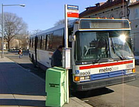
 Rather than this example from WMATA. This sign is pretty typical of bus stop signage across the country. WMATA is not the only government or not-for-profit organization approaching graphic design from a very institutional-traditional thinking mindset.
Index Keywords: transit


0 Comments:
Post a Comment
<< Home