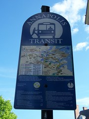
Annapolis transit sign
In theory this is a good sign, with a map and fare information. On the other hand, it's posted up high in the air, at the top of a sign pole, and you have to cran your neck up to try to read it. Besides the type is small, too small to read at that height. But the sign is pretty...
The map and other information should be posted on a lower sign at a height that is convenient for riders.
Index Keywords: transit


0 Comments:
Post a Comment
<< Home