Straw Man Argument #1 (Jane Jacobs and Urban Design/Placemaking)
 Image by Cristoph Neimann that accompanied the piece by Nicholas Ouroussoff.
The urban planning field, especially the New Urbanist branch, is in a tizzy over a piece in the Sunday New York Times "Week in Review" section entitled" Outgrowing Jane Jacobs and Her New York," by the paper's architecture critic, Nicholas Ouroussoff.
There are a number of points to raise with regard to the review. First seems to be the function vs. expressive argument in art and architecture. Ouroussoff clearly favors the expressive. This explains his preference for sweeping, but unused, plazas, such as his positive comments about the Lincoln Theatre complex, in particular the plaza--beautiful in photographs, but often forlorn, empty of people and activity. Can an unused place be beautiful?
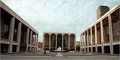 Don Hogan Charles/The New York Times. BIG BUT NOT BAD The plaza at Lincoln Center, silence amid chaos. Go to the article for a larger version of this image.
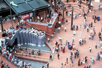 Pioneer Courthouse Square, Portland, PPS photo.
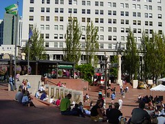 Pioneer Courthouse Square, Portland, Cyburbia photo.
One place has people--use--the other doesn't.
Jane Jacobs' focus on function rather than form leads to one of the only "arguments" I have had at times with Jane Jacobs. One of the early "project planners" that came around was Daniel Burnham and the City Beautiful movement, which demolished neighborhoods in favor of beautiful, often cold, edifices.
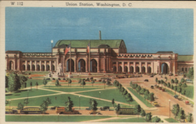
In DC, Union Station is a perfect example of the City Beautiful movement. At the same time, it is a highly used and grand public place although I would argue that its outside plaza is wasted and needs significant doses of attention and change in the vein of the Project for Public Spaces workshop "How to Turn a Place Around." IN FACT, one of my desires is to do an annual version of this training in DC, and I just came up with one of the places to do it--the plaza spaces and walkways and Metro entrances...).
This did come at a great cost. A neighborhood, "Swampoodle," a predominately Irish community, the area where the Union Station railyard lies (and the site of the pre-1900 Washington Nationals baseball stadium) was demolished. And Jane Jacobs rightly focuses on this, where I sometimes focus on today and the vitality (although a lot can be improved, especially the restaurants) of Union Station (maybe I just like the easy access to transit...).
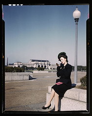 Woman putting on her lipstick in a park with Union Station behind her, Washington, D.C. , 1943. FSA-OWI, Library of Congress.
 Union Station is the most heavily visited building in the city, with as many as 27 million visitors each year, many of us using its transportation facilties, either the trains (MARC, VRE, and Amtrak) or the subway and buses. That's why Union Station works--even though as many know, at one point it was a sadly neglected and underused facility, until the interiors were rehabilitated and "commerce" functions were added--the downstairs food court and cinemas and shops on the first floor and on an added mezzanine floor, and the waiting areas for the railroad users were vastly improvedwas adaptive reused and reopened in the 1980s.
Proof of the point that Alex Wall makes that "commerce drives urbanism" or the importance of what Fred Kent calls the "layering of attractions" to create great highly-used places.
Contrast this to Cleveland, where the Burnham-designed Civic Center complex is attractive but cold, and hardly a heavily used and active public space. Or Dan Kiley's award-winning landscaped park space in Tampa that was in many respects impractically designed, unused, and too expensive and beyond the capacity of the City of Tampa to maintain. Note the similarity between Kiley's space and Lincoln Plaza.
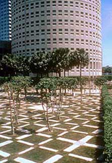 Nations Bank Park Plaza, Tampa. Photo from Landscape Online.
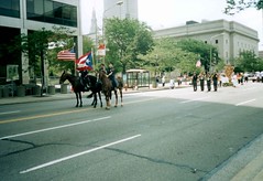 Photo by Dr. Bostjan Bezensek. Even during a parade Cleveland's Civic Center area is somewhat empty. (Civic Center looms in the rear of the photo.)
Note that this is the same problem with Pennsylvania Avenue NW in Washington, DC. Daniel Patrick Moynihan is "lauded" for its revival, but the fact is this is not "America's Main Street."
It's a cold, dead and austere, a vastly underused place. The buildings are large, often ugly (especially the FBI Building), single-use functioning places that are dark for most of a 24 hour period. The federal buildings allow no ground floor uses (although one does includes a Post Office).
EXCEPT for the area at 7th and Pennsylvania, which is where commercial uses come into play, from 7th Street, there is a Starbucks with patio seating, and places for people to buy food and sit outside, etc.
The point in Death and Life of Great American Cities about "Mixed primary uses" is fundamental, as is the point about sidewalks and the rhythm of buildings on the street, which is perhaps best captured by the repeating rhythm of 40 feet wide (or so) storefronts that made up the streetwall that Jane Jacobs was observing almost 50 years ago.
By the way, this is why 7th Street is the only truly vibrant place "downtown." People argue that it is because of the Verizon Center, but I disagree (although it contributes as an attraction especially because most people get there by modes other than driving, so people spill out onto the streets). I say it is because 7th Street from Indiana Avenue to Massachusetts Avenue is the longest extant stretch of historic buildings with the historic storefront rhythm and pacing. And the new buildings that have been constructed pay respect to that pacing by repeating (and therefore maintaining or extending) the rhythm. It's a shame that Ben Forgey, the Post's architecture writer, doesn't understand this.
What really matters is how buildings and places connect to the world outside. Function is key. Connection is key. And that's what Death and Life of Great American Cities is about--life on the street, eyes on the street, activity on the sidewalks, etc.
Jacobs sets the stage for urban design and still remains the foundation for looking at how and why successful places work. (Just like Newtonian principles still undergird the study of physics even though the profession has continued to develop in the 280 years since his death.)
Perhaps the Project for Public Spaces has best extended this concept into why there is life on the street. William Whyte called it "triangulation," where "some external stimulus provides a linkage between people and prompts strangers to talk to other strangers as if they knew each other." (p. 154, The City).
Fred Kent extends this idea with what he calls "layering" or "layering attractions:"
[PPS has] plenty of suggestions for creating the sort of clutter on a street that people like, for the way buildings ought to behave — don’t create blank walls, don’t confront pedestrians with the heating and air conditioning infrastructure, don’t lard a block with curb cuts — and for layering attractions that gather people in. “If you have a children’s reading room inside and a playground outside,” says Kent, “then you put a coffee shop, a Laundromat and a bus stop right there, you will create the busiest spot in your community.” (From Governing Magazine, "Pride of Place," April 2005.)
Urban and environmental designers have extended Whyte's observations into the concept of the social bridge:
Except for a minimal number of elements, the environment does not facilitate interaction between strangers. While someone could hold open a door and a person passing through could say thank you, necessary ADA regulations are making many doors automatic. If social capital is to be increased and interaction between people who know one another and people who do not know one another improved, environments that might foster positive interaction should be built. At the destinations, social bridge elements could be incorporated in the built environment. These social bridge elements include four types: 1) Assist, 2) Connect, 3) Observe, and 4) In Absentia. ("Design Guidelines for Greenways," from the concluding chapter of Dr. Anne Lusk's dissertation titled "Guidelines for Greenways: Determining the Distance to, Features of, and Human Needs Met by Destinations on Multi-Use Corridors." University of Michigan.)
Jan Gehl, in Life Between Buildings: Using Public Space calls this "to assemble or disperse" in city and site planning:
To Assemble or Disperse
To Integrate or Segregate
To Invite or Repel
To Open Up or Close In.
This is why I call Ouroussoff's piece a "straw man" argument, which starts off:
TIME passes. Jane Jacobs, the great lover of cities who stared down Robert Moses' bulldozers and saved many of New York's most precious neighborhoods, died last week at 89. It is a loss for those who value urban life. But her death may also give us permission to move on, to let go of the obsessive belief that Ms. Jacobs held the answer to every evil that faces the contemporary city.
The fact is she set the foundation for understanding cities, and the "evils" that cities face. You don't move on from foundations, you build upon them.

Such as Whyte in The City, the Urban Design Compendium from the English Partnership, Steve Belmont's Cities in Full, which is a triumphant extension of Death and Life--more below and in fact the first chapter is titled "Jane Jacobs", the Project for Public Spaces, architects like Jan Gehl, landscape architects like Clare Cooper Marcus, writers like Roberta Gratz in Cities: Back form the Edge and The Living City, and many others.
Ouroussoff's attempt to recenter the focus on buildings as art rather than about cities being places that people "use"--places that are settings for living, earning, learning, and playing--is overly facile, and in fact, ignores the real and fundamental problem of the dominant land use and planning paradigm that works to destabilize and disinvest contemporary cities.
The suburban land use paradigm is about deconcentrated and decentralized land use, what many call "sprawl."
Sprawl has real consequences and in some respects is bankrupting American society socially and economically--$300 billion and counting in Iraq has a lot to do with the need to maintain access to relatively cheap gasoline needed to fuel the cars that connect people to the places that they have to go in their single use, low density suburban and exurban environments.
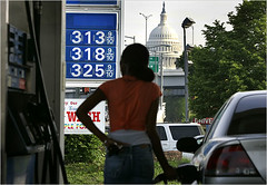 Maintainence of the sprawl land development paradigm undergirds U.S. domestic and foreign policy. (My caption; New York Times photo by Doug Mills.)
 Jodi Hilton for The New York Times. Fernanda Tapia's Dodge Neon often just sits in the parking lot. My caption: uncompact development and automobile dependence makes for an often grim existence in the seeming suburban idyll.
Ouroussoff talks about Jacobs' work not having stopped sprawl.
But I would say that Jacobs four points -- mixed primary uses, density, small blocks, and a large stock of old buildings -- should then be "rolled up" into a fifth point, a sustainable land use and resource paradigm of "compact development" supported by a sixth point that to her was so obvious, being based in New York City that she didn't write about it extensively, and that is that compact development allows for efficient and effective mobility systems that aren't automobile-dependent. (I admit this point needs serious wordsmithing.)
This is precisely what Belmont's book is about. It truly is one of the best books published in planning since Death and Life, Suburban Nation being another, but Belmont's book truly is an extension (with hard numbers) of Death and Life of Great American Cities.
Ouroussoff's criticism of New Urbanists (one or two lines that have worked up the NUists into a lather) ignores the fact that the city that Jane Jacobs wrote about had many developers, and these days new development is the massive reworking of a site controlled by a single owner.

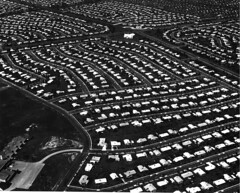 Levittown, Pennsylvania.
To bring this back to traditional center cities, take Washington and think about its historic neighborhoods. Neighborhoods like Capitol Hill are so much more interesting than blocks built by Wardman in his most "productive" years. Whereas the typical Capitol Hill block has similar building stock with greatly varying facades because the buildings were constructed in small sets by many different builders, over a few decades, Wardman developed single large tracts with the same basic house type--for example one of his developments in Columbia Heights produced almost 900 houses, all of the same basic type, with few visual variants on the facade.
I like the buildings, but the area doesn't have the same kind of character and visual vibrance of a street built over the decades through the diligent efforts of many different "designer-builders" each bringing a slightly different take to their efforts, but hewing to the overall symmetry of height, massing, and organization of the rowhouse.
Contrast that to production building of today. A developer has a few stock plans for each subdivision, and everything is built at roughly the same time. We live in neighborhoods that have grown and changed over a 200 year period...
It's the same for neighborhood commercial districts. Compare Georgetown in DC to the Bowie Town Center. And the new construction in Georgetown that doesn't pay as much respect to the historic buildings as it should is definitely out-of-place, whereas new construction that respects the precepts of historic commercial archictecture works, even if somewhat modernist. (I'll have to get photos, I was there yesterday, but didn't think to shoot the buildings I am thinking of--e.g., the German TV office just east of Nathan's is anti-street, whereas the building where the furniture store Artefacto works.)
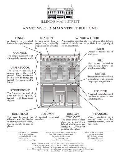 Regardless of what Nicholas Ouroussoff thinks, if you ignore this anatomy, a commercial building doesn't "work." Cubism is art, but cubism as a template for the construction of buildings that people are supposed to use doesn't work for the people who in fact use the building.
When you build everything at once, its not going to be able to work together in the same way, it's going to have a somewhat ersatz feel, and in the typically newly constructed "commercial district," but called a mall or "lifestyle center," it's likely to be all commercial, rather than having the mix of public and private functions that are typically sprinkled throughout our neighborhoods and particularly in commercial districts. The street won't have the same kind of flow.
Just like physics is founded on the work of Newton so to is the best of urban planning based on the work of Jane Jacobs.
Ouroussoff can continue to write about starchitects and "pretty" heroic buildings, but because
A community’s physical form...is its most intrinsic and enduring characteristic
we are going to continue to have to focus on life on the street, urban design and placemaking, and function over form, or as the title of book by Jan Gehl puts it, the Life Between Buildings.
Index Keywords: urban-design-placemaking


0 Comments:
Post a Comment
<< Home