Central Libraries in DC and Seattle
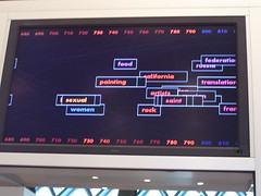
The display above the Reference Desk constantly changes. This image shows call number ranges and subjects.
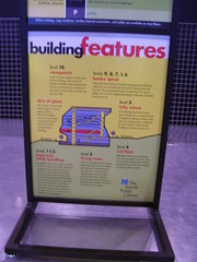
I did spend a bit more than one hour checking out the Central Library in Seattle. There are still lots of books
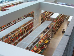
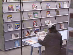
and magazines and journals
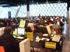
and many many computers
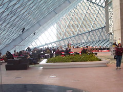
big open spaces
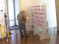
and a transit information rack
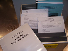
plus I liked how government information and notices were placed in a highly visible location
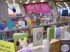
a nice children's area
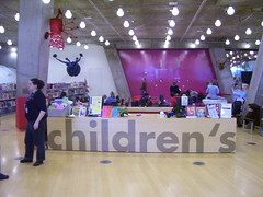
an auditorium that I wasn't able to photograph because the lights were off--too dark to shoot
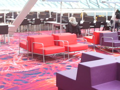
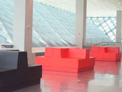
but I didn't think to sit on this furniture to see if it was comfortable.
They say that the first year of opening the library experienced a doubling of patrons, to 2.2 million, and 700,000 were non-residents (tourists, other visitors). Circulation increased quite a bit although it has dropped a bit, as visitorship has dropped.
Interestingly, they have copies that you can take with you of the special section on the opening of the Library from the Seattle Times. (See "Seattle's new Central Library" for the online version.)
On Tuesday, in "How the new Central Library really stacks up," the architecture writer for the Seattle Post-Intelligencer wrote that the building looks cool but isn't all that functional.
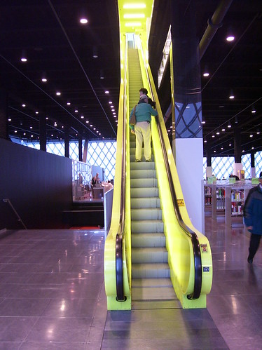
I wondered about that myself.
Andrew passes on an interesting entry "Improving the DC scene: The NGA" from an Arts Journal blog, Modern Art Notes which suggests that DC's Martin Luther King Central Library be converted into a gallery of contemporary art for the National Gallery, to best use its spaces and to help the NGA expand its ability to display its collection.
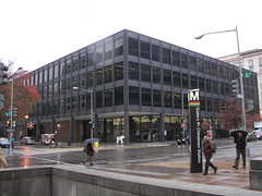
You see, I don't like the Martin Luther King Library.
It's somewhat striking visually (yes, I said this, even though I tend to not be a fan of modern architecture).
But it doesn't work as a library. It's extremely uncomfortable. It's not very warm. I always say "books are our friends." And this library separates books by departments, and doesn't treat books with reverence.
The reason I was against the Mayor Williams proposal was because it wasn't well thought out, because it called for a smaller facility, which would make it hard to do other things (such as have space for a great auditorium, or a visitors center or history and archival displays), and because it proposed to replace one uncomfortable modern architecture place with another likely uncomfortable modern architecture place.
I figured it was better to go with the Devil we know.
But we do deserve a lot better. At least I think so.
Labels: arts-culture, cultural heritage/tourism, libraries, museums, urban design/placemaking



0 Comments:
Post a Comment
<< Home