Signs, signs and the necessity of design review
---------------
Reprinted from 4/2005. Some of the signs depicted here have been removed as the businesses have closed.
---------------
In testimonies to the Zoning Commission (for the H Street Neighborhood Commercial District Overlay) and to the DC City Council Committee on Economic Development (about the DC Main Streets program), I submitted a document picturing various signs on H Street, to make the point about the necessity of sign guidelines as part of the overlay for the former, and for the necessity of design review in Main Street districts for the latter testimony. (Here's a related blog entry from last month.) The last two images are new.
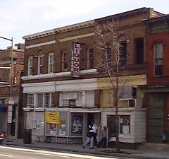
415 H Street. Photo by Michael Berman.
This typical lightbox sign was purchased and installed as part of the Community Development Block Grant (CDBG)-funded facade improvements on H Street in 2003. It is counter to the recommendation of the signage recommendations in the Office of Planning produced Thrive: A Guide to Storefront Design in the District of Columbia, which recommends that alcohol, among other products, not be promoted, and that lightbox signs not be used as part of creating distinctive and quality storefronts.
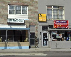
506 and 508 H Street. Photo by Michael Berman.
The sign on the left was installed as part of the CDBG project. The two signs on the right have been installed within the past few months as part of the opening of two new businesses on the H Street corridor.
The new signs demonstrate that providing examples of quality signs such as through the "Expressive Signs" project from the DC Commission on the Arts and Humanities, isn't enough.
Review and guidelines seem to be required to ensure quality.

832 H Street. Photo by Michael Berman.
The newest "Stan's" sign was installed as part of the Expressive Signs project spearheaded by Derrick Woody of the Office of Planning and Economic Development, and implemented by the DC Commission on the Arts and Humanities. The lightbox sign visible in the rear of the photo was installed as part of the CDBG program in 2003, and was moved to the east facade of the building in 2004.
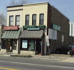
1000 and 1002 H Street. Photo by Michael Berman. Run-of-the-mill signs on the H Street corridor.
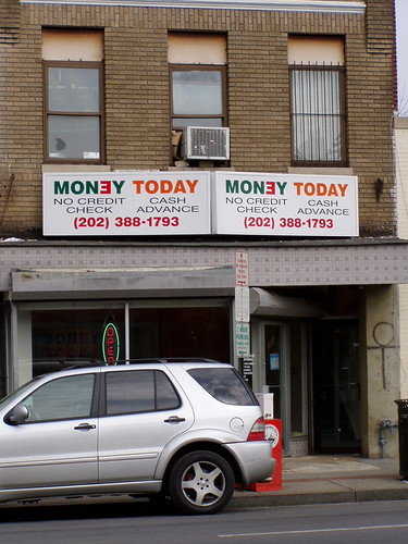
New business on the 1000 block of H Street. Photo by Elise Bernard.
Signs installed within the past three months, another indication that a guidance and review procedure seem to be required to better ensure a quality signage environment.
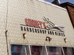
Stalwart business on the 1300 block of H Street. Photo by Elise Bernard.
This new sign was installed as part of the Expressive Signs project.
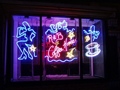 '
'Neon sign at R&B Cafe by Marty King. Photo by Elise Bernard. From the Expressive Signs project. (I really like Marty King's neon!)
There are a couple other examples of quality signage, including Urban Legends and the logo design for Stella Bleu, a salon-boutique. Lamentably, these are exceptions. We'll see what happens here...
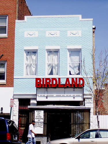
Photo by Elise Bernard.
Labels: urban design/placemaking


0 Comments:
Post a Comment
<< Home