Updating my review of the Silver Spring Transit Center: a few things I missed in 2015
This vintage postcard describes Chicago's train stations as major attractions.
I wrote about the Silver Spring Transit Center in 2015:
-- "Multiple missed opportunities in the creation of the Silver Spring Transit Center"
-- "Brief follow up on the Silver Spring Transit Center"
although my review of the Takoma Langley Crossroads Transit Center in 2016 has a more detailed framework.
(And other guides for railway--Network Rail in the UK, and streetcar--SEPTA in Philadelphia--systems have great frameworks and checklists too.)
The three pieces provide a pretty good framework for thinking about a wide range of access, service, and accommodation issues as it relates to transit stations.
This is also another example of apply "Transformational Projects Action Planning" at multiple scales, in this case at the scale of an individual project.
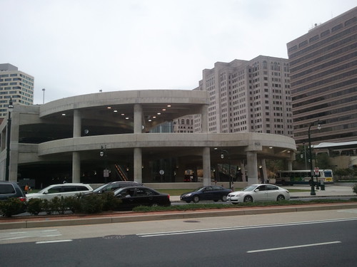
WRT the SSTC, over time, I've come up with a few things I missed that are a big deal.
1. The transit information center shouldn't be buried in the back of the bus station on the second floor but placed on the ground floor at the front.
It should also be open on weekends.
It could function in part as a Silver Spring Visitor Center too, and get some other funds to support 7 day/week operation.
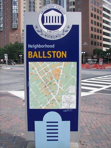
Area map sign for a neighborhood in Arlington County.
2. Two of the three information panels on the SSTC directory repeat. One of the panels should have a map of Silver Spring, comparable to area maps in other wayfinding systems.
The information panels aren't lighted at night. That's a big deal.
In the Gallery Place station there are sign panels showing the Metrobus transit network for Greater Washington, which they call the National Capital Region. This kind of signage needs to be placed at main transit stations such as SSTC.
3. At the transit information center, on the second floor, they have a real time display of all the bus routes serving the station. But that's the only place it's available. This information is not displayed as you approach the bus station on the ground plane, is not in the foyer of the Metrorail station, etc.
4. There should have been accommodations made for the long distance commuter buses, to provide shelter, on the "ground floor" of the site, not necessarily within the current SSTC footprint. The inter-city bus line Peter Pan does have a bay in the main SSTC, and you can buy tickets for it from the transit info center. (But Greyhound still has a separate station about one mile away.)
Commuter buses don't go into the SSTC because it would add time to the trip. Instead they stop adjacent to the station on Colesville Road, but closer to the intersection at East-West Highway.
A ground floor "appendage" closer to the street could have been created to provide more direct support for this kind of service.
Which could also be extended to serve other inter-city bus services like Best Bus, which does stop at Silver Spring, but on the street in front of the transit center, not inside.
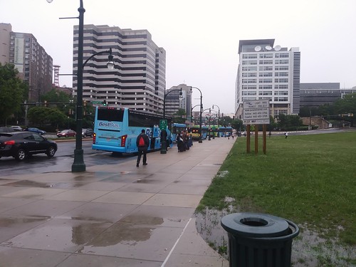
Best Bus -- service to NYC -- stopped adjacent to Silver Spring Transit Center, on Colesville Road.
5. In fact, a bus station lobby for Colesville Road commuter and inter-city bus service could be integrated with a relocated transit information center facing the street. Plus a visitor center for the district could be included.
Charlottesville's two-level Downtown Transit Station would be an example (the second floor fronts the pedestrian mall and has the town visitor center, while the ground floor, facing Water Street, has the ticket office, waiting area, and restrooms).
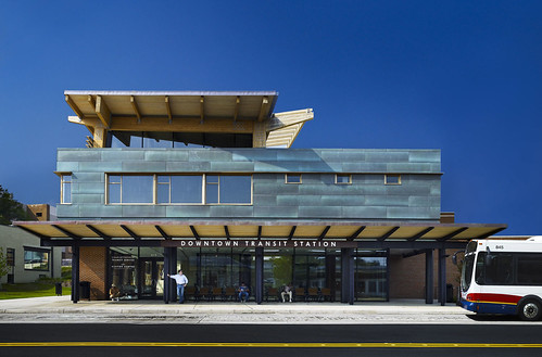
Bus station side of the Downtown Transit Station, Charlottesville. (It could use more prominent signage.)
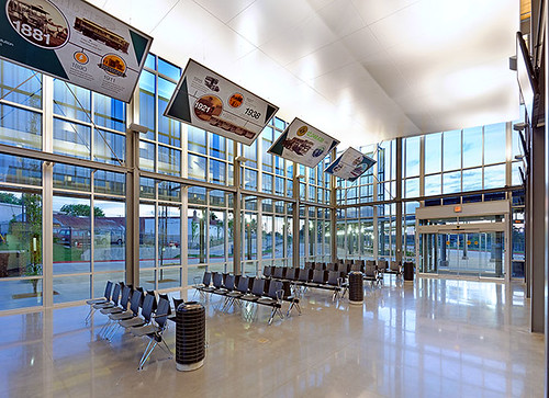
Springfield Missouri, Downtown Bus Transit Station.
The transit ticket office and waiting area in Lancaster, PA would be another. But there are others.
Some transit systems do have customer service centers in street-facing locations. It could also have a café.
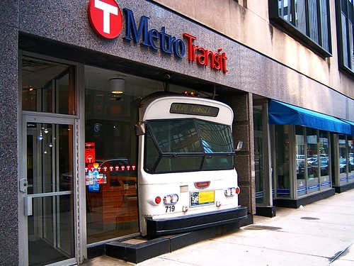
Metro Transit Service Center, Minneapolis.
6. I wrote about high quality exterior signage also as a form of public art being a big miss in TLCTC, using examples from California and San Antonio. I didn't think about that for the SSTC until recently.
WMATA's signage isn't very interesting, the "obelisk." It also can't be seen from far away.
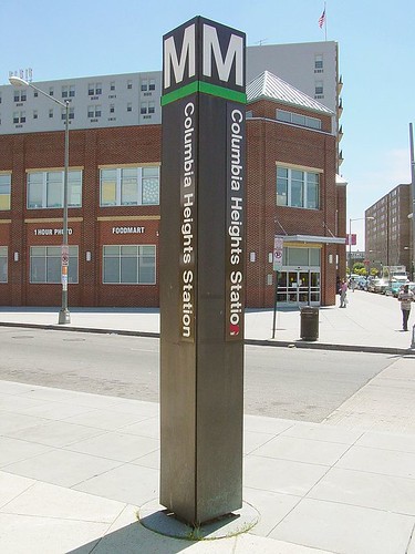
Columbia Heights Metrorail Station pylon sign.
In an e-discussion today, I brought up old Greyhound bus terminal neon signage as an example of practical signage that is also a form of public art.
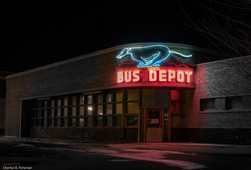
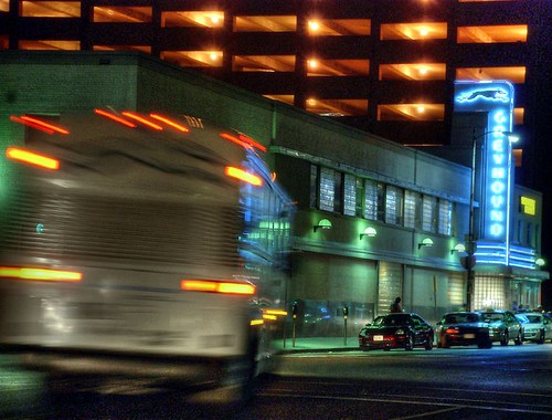
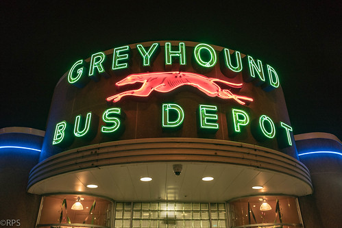
Greyhound Bus Depot- Huntington, West Virginia
But there are examples of train stations too. Not just the "Go By Train" signage in Portland, Oregon, although I should have referenced it. That model has been used elsewhere in the city to create "Go By Streetcar" and "Go By Tram" signage.
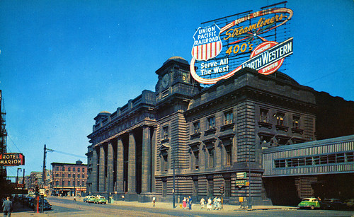
Chicago and Northwestern Station, Chicago.
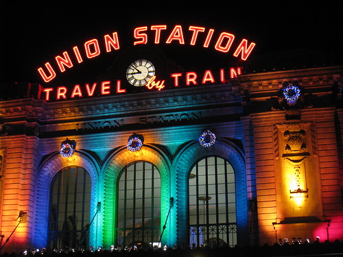
Denver.
The Denver train station also shows the opportunity presented by architectural lighting.
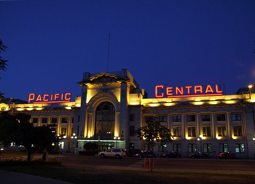
Pacific Central Station, Vancouver.
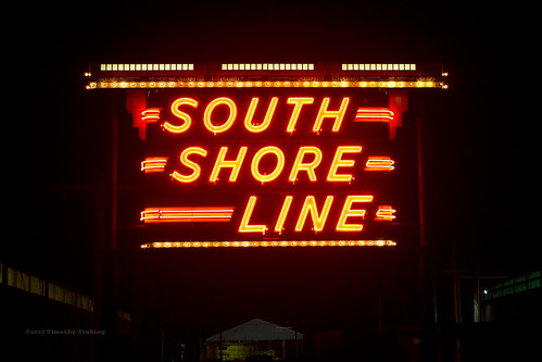
In fact, why don't local transit agencies create great neon signage. The old North Shore and still extant South Shore Lines in Greater Chicago had such signage.

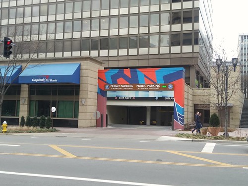
7. Recent initiatives to add bursts of color in the otherwise monochromatic Crystal City business district demonstrate that ugly concrete parking structures don't have to remain dull.
Labels: bus stations, capital planning and budgeting, inter city bus service, railroad stations, station area planning, transportation planning


0 Comments:
Post a Comment
<< Home