More examples of the need for mandatory design review in Washington, DC
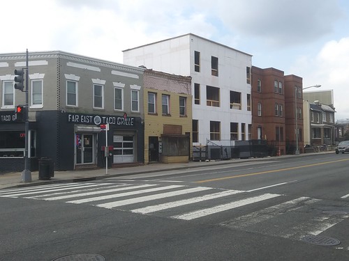
This site had been vacant for decades. I can't say when I first noticed, but it must have been around 20 years ago at the least.
Back then, when the neighborhood had experienced little "inward investment" and many buildings were vacant, when you would see footings and foundations for new construction you'd be hopeful that it meant the neighborhood was worth investing in.
That the languishing neighborhood was about to turn around.
But because the end product mostly was not very good--by that I mean new construction value engineered with little respect for the historic architecture around it--I became appreciative of architecture, historic urban design, the concept of historic preservation and a belief that new construction in neighborhoods dominated by historic architecture should be complementary and context sensitive rather than oppositional.
This building is a few lots down, where M Street NE merges with Florida Avenue NE.
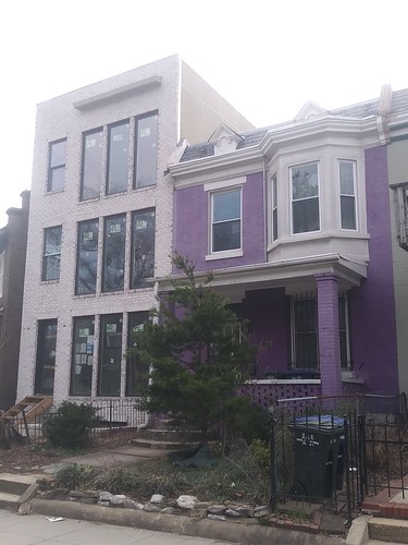
It wouldn't have taken very much effort or money to make the design of the facade fit in better, to use materials that matched better (like the style of window), but because the city doesn't have design review requirements for new construction, except in areas that are designated as historic, it's anything goes.
It reminds me of Ann Arbor, where I went to college. In the 1960s and early 1970s, many "old buildings" were demolished and replaced with cheap apartment buildings making for a very incongruous urban fabric.
That's what's happening to blocks and streets all over the city today, but because the Historic Preservation Office is not so much focused on the city as a whole as opposed to places that are designed, because the Office of Planning has been virtually invisible ever since the current mayor was first elected, and because the rest of the city's elected officials don't have much connection to the value of aesthetics -- in this case, historic architecture, historic urban design, and historicity (identity and people) as key elements of the city's identity and competitive advantages vis a vis other places -- there's little concern about how these changes diminish the city's fabric and will last for generations.
-- "Strong real estate markets need more public protections, not fewer: entry of CVS into DC's Mount Pleasant neighborhood," 2018
-- "... a opportunity to consider DC historic preservation issues," 2017
-- "Historic Preservation Tuesday: Saving buildings vs. "the right to petition to redress grievances," 2015)
-- "40th anniversary of the local historic preservation law in DC as an opportunity for assessment," 2019
One of the most out of proportion pop ups I've seen, 163 Rhode Island Avenue NE
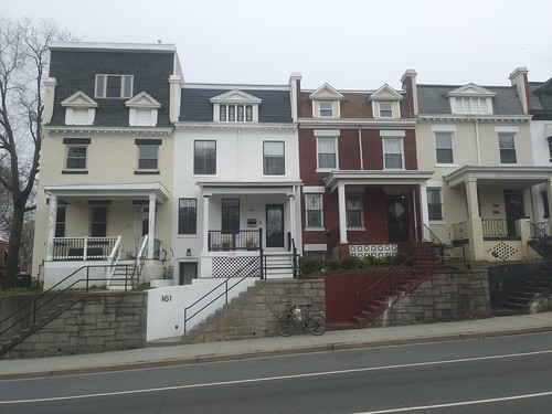
Another really bad pop up on the 300 block of V Street NE, a couple blocks from the other one.
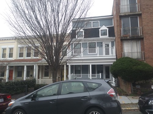
Historic districts aren't immune to ugly new construction.
Addition for housing on top of Frager's Hardware, 1100 block of Pennsylvania Avenue SE
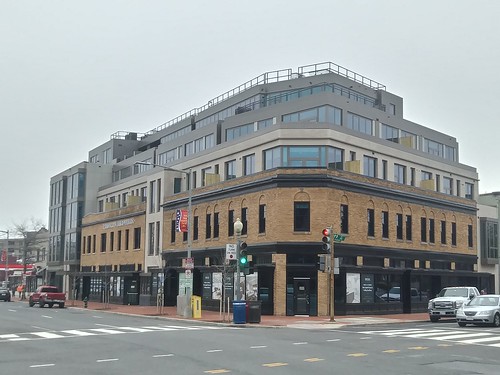
This project was featured in the Saturday Real Estate section of the Washington Post. ("Frager's Hardware returns to the neighborhood and brings condos with it").
I was struck by how the addition is so ugly and discordant. I am not against building more housing, infill development, and even depending on the situation of building new, even in historic districts, depending on the situation.
This project illustrates a schism in historic preservation theory and practice of "architecture of its time versus architecture of its place."
-- "An argument for the aesthetic quality of the ensemble: special design guidelines are required for DC's avenues," 2015
From general guidelines the inference is that new buildings in old places should be constructed of their time, that is of new designs. But that tends to diminish the quality of place, context and architectural coherence that is otherwise present in historic districts.
I'd rather have seen a new building constructed here but incorporating and extending the design of the first two floors.
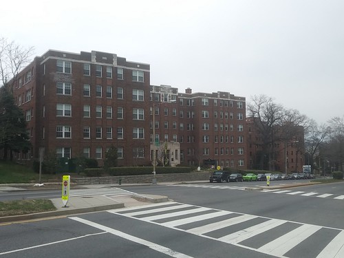
This building across the street, on the 1000 block of Pennsylvania SE, is much better, even if the proportions are somewhat off. It's built on the site of a gas station, and is 100% new construction.
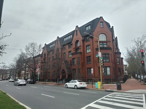
These buildings, on the 200 block of Rhode Island Avenue NE, show how buildings looked when they were constructed in the 1920s and 1930s.
This rendering of a new building to be constructed in Philadelphia's Italian Market demonstrate the concept of "architecture of its place" while the Frager's building is "of its time."
It's not high art but it will fit in with and complement other buildings in the district, rather than stick out from them.
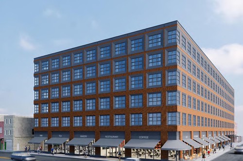
Proposed apartment building on 9th Street in South Philadelphia, to be constructed by Midwood Investment & Development of New York. It will be a six-story building with 157 apartments. That’s down from the eight-story, 182-unit building proposed in October.


6 Comments:
Popups are the new McMansions.
Most of California is this way too -- just plain ugly.
Are these buildings going to last 20 years or 100?
the first building is a bit off but not terrible to me. Plus, FL Ave is a hot mess anyways. I kinda of like the 2nd building! not offensive to me.
The 3rd is a mess but could've been nice with some slight improvements. SMH
The first building is too soon to judge. They may cut out more windows. 2nd building is decent, economical perhaps, infill that many cities have. Its different, and obviously not legacy, but not out of scale. Rather than preserving montonous block faces all built in one era, it is not unusual to see good and bad, old and new, and numerous styles mixed together.
The Philadelphia building is incredibly dull.
1. I agree that the first building might end up being ok. I included more because it is amazing that those lots (on either side of the extant building, which likely was constructed in the late 1970s or early 1980s as infill) have been vacant for so long.
2. The second building isn't terrible design wise, except for the fact that it is out of place next to buildings construction pre-1920s.
3. I think the Philadelphia apartment building is far better than most of the new construction multiunit, which mostly looks the same.
But yes, it's utilitarian. It'll probably look better as constructed.
Hi everyone, Are you into trading or just wish to give it a try, please becareful on the platform you choose to invest on and the manager you choose to manage your account because that’s where failure starts from be wise. After reading so much comment i had to give trading tips a try, I have to come to the conclusion that binary options pays massively but the masses has refused to show us the right way to earn That’s why I have to give trading tips the accolades because they have been so helpful to traders . For a free masterclass strategy kindly contact maryshea03@gmail.com for a free masterclass strategy. She'll give you a free tutors on how you can earn and recover your losses in trading for free..
Post a Comment
<< Home