Design as a city branding strategy: transit edition

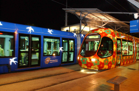
Images of the Montpellier tram. First photo from the Rugby Network; second photo from the transit operator.
According to the New York Times Travel Section's piece, "The 45 Places to Go in 2012," Montpellier France utilizes high quality design as a way to promote and brand the city and extends this idea to their transit system.
The most celebrated architect in France, Jean Nouvel, and a collaborator, François Fontès, introduced their blue and cube-like city hall in November, and early next year Mr. Nouvel’s RBC Design Center — another coolly modernist structure that will house the RBC brand’s furniture showroom — is to open its doors in this medieval, student-filled Mediterranean city.
Even more innovative, the long-awaited Pierres Vives Building from the star architect Zaha Hadid will be ready by year’s end. A long, sprawling edifice of swirly white concrete layers and green-tinted glass, the futuristic structure will hold a library, archives and municipal offices.
And to reach them, the city is installing what may be Europe’s sexiest tram system. The two existing lines sport exteriors of kaleidoscopic birds and flowers by Christian Lacroix, and two new lines with Mr. Lacroix’s trademark color-soaked style are on their way. Both will make their debut this spring with an underwater design theme and a solar theme, respectively, along roughly 17 miles of new track. Think of it as France’s longest fashion runway.

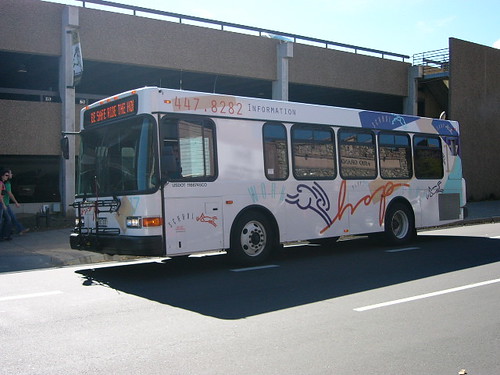
It is very rare that transit is marketed in the U.S. comparable to that of Montpellier, although some bus systems (Orlando, Boulder, Pittsburgh, Santa Monica) are known for particularly engaged livery designs.
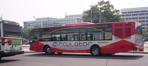
A lot of people like the Circulator design in DC, which is decent. But generally, transit operators have dull looking vehicles.

The vehicles are rolling billboards, and while they are often used for advertising, the design of the bus or fixed rail transit vehicle has to be considered a key element in how transit is defined and the system is marketed.
Boulder's bus lines are named, rather than numbered. This one is called Hop. Image credit.

Transit vehicle design is moving forward, and the Van Hool buses that the DC Circulator system uses, some of the buses used by WMATA such as the New Flyer buses, and light rail vehicles (Citadis by Alstom especially) are well done.
But it needs to go beyond the vehicle and include using the livery in full-fledged design, to achieve significant communications and marketing objectives. Montpellier shows us how it can be done.
Labels: branding-identity, design method, transit marketing


0 Comments:
Post a Comment
<< Home