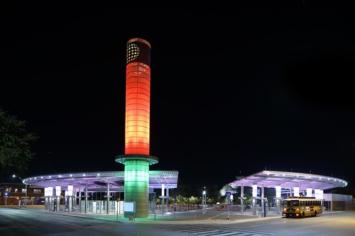
Speaking of "fun" in transit: great design at the VIA Transit Stone Oak Park and Ride in San Antonio, Texas
In keeping with the broad discussion about transit/transportation infrastructure as an element of civic architecture and high quality design as an element of branding transit as design forward ("Branding's not all you need for transit" and various previous entries cited within this piece).
I have commented before on the VIA Transit system in San Antonio, and how their planning section has an urban design mandate ("VIA urban planner wants to build a better San Antonio," San Antonio Express-News) which includes how they design bus shelters and incorporate public art into new facilities such as the Chroma Tower by Bill FitzGibbons at the Centro Transit station.

Look at how this wall has been treated at the new Stone Oak Park and Ride facility, which includes parking, bus transit connections, e-car charging, bike facilities, and phone charging accommodations in the waiting room (imagine, a waiting room!). See "VIA expanding services to meet growing demand," San Antonio Business Journal.
," .

It promotes transit and the region in a graphically attractive manner.
Compare that to walls in the typical transit center or train station in the US. (Stations in Europe, often through the use of tile, tend to be more interesting and attractive.)
Labels: branding-identity, civic architecture, graphic design, transit infrastructure, urban design/placemaking


0 Comments:
Post a Comment
<< Home