Branding's (NOT) all you need for transit
======
A big problem in improving programs is that most people are capable of one big idea, but usually "the one big idea" ends up addressing only part of the problem. A systems and structural approach goes much deeper.
======
When I saw this piece in Mobility Lab Express, "Consistent branding can increase transit ridership," referencing an effort by Stewart Mader, chair of the PATH Riders’ Council, to raise transit use by improving branding, I couldn't help but think of the Beatles song "Love is All You Need." From the article:
Some transit systems are iconic for their fonts. New York’s Helvetica, London’s Johnston – these fonts hold a special place in each city’s ethos.Branding is not enough in and of itself, not "all you need," to increase transit ridership. It helps, sure. Yes, it is a key element.
But they also exist for practicality: whenever you see these fonts in the city, you implicitly know it’s affiliated with transit.
This is intentional. Consistent branding is a huge part of wayfinding, or the signage that helps people easily move around cities. And it even has the potential to increase transit ridership.
That’s what Stewart Mader believes. The chair of PATH’s Riders’ Council (you might know him from his New York/New Jersey subway map) created a database of transit agencies’ brand standards manuals from his “personal library of branding, wayfinding, and digital-strategy resources I’ve relied on to help inform the Riders’ Council collaboration with PATH,” he said.
“I found these resources useful, so I figured I should condense them on my website,” he said. “Transit agencies like it because I link directly back to their sites.”
His database – called Transit Standards – also includes resources on branding, wayfinding, and customer experience.
“I want to help transit agencies exchange best practices,” he told me.
Mader thinks it’s important to “blend distinctiveness with standardization.” Distinctiveness – like New York’s Helvetica – is what makes a place special. But standardization makes transit easy to use. And when the customer experience is good, “people will take transit more,” he said.
But at best it's the third element of a comprehensive approach for the design and delivery of successful transit as a system. Delivering transit as an integrated system is what will increase transit ridership in substantive ways.
The first element is an integrated transit/mobility system a la the German transport association model. That means that at the regional scale, all the transit and mobility agencies are part of one overarching organization focused on integrating services, planning, routes, and fares.
-- "The power "of understandable graphics: a proposal for integrating NYC-area railroad passenger service," 2014
-- "One big idea: Getting MARC and Metrorail to integrate fares, stations, and marketing systems, using London Overground as an example," 2015
-- "The answer is: Create a single multi-state/regional multi-modal transit planning, management, and operations authority association," 2017
-- "Verkehrsverbund: The evolution and spread of fully integrated regional public transport in Germany, Austria, and Switzerland," Ralph Buehler, John Pucher & Oliver Dümmler, International Journal of Sustainable Transportation (2018)

As it is, PATH goes a step further than many transit systems, by integrating its transit fare payment systems with the NYC Subway transit farecard, even though the transit system is New Jersey-based, and it does provide high quality service to Lower Manhattan.
Part of a necessary transit improvement program in Greater New York would involve inter-connecting the systems, such as by extending PATH lines further into NYC (e.g., "PATH train to Staten Island proposed, with details to come," Staten Island Advance) and the NYC Subway into New Jersey ("A Subway Ride to New Jersey?," New York Times), and merging a number of MTA and NJ Transit rail lines for through running, etc.
A number of groups are calling attention to this, such as Jim Venturi of Rethink Studio ("NJ Transit won't take you to Queens. But Jim Venturi will," Bergen Record)
-- ReThink NYC
-- Trans-Regional Express (T-REX), Regional Plan Association
Within an integrated transit organization and delivery system, the second element is treating transit as "a design product" and ensuring that each and every element within the system of providing transit and mobility services is designed to be effective, efficient, successful, powerful and connected.
Transport for London, transit in Paris, and the various systems in Germany and in Austria and Switzerland using the German transport association organizational structure are probably the best examples (there are likely some Asian examples with which I am unfamiliar). Melbourne too. I wrote this last fall about London:
The London Underground as a design product. The London Underground is an outlier for transit systems in that it has been a consistent innovator in design and usability for 100+ years.
Key to this development was Frank Pick, who started at the agency being responsible for communications ("PR") and who laid the groundwork for corporate branding by coordinating all elements of the program into an integrated and extensive transit system -- advertising, branding, station architecture, vehicle design, and mapping -- with the highest standards for "design."
That legacy had been maintained through the creation of "product design managers" for the various transportation modes managed by the successor agency, Transport for London. But more recently, because the agency has been crushed by needing to find money to pay for Crossrail, in part because the national government cut back its contribution, they've cut these positions (and many other programs across the system).
-- Product design guidelines, Transport for London
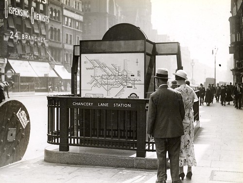
Chancery Lane Station entrance, London Underground, c. 1930s, with posted Harry Beck Tube map. The new London Underground map seems incredibly modern in the context of London's built environment being dominated by architecture from the previous centuries.

Transit as a design product: transit as a system must be complete, integrated, and legibile. The creation of high-frequency bus networks, night bus networks ("Night and weekend transit/subway service: Metrorail edition" and "Slight revisiting of overnight transit service: San Francisco"), the program around the creation of true bus rapid transit lines, such as in Cleveland, or the collaborative integration of transit agencies in the Raleigh-Durham area under the GoTransit brand ("Will buses ever be cool? Boston versus the Raleigh-Durham's GoTransit Model") are other examples of applying usability approaches to transit.
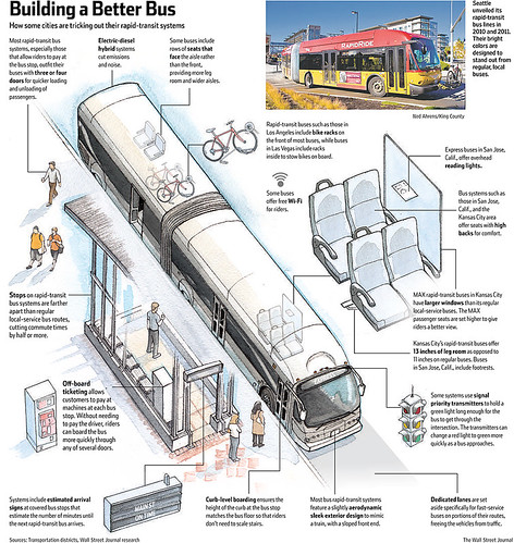
Wall Street Journal graphic.
And not satisficing and making bad decisions that ultimately will lower ridership, e.g., Alexandria's cutting entrance access to the forthcoming Potomac Yard Metrorail infill station to save money ("Alexandria publicly apologizes for Potomac Yard Metro secrecy," Washington Business Journal).
Even when there isn't a formal integrated system, many regions systems do provide integrated "journey planner" applications. In the DC area, WMATA has done this for more than 15 years. MTA in NYC released their first such app earlier in the week ("New MTA app to help streamline commuting for even PATH and NJ Transit users," Bergen Record).
Finally, the third element, tying it all together, is an integrated branding system. Branding is more than a font or a logo. It includes design within every element of the system, in all its aspects, from signage to liveries for trains and buses, routes, stations and stops, a combined call center, wayfinding systems, etc.
This entry discusses design thinking, design systems, etc. as it relates to (cities and) transit in a comprehensive and thorough way:
-- "Part 7 | Using the Purple Line to rebrand Montgomery and Prince George's Counties as Design Forward," 2017
This entry lays the groundwork for my thinking about transit infrastructure as a key element of civic architecture.
-- "Transit, stations and placemaking: stations as entrypoints into neighborhoods," 2013
For a bus-only system, Raleigh-Durham NC gets toward this, in a setting where the agencies are still separate. In seeing the various other transit systems across the country when I travel, outside of the NYC Subway system, none really stand out from a "branding" standpoint.
Most transit systems are disconnected from wayfinding. On that score, London takes it furthest, using the same mapping system to provide information for leaving transit stations, the area around transit stations including printed guides, bus stops, the Legible London pedestrian-focused wayfinding system, and the maps on bike share station kiosks.
In terms of subtle indicators of branding, I was impressed with how Merseytravel in Liverpool--they are responsible for local transit planning and directly contract and run the train system, although because of the UK's strong privatization rule for buses, London being the only exception, bus graphic design/liveries are an exception--uses the color yellow in their brand and in various elements of the furniture and design architecture of the system, from the color of benches and other elements at bus stops, to ticket offices, even bike racks in the main bus station complex, Queens Square, and the framing of system information posters, etc.
This is in line with the point I made almost 15 years ago, that bus stops especially are key marketing touchpoints for transit.
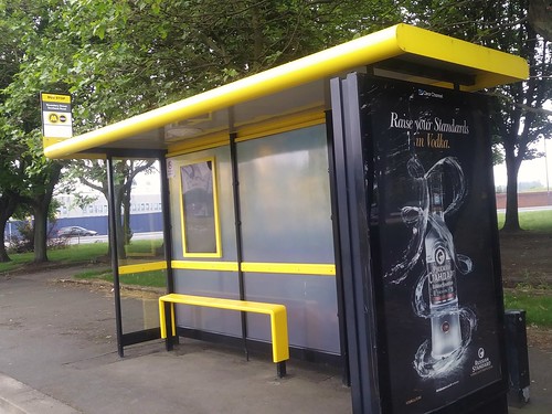
Bus shelter, Boundary Street, with yellow accents, Merseytravel, Liverpool

Bus stop sign stanchion is yellow, Merseytravel, Liverpool. In Liverpool, the bus "system" doesn't use yellow on bus liveries, so a yellow stanchion stands out. In London, because all the buses are red, a red stanchion would "blend in" to the bus while at the stop, becoming invisible. But even so maybe it's worth it, to make very clear the brand connection between the bus stop and the bus?
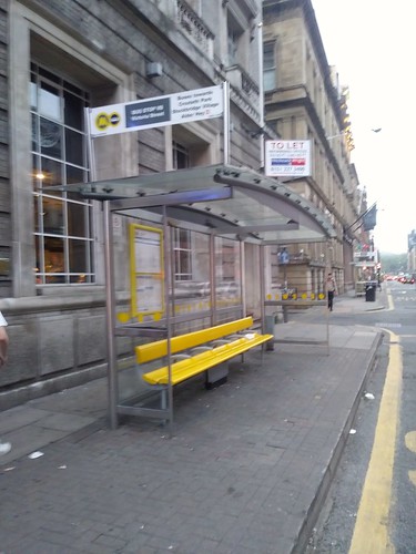
"Nichols Street bus shelter with yellow bench, Liverpool, Merseytravel
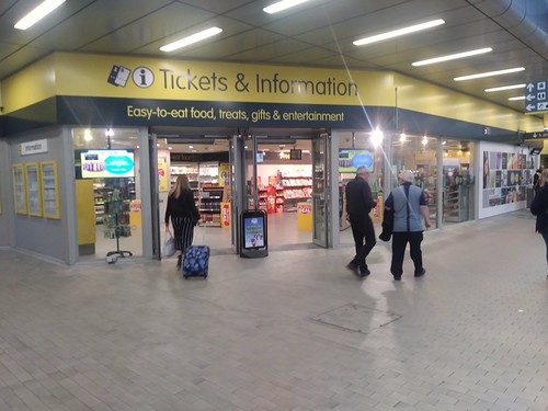
Merseyrail Liverpool Central Station transit ticket and information office. The local rail transit system in Liverpool is more like the PATH system in that it is comprised of railroad equipment, not "heavy rail" vehicles. That has likely shaped the system in terms of how it still has ticket offices, by comparison to more typical local transit systems like the London Underground.
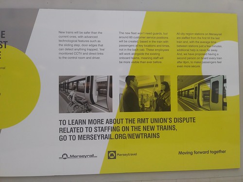
Information sign about Merseyrail's train equipment improvement program. It uses the yellow color, and also acknowledges a labor dispute.
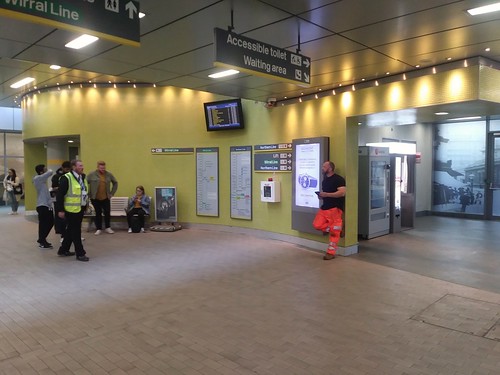
Liverpool Central train station, Merseyrail, Liverpool
Labels: design method, graphic design, integrated public realm framework, transportation infrastructure, urban design/placemaking
posted by Richard Layman @ 7:46 PM&Permanent Link
![]()
![]()


7 Comments:
https://www.post-gazette.com/news/transportation/2022/06/09/port-authority-allegheny-county-new-name-pittsburgh-regional-transit-prt-pat-buses-t-light-rail/stories/202206090131
"Goodbye Port Authority, hello Pittsburgh Regional Transit: Agency unveils new name, branding"
In addition to the physical changes, the authority also is revamping its approach to customer service. Operators and other employees who deal with the public will go through training classes to improve their interaction with the public, beginning with new employees.
The rebranding process actually was developed more than two years ago by research firm Campos and branding agency Red House Communications under a $544,000 contract awarded in 2018. They talked with riders at transit stops and conducted a series of focus groups to see what riders expect from the transit system. ...
Initially, a few buses will be wrapped with the new logo and color scheme, but the program will roll out over an extended time to hold down the cost. The first new, fully branded buses will likely be available beginning in September, and schedules and many signs will change according to their regular schedule.
"You're not going to see everything change overnight," Mr. Brandolph said. "We're trying to be very efficient in our costs. But people are going to know the new brand — the new Port Authority." ...
Ms. Kelleman said many people had suggested the agency return to it roots by adopting Pittsburgh Area Transit — similar to PAT, as it was known for many years — but she said the agency wanted to get away from any possible link to “port,” which suggests a water-based service.
Reddit post with writer listing his criteria for evaluating the rider experience:
Station Cleanliness/Safety:
Station Way-finding:
Station Staff:
Headways:
Train Cleanliness/Safety:
Overall Network Reliability:
Article in Print Magazine about Samuel Insull being influenced by Frank Pick, and how Chicago transit, and area railroads used the same kind of approach to marketing/posters as the London Underground.
https://www.printmag.com/branding-identity-design/a-true-visionary-gives-chicago-a-landmark-branding-campaign-circa-1920-30/
A True Visionary Gives Chicago A Landmark Branding Campaign Circa 1920-30
https://thetrolleydodger.com/2019/07/31/posters-plus/
https://www.printmag.com/branding-identity-design/keeping-everyone-in-the-loop-50-years-of-chicago-l-graphics/
How Color Transforms Transit—and Why It’s Time for U.S. Systems to Get Noticed
https://www.allaboardohio.org/posts/how-color-transforms-transit-and-why-it-s-time-for-u-s-systems-to-get-noticed
https://palmbeachartspaper.com/its-a-wrap-delray-artist-creates-colorful-mural-for-brightline-train/
It’s a wrap – Delray artist creates colorful mural for Brightline train
The wrap is part of a marketing initiative called “Love the Palm Beaches,” a collaboration between the Cultural Council for Palm Beach County and Discover The Palm Beaches, and is aimed at boosting tourism.
“The Palm Beaches is known as Florida’s cultural capital,” says Dave Lawrence, CEO of the Cultural Council. “We have an incredible lineup of arts experiences and are home to many talented professional artists like Meghan. We’re thrilled to feature her work, which reflects our destination so beautifully.”
How Metro became D.C.'s favorite brand
https://www.axios.com/local/washington-dc/2026/01/14/metro-merch-how-became-favorite-brand-speedoes-sweaters
Demand for Metro merch was up 300% in 2025, year over year, according to WMATA.
Metro's Chief Customer Officer Sarah Meyer tells Axios the rebrand kicked into gear as crime fears spiked post-pandemic.
"We had to create our own storytelling," she says. "We had to get our own pictures out there to show people, you know, what transit is really like for the average user."
There's no staid gift shop. New drops roll out via flash pop-ups at MLK Library and elsewhere (plus online), with themes like retro collegiate gear for back-to-school.
Metro merch has become a subtle barometer of system health: the cheekier the swag, the smoother the service.
Case in point: The speedo-esque "Foggy Bottom" swim briefs released last summer — ahead of a fiscal year that saved $120 million and saw ridership climb.
"We can only do this if the service is really good," Meyer says.
BART Station Experience Design Guidelines, 2018
https://www.bart.gov/sites/default/files/docs/20180212_BART_SEDG_Final-lowres.pdf
Post a Comment
<< Home