PL #7: Using the Purple Line to rebrand Montgomery and Prince George's Counties as Design Forward

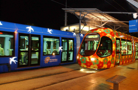
Images of the Montpellier tram. First photo from the Rugby Network; second photo from the transit operator.
 (1) I argued that cities need a "Graphic Design" element in their master plans but I realize now it's more a branding-identity-design element
-- Design as city branding: transit edition
-- City (and university) branding: brand deposits; brand withdrawals; brand destruction
-- Georgetown: A subtle but important difference between branding and identity-positioning
-- Identity ≠ branding or Authenticity is the basis of identity
-- The taxi livery debacle as a lead in to a broader discussion of the importance of "design" to DC's "brand promise
-- Illustration of government and design thinking: Boston's City Hall to Go truck
-- (DC) Neighborhoods and commercial districts as brands
(2) the design method may be superior to the "rational planning methodology" for planning but also for thinking about how to deliver public services
-- Social Marketing the Arlington (and Tower Hamlets and Baltimore" way
-- All the talk of e-government, digital government, and open source government is really about employing the design method
-- Best practice bicycle planning for suburban settings using the "action planning" method
-- A DC [Government agency] example of branded communications
(3) I have been developing this theme also in terms of transit infrastructure as an element of civic architecture
-- Transit, stations and placemaking: stations as an entrypoint for neighborhoods
-- DC's bad urban design as it relates to transportation inrastructure
-- Transportation Infrastructure and Civic Architecture #3: Rhode Island Avenue Pedestrian Bridge to the Metrorail station
-- Transit stations as an element of civic architecture/commerce as an engine of urbanism
-- Takoma Langley Crossroads Transit Center: A Critical Evaluation
-- Not butt ugly costs a little more: DC streetcar barn edition (transit infrastructure as civic architecture)
I made the point about design, brand, and identity in a couple commercial district revitalization framework plans I did in 2008 and 2009 (and I modified the language more broadly in terms of recommendations about "asset management," see "Town-city management: we are all asset managers now").
The basic idea is that whether or not they conceive of themselves that way, the decisions elected officials and stakeholders make shape the community's design and "brand," for good or ill, depending on the quality of the decision.
The Purple Line as a design intervention
-- Setting the stage for the Purple Line light rail line to be an overwhelming success: Part 1 | simultaneously introduce improvements to other elements of the transit network
-- Part 2 | the program (macro changes)
-- Part 3 | influences
-- Part 4 | Making over New Carrollton as a transit-centric urban center and Prince George's County's "New Downtown"
-- PL #5: Creating a Silver Spring "Sustainable Mobility District"
- Part 1: Setting the stage
- Part 2: Program items 1- 9
- Part 3: Program items 10-18
- Part 4: Conclusion
- Map for the Silver Spring Sustainable Mobility District
- (Big Hairy) Projects Action Plan(s) as an element of Comprehensive/Master Plans
- "Creating the Silver Spring/Montgomery County Arena and Recreation Center"
-- Part 6 | Creating a transportation development authority in Montgomery and Prince George's County to effectuate placemaking, retail development, and housing programs in association with the Purple Line (to come)
-- Part 7 | Using the Purple Line to rebrand Montgomery and Prince George's Counties as Design Forward
According to the New York Times Travel Section's piece, "The 45 Places to Go in 2012," Montpellier France utilizes high quality design as a way to promote and brand the city and extends this idea to their transit system.
France’s eighth-largest city is dressing up in designer style.
The most celebrated architect in France, Jean Nouvel, and a collaborator, François Fontès, introduced their blue and cube-like city hall in November, and early next year Mr. Nouvel’s RBC Design Center — another coolly modernist structure that will house the RBC brand’s furniture showroom — is to open its doors in this medieval, student-filled Mediterranean city.
Even more innovative, the long-awaited Pierres Vives Building from the star architect Zaha Hadid will be ready by year’s end. A long, sprawling edifice of swirly white concrete layers and green-tinted glass, the futuristic structure will hold a library, archives and municipal offices.
And to reach them, the city is installing what may be Europe’s sexiest tram system. The two existing lines sport exteriors of kaleidoscopic birds and flowers by Christian Lacroix, and two new lines with Mr. Lacroix’s trademark color-soaked style are on their way. Both will make their debut this spring with an underwater design theme and a solar theme, respectively, along roughly 17 miles of new track. Think of it as France’s longest fashion runway.

It is very rare that transit infrastructure is positioned in the same way in the US, although Transport for London has "design product managers" for each transit mode. For example, I make the point often that transit shelters are the key touchpoints for marketing transit, for communicating whether or not we value transit or merely look at it as a social service.
See "Making bus service sexy and more equitable" and "(Ir)rational planning #2: sexy (Circulator) vs. plodding (Metrobus) bus service","
(1) some bus-only systems (Orlando, Boulder, Pittsburgh, Santa Monica, Columbia, SC) are known for particularly engaged livery designs. This makes sense because in effect, the vehicles are rolling billboards, and while they are often used for advertising, the design of the bus or fixed rail transit vehicle has to be considered a key element in how transit is defined and the system is marketed.
(2) many transit systems incorporate public art, but a few systems employ public art as a key element of their branding and placemaking strategies
(3) transit systems are beginning to treat bus shelters, stations and other elements in terms of design and placemaking rather than as utilitarian appurtenances. See "Thinking systematically about bus transit service improvements: spurred by Columbia SC, Edmonton AB, and Baltimore."
(4) some transit systems, especially for bus rapid transit services, are incorporating design forward bus vehicles, and this can be the case for streetcar vehicles too, in terms of using modern or heritage replica designs--most new streetcar systems use modern vehicles.
The Christian Lacroix tram design extends to the use of color and design within the light rail vehicles.
But in the US, light rail vehicles don't seem to be utilized as a way to brand transit as design forward.
Clearly, Montpellier, France demonstrates this is a missed opportunity, and given that we are aware of this, ideally the Purple Line could incorporate forward design in the transit vehicles as a way to better market, promote, and position transit.
By extension, Montgomery and Prince George's Counties could do the same thing, as discussed in various program elements in the Silver Spring series.
Unfortunately, I haven't had a chance to pick up the and read the chapter on "Public Sector Innovation" in Economies of Design, or on "Branded Places" from Culture of Design
both published by Sage.
There are some articles about Montpellier, including:
-- "Montpellier: the capital of design," Tourism Montpellier
-- "Montpellier -- the big build up," Conde Nast Traveller
Also see:
-- "Political economies of design activism and the public sector," Guy Julier, author of Economies of Design
-- Cities of Design Network
-- World Design Capital program
-- Design and Creativity: Policy, Management and Practice
-- "The world's 16 best cities for design," Business Insider
Labels: branding-identity, business process redesign, change-innovation-transformation, city-regional branding, design method, graphic design, revitalization, transportation planning, urban design/placemaking


6 Comments:
I need to write a standalone piece on design elements as a part of community master plans.
San Francisco Chronicle: San Francisco finally has its own font. And the inspiration was truly historic.
https://www.sfchronicle.com/oursf/article/San-Francisco-finally-has-its-own-font-And-the-16109954.php
4/19/2021
Related:
http://urbanplacesandspaces.blogspot.com/2018/07/brandings-not-all-you-need-for-transit.html
I didn't write about creating "design districts". This Detroit News article is about the creation of one there.
The first phase is focused on design as consumption, not production. Their challenge is to attract producers.
https://archive.ph/7dqqw
Detroit district builds around design
A second phase for the Detroit Design District around the corner at 6540 St. Antoine St. will modernize the Boyer Campbell building. The 1929 four-story, 60,000-square-foot industrial building was once the headquarters of a leading automotive supply company. Among its notable features are its Albert Kahn-styled columns and an old spiral package shoot that leads to a former assembly floor.
“How can we attract tenants in the creative space and industries?” Patt-Zamir said. “Before COVID, we're getting a lot of inquiries just from like regular office users who perhaps want to relocate from Southfield. That changed, but also, we’re looking to more creatively activate it.”
Method Development co-founder Rakesh “Rocky” Lala said they’ve received inquiries from food and beverage businesses as well as flower shops about occupying spaces on the block.
The company recently hosted an event for the Detroit Month of Design in the Boyer Campbell building, launching a solo exhibition called Ergofeaturing Detroit-based artist Paula Schubatis. The exhibition is open Friday and Saturdays and by appointment through Oct. 17.
Method Development has considered using the upper levels of the Boyer Campbell building as a hub or incubator for student artists or those learning to code, Lala said.
===
this is what John Montgomery writes about.
http://urbanplacesandspaces.blogspot.com/2019/01/reprinting-with-slight-update-arts.html
How Color Transforms Transit—and Why It’s Time for U.S. Systems to Get Noticed
https://www.allaboardohio.org/posts/how-color-transforms-transit-and-why-it-s-time-for-u-s-systems-to-get-noticed
https://palmbeachartspaper.com/its-a-wrap-delray-artist-creates-colorful-mural-for-brightline-train/
It’s a wrap – Delray artist creates colorful mural for Brightline train
The wrap is part of a marketing initiative called “Love the Palm Beaches,” a collaboration between the Cultural Council for Palm Beach County and Discover The Palm Beaches, and is aimed at boosting tourism.
“The Palm Beaches is known as Florida’s cultural capital,” says Dave Lawrence, CEO of the Cultural Council. “We have an incredible lineup of arts experiences and are home to many talented professional artists like Meghan. We’re thrilled to feature her work, which reflects our destination so beautifully.”
How Metro became D.C.'s favorite brand
https://www.axios.com/local/washington-dc/2026/01/14/metro-merch-how-became-favorite-brand-speedoes-sweaters
Demand for Metro merch was up 300% in 2025, year over year, according to WMATA.
Metro's Chief Customer Officer Sarah Meyer tells Axios the rebrand kicked into gear as crime fears spiked post-pandemic.
"We had to create our own storytelling," she says. "We had to get our own pictures out there to show people, you know, what transit is really like for the average user."
There's no staid gift shop. New drops roll out via flash pop-ups at MLK Library and elsewhere (plus online), with themes like retro collegiate gear for back-to-school.
Metro merch has become a subtle barometer of system health: the cheekier the swag, the smoother the service.
Case in point: The speedo-esque "Foggy Bottom" swim briefs released last summer — ahead of a fiscal year that saved $120 million and saw ridership climb.
"We can only do this if the service is really good," Meyer says.
Post a Comment
<< Home