Transportation Infrastructure and Civic Architecture #3: Rhode Island Avenue Pedestrian Bridge to the Metrorail station
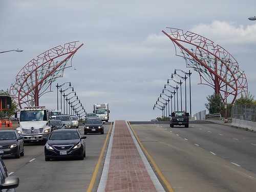
Gateway Wings, New York Avenue Bridge Gateway, designed by Kent Bloomer Studio. To my eye, this design is roughly equivalent to the intellectual heft of the Real Housewives tv programs.
I have written quite a bit about the failure of many transportation agencies to take seriously their responsibilities for the aesthetic qualities of the infrastructure they build or fund ("DC's bad urban design as it relates to new transportation infrastructure"). One such example is the horrid "sculpture" on the New York Avenue Bridge ("I think this is hideous: metal sculpture on the New York Avenue bridge").
In these writings including "Transit, stations, and placemaking: stations as entrypoints into neighborhoods," I recommend that transportation agencies have a "Chief Design Architect" and an urban design/landscape architecture division responsible for bringing higher quality attention to the aesthetic elements of transportation projects. Also see "Transportation bridges as an element of civic architecture, urban design and placemaking
It's not always that agencies are constructing projects with poor aesthetic qualities. Sometimes it's the failure to think big and do something distinctive and special. Plus, they can only go so far.
Transportation agencies are focused on achieving mobility objectives and after a certain point, to get better aesthetic outcomes, local communities, not the transportation department or transit agency, will have to pay for the extra costs associated with aesthetics.
Still, a greater focus on achieving high quality aesthetic outcomes simultaneously with transportation mobility improvements can make a big difference and contribute positively to neighborhood branding and identity, further contributing to the return on investment from urban revitalization and other economic development initiatives.
I argue that such an approach yields much higher ROI and much greater velocity in terms of improvement, like what the NoMA Metrorail station has done as discussed in the immediate two entries, or the streetcar on H Street, despite all the implementation failures ("DC and streetcars #4: from the standpoint of stoking real estate development, the line is incredibly successful and it isn't even in service yet, and now that development is extending eastward past 15th Street).
A perfect example is the Rhode Island Avenue Metrorail Pedestrian Bridge, which like the proposed pedestrian tunnel from the east side of the NoMA station to the entrance on the west side, was an important access improvement for people living on the northeast side of the Metrorail station. Before they had to walk considerably farther to get to the station. Now they don't.
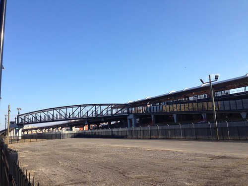
MBT-Rhode Island Ave Metro bridge. Flickr photo by airbus777.
But compare that bridge as a final product to the High Trestle Trail Art Bridge in Madrid, Iowa. The visual impact is so much more significant, not just during the day, but at night. Imagine a pedestrian bridge and transit station platform canopy both having attractive architectural lighting treatments at night.
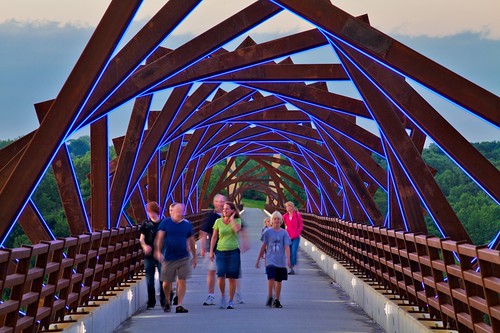
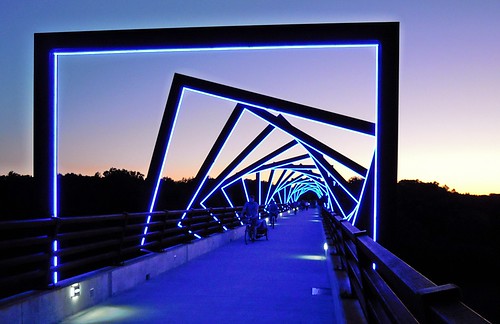
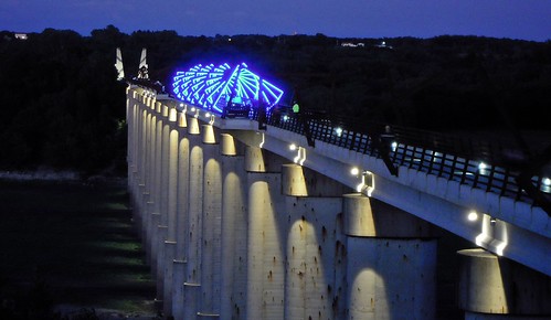
It borders on ludicrous that Washington, a city built on planning and distinctive architecture, can be outspanned by places like Madrid, Iowa or the I-35 Bridge in Waco, Texas when it comes to leveraging the value of night time lighting as an element of transportation infrastructure and civic architecture.
Waco bridge on I-35.
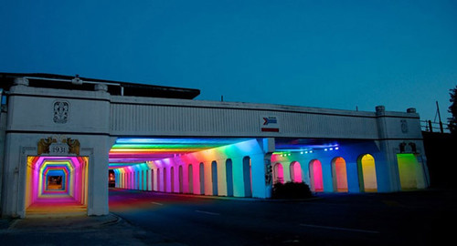
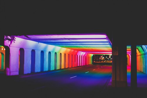
Similarly, the underpass at the Rhode Island Metro Station could be distinctively treated as well, such as the Tunnel of Lights underpass public art project by Bill FitzGibbons in Birmingham, Alabama.
That would be a one (bridge) - two (Metro canopy) - three (underpass) punch. And like how I suggest that DC should treat the bridges across the Anacostia River as a system ("Anacostia River and considering the bridges as a unit"), this would treat the architectural elements of the Rhode Island Metro Station as an integrated system also.
Labels: branding-identity, civic assets, cultural landscape, landscape architecture, public realm framework, transportation infrastructure, transportation planning, urban design/placemaking, urban revitalization


6 Comments:
At some point, you have to conclude there is something in the water here that makes us not appreciate good design.
It's a reflexive oppositional response, against the L'Enfant Plan and City Beautiful design, out of a sense they are oppressive, establishment, outdated, and modern responses are better.
That being said, I think I am ok with some modern responses and not others. Modern sculpture I don't necessarily have a problem with.
But walls for a house retaining wall out of concrete when the prevailing materials type when the block was constructed were stone should still be stone. Etc.
There are still 4 more pieces to come in this series, although all aren't necessarily about design per se, as much as they are about placemaking elements of urban design.
Plenty of "modern buildings" function fine on the first couple stories as people-space activating, even if the building is more sculptural and doesn't fit well in terms of an ensemble constructed of buildings from a variety of times/architectural styles.
Well, on a good day I'd agree with your analysis.
I'd push back and say it isn't the "Modern" that is the problem in DC. IT goes to the fact that the Jacobs/anti-highway roots of modern urbanism are very suspicious of anything modern.
The co-flation of property rights here is another problem -- people can't say that good design needs to respect what is around it.
But today, I may be just sticking to the lead in the water.
I felt that way at the Grand Rapids Art Fest -- more genuine creativity there (and local!) than in the entire DC/MD urban areas.
Again DC has gone through stages (DC was Miami, post civil war. Silicon Vally for a bit with Bell and IBM. Chocolate city. The Security City. And maybe we'll be a design city again)
(The lack of high end design stores in DC is also a leading indicator here)
25 years ago in talking with a work colleague, I remonstrated that DC felt very "antiseptic."
Some day I'll get to the GR event, but 12 years ago I was at an art event on Clifton Avenue in Louisville. It was in an old art deco car dealership building no longer used for cars, rented out as an event space, and people set up an art event with a bar. I went in and one of the pieces was a video set in a light box, with a pewter covering and a cross cut out, showing gay sex. It presaged the controversy at the Smithsonian by many years.
My reaction was "wow, I don't think we'd ever see something like this in DC."
cf. the Mapplethorpe controversy before my time in the early 1980s. I also remember a video of Halle Berry and some sex scenes at an Artomatic, where the commentary around it was black women can only win an Oscar if they are sexualized. But that wasn't near as provocative as the work I saw in Louisville.
wrt "the modern" and opposition to it as a foundation of urbanism. That's true, but there is a co-equal oppositional force, e.g., Leon Krier and a bunch of new urbanists.
I was pretty reflexively against myself for a long time before I realized that just because something was modern didn't mean it was bad, just that a lot of modern stuff, especially stuff built in neighborhoods tends to be horrid. But that I needed to be discerning.
Plus it's complicated because the way a building is on the outside impacts the street and the ensemble is different from how the building functions on the inside.
You have plenty of modern buildings bad on both. You have some on the outside that work on the street plane but not in terms of the ensemble.
You have other buildings, that if the basic built environment is strong, function as a kind of sculpture within a more classical built fabric (the new buildings in Bilbao, maybe even some of the London buildings).
The issue is how much can you deal with that, or does the new overpower the classical.
Anyway, I am more flexible than I was. Even if I believe, rightly for the most part, that most new buildings aren't done very well.
relatedly is when architects put on crap adornments, because something is "missing." But the adornments don't add much, like that horrid sculpture on the NY Ave. bridge. Versus the more classical cornices, architectural brick work, etc. which have a wholeness that eludes most executions by present day architects.
calatrava bridge/constitution bridge, at bus terminal, across canal in Venice.
Another Calatrava ped bridge (not as attractive) in Zurich.
Post a Comment
<< Home