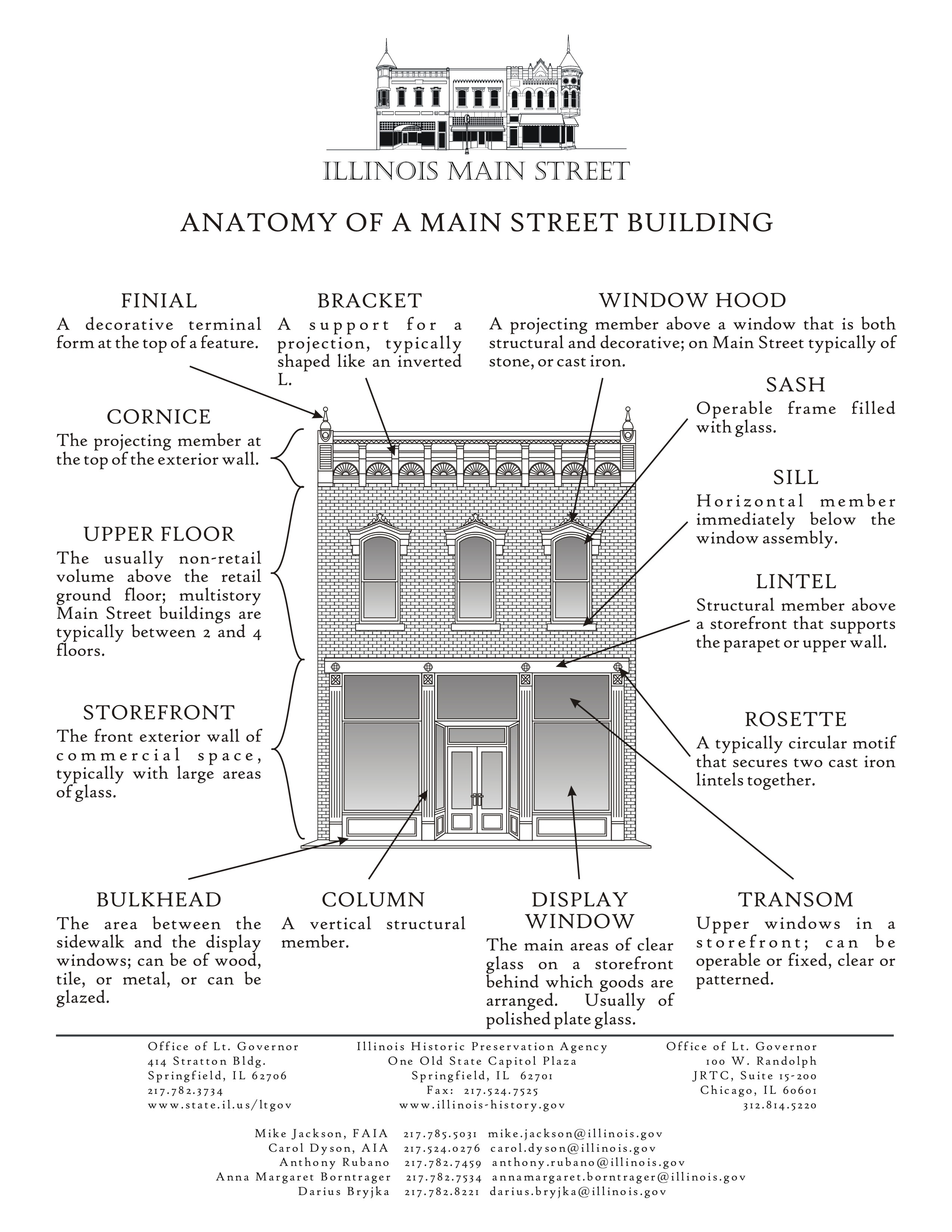
Graphic design innovation for parking signage

But Nikki Sylianteng takes design innovation to a new level by moving away from words to a simplified grid, with times, days and green and red blocks denoting yes and no.
In the world of parking signage, green means what you can do and red means what you can't. In the grid/block format, use of hatching and icons can communicate yes/no without having to see color, which is an added advantage for people who are color blind.
-- To Park or Not to Park webpage
In her discussion of design principles behind the project, she shows a current sign, with her revised version in this mock up, below.


Signage based on her concepts is being tested in a number of cities including Brisbane and Los Angeles ("LA's Proposed Parking Signs Are Brilliantly Simple," Wired and "Confused about parking restrictions?," Los Angeles Times.
In Brisbane there was a reduction by 60% in the number of infractions.
Labels: design method, graphic design, parking and curbside management, traffic engineering
posted by Richard Layman @ 9:49 PM&Permanent Link
![]()
![]()


4 Comments:
If there's a decrease in infractions, then there's a decrease in fine revenue. NYC is a definite improvement, but Sylianteng is still good because once you learn the graphic conventions (and assuming they are applied consistently, a big "if") you can understand it at-a-glance. Was in Philly this weekend. That place has maddening parking, and the on-street signage is wordy and too small to read from the "windshield perspective" to be able to make a decision while somebody is right on your tail.
This would make a huge difference in being able to spot parking spots in metered zones in NYC, though it would need a few changes to be usable
- arrows indicating where zones stop and start;
- Contrasting colors indicating free vs. paid parking;
- Indication of street cleaning times would make this format usable across all streets, including residential ones, though it would require perhaps a six-row Mon-Sat format in those cases.
On that note, ticket vs. immediate tow or permanent sticker -- formerly, in the case of street cleaning -- can be an important factor in risking an infraction.
Great comments. Thank you.
Thanks so much for the site, I found a lot of useful information for us.
Post a Comment
<< Home