Crosswalk treatments
14th Street and G Street NW, circa 1962-63. Photo: DC Department of Transportation.
DC used to have pedestrian scrambles at Downtown intersections back when it was the major shopping district for the entire region, but as the city center's retail offer was supplanted by suburban shopping malls, eventually this type of street crossing treatment was abandoned.
Pedestrian scrambles today. I argue for more pedestrian scrambles at intersections where there is a high degree of pedestrian use and as a way to balance levels of service between pedestrians and motor vehicles ("Barnes Dance Intersections as possible "solutions" to Wisconsin & M, 14th and U intersections").
I think the use of pedestrian scrambles should be a key element of the Vision Zero agenda ("Updating Vision Zero approaches") and as a way to define DC as a "Walking City." There are many intersections in the city deserving of this treatment.
So far, the first and only modern pedestrian scramble in DC is at 7th and H Streets NW at the Gallery Place Metrorail station, about one long block from Verizon Center.
I had criticized the treatment as not being sufficiently visible and dominant in terms of the painted markings, but I noticed more recently that it has been repainted, with lines for the diagonal crossings extended across the entire intersection. This is a good step forward because it is a street treatment that is very rare in the DC-MD-VA region, so how to use it needs to be very clear.
Part of one of the diagonal crossings is painted in a Chinese-motif, but oddly this hasn't been extended across the entire intersection, although the webpage for the designers of the project, Charles Bergen Studios, shows a complete concept.
Maybe they're just behind schedule.
Taditional crosswalk treatments. In the US, the standard crosswalk treatment is a set of white bars, like the crosswalks shown in the Chinatown graphic.
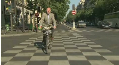
In Europe, they use a mix of the bars and a checkerboard pattern, which to me seems to be bolder, and bolder is better when it comes to "calling out" to motor vehicle operators that they need to slow down and pay attention to pedestrians crossing the street.

Paris.
Untraditional-innovative sidewalk treatments. Over the past few years there has been an explosion of creative crosswalk treatments that are more artistic in intent.
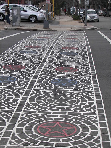
 One type is what is called "stamped asphalt" with a special design. Although one streetscape designer I know makes the point that crosswalks are a traffic safety design element and artistic treatments can reduce visibility of the markings. (Plus, over time, as motor vehicles cross back and forth over the stampings, they fade. This is an issue on 14th Street NW).
The other type is special painting. One example is the Chinatown crossing treatment shown above, but there are many other types, from rainbows in Seattle ("Colorful crosswalks celebrate gay pride in Seattle" Seattle Times) to colors that aren't white. and special designs.
There is also the variant of guerrilla painting of crosswalks where they don't exist ("Fighting Traffic One Paint Brush at a Time," Governing Magazine).

St. Louis pedestrian crosswalk painted in leaves to call attention to its location by the Missouri Botanical Gardens. Photo by Robert Cohen, St. Louis Post-Dispatch.
More recently, the Federal Highway Administration has cautioned local transportation agencies on going overboard with such treatments.
St. Louis traffic engineers, relying on guidance from the Federal Highway Administration, stopped supporting the creation of artistic treatments within pedestrian crosswalks ("St. Louis will let crosswalk art that violates federal rules fade." St. Louis Post-Dispatch).
Rainbow sidewalk in Seattle. SDOT photo.
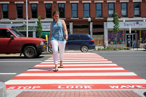
Adding color to traditional crosswalk treatments. In the last few weeks, a city in Massachusetts has begun painting the black "blank spaces" inside crosswalks in red, to make the crosswalks stand out ("Great Barrington makes crosswalks more visible, repainted red," Berkshire Eagle).
A few weeks ago, a driver ran into four people at this intersection. According to the article, the city's police department has been advocating for an increase in pedestrian safety initiatives. The latest crash moved the city to act.
This might be a good compromise strategy that satisfies the concerns of the FHWA. Although I think that the special treatments like the fleur de lis or rainbows are probably fine, especially in urban settings.

Photo: Ben Carver, Berkshire Eagle.
Labels: car culture and automobility, public safety, public space management, traffic engineering, traffic safety and enforcement, transportation planning, urban design/placemaking


0 Comments:
Post a Comment
<< Home