Street furniture: charm versus utilitarian design

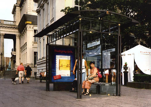
Helios bus shelter style, Berlin.
In 2006, during the process to pick the style of bus shelter for DC in the face of the city's new bus shelter contract, I advocated for a historically-sympathetic shelter that would complement the city's historic architecture.
The company with the contract was agnostic about the style, but what passes for the city's urban design contingent was fine with the modern version of a bus shelter, arguing that it was important to differentiate between new and old.

The counter-argument would be that the value of the ensemble within the built environment can be either enhanced or diminished with each new addition, depending on the quality of the addition. To be honest, wrt the bus shelters they are more or less neutral.
They are new so they contribute to the quality of the public space, and even though they are modernist-designed structures, they function more like background objects, and neither diminish nor exalt the city's historic architecture.
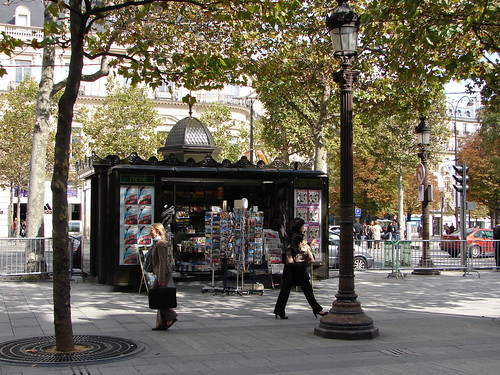
NotionsCapital calls our attention to proposed new news-stands in Paris, which along with the improvements--heating, better lighting, a digital screen on the outside for community information, will eliminate the art nouveau design adornments that distinguish the current structures “Puerile,” “soulless”: The verdict on the newsstands that could replace Paris’ iconic green kiosks," Quartz).

Newspaper kiosk, Champs Élysée, Paris. Flickr photo by Burgermarc.
This is an example of how little by little, the urban design and architectural quality of the built environment is often dumbed down.
In DC, it didn't matter with the bus shelters, because at least over the past 50 years, the city has had very simple structures.

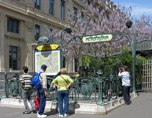
The Paris Metro was first opened during the height of the art nouveau period and transit station design of the time reflects this style. Flickr photo by Dvotaw.
But in Paris, when you have a coherent design aesthetic that has resulted in an architecturally distinctive family of street furniture, typified by design elements associated with the city's Metro system, eliminating the artistic embellishments of street furniture with each new design ends up impoverishing the way that street furniture contributes to placemaking and beauty in the built environment.
Labels: civic architecture, street furniture, urban design/placemaking


0 Comments:
Post a Comment
<< Home