A well designed train station is a well designed train station: it's not about "luxury"
Interior, Grand Central Station. Alexsandr Stickpin Photography. ("Grand Transit: MTA and Grand Central Terminal," Art History Today).
MobilityLab Express has an article, "Grand Central was designed for luxury travel. That’s why commuters love it," attributing the success of Grand Central Station in New York City to the fact that it was designed for long distance trains during the heyday of railroad passenger travel.
I don't agree.
It is a pretty station. But virtually all big city railroad stations constructed before 1935 were similarly grand, even if the level of grandeur was scaled to the size of the city. Grand Central Station was built to be both functional and aesthetically attractive.
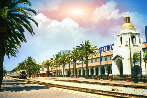
But so was the Santa Fe railroad station in San Diego or Union Station in Denver, etc. (Or for that matter, the Ferry Terminal Building in San Francisco.)

In the postwar period and in the context of an automobile-centric transportation, the importance of design and aesthetics was stripped out of railroad station planning, whereas most train stations in the US are now built to be functional. (Separately, the train station preservation movement, both for use as transportation facilities or as adaptive reuse projects to maintain the building in the face of the loss of its function.)
NJ Transit platform at Penn Station. Wikipedia photo.
Penn Station, while originally built with a beautiful façade, was built for both local--presumably not "luxury"--and intermediate distance travel primarily between Washington, Philadelphia, New York City and Boston, and according to some architectural historians was poorly designed as it relates to passenger throughput.
And anyone who uses the station knows how cramped the platforms are, which were created as part of the original station and retained after the above-grade building was demolished in the early 1960s.
I think more than "building a station to serve luxury markets," the issue is the design of the station as a way to maximize the quality of the trip and the experience, specifically:
-- quality of accommodations for passenger throughput generally (entry and exit, connections to other transit services)
-- quality of accommodations for passenger throughput specifically to/from and on platforms
-- centrality of its location (for example the recently in the news Michigan Central Station was deliberately constructed in a location outside of the center thinking it could attract patronage regardless)
-- its place as an anchor of the area transit system and the mixed use district in which it is placed
-- amenities, especially retail and food service
-- architectural design and aesthetics.
In my two trips to Europe, I have been in train stations in Hamburg, Essen, and Dortmund in Germany and in the UK, St. Pancras, Kings Cross, Euston, and London Bridge in London; Lime Street, the Liverpool airport station (some distance from the airport), and the Liverpool Central commuter rail station.
Hamburg especially impressed me. It's one of the busiest stations in Europe with 650,000 people moving through the station, with connecting service from multiple underground lines, the main inter-city bus terminal nearby (with an underground connection across the street); superior placement and separation of tourist bus services from traditional local transit service; and it anchors both the city's pedestrian shopping district and the Spitallerstrasse transit mall.
The way local transportation intertwines but is separated to foster throughput with the Hamburg train station as the anchor to all the services is far superior to any train station I've experienced in the US, especially Union Station in Washington, where taxicabs, tourist buses, ride hailing pick up and drop off, and individual passenger pick up and drop off are all massed together--poorly--in front of the station.
But even smaller stations in Essen and Dortmund were similarly situated--adjacent to the main pedestrian shopping district, with inter-city bus and local transit services, and tourist bus services, all well integrated but separated as needed for optimum service provision.
Similarly, my more recent trip to the UK super impressed me in terms of the way the train stations were so massive, beautiful, full of amenities, and successful (even if there were wayfinding and other issues) and itinerant service problems on the Thameslink/Southern Rail and Northern Rail services.
Euston is an "old station" undergoing renovation so it was cramped--especially in the face of recent massive train service breakdowns. But it still has great underground and bus connections, and compared to just about any train station in the US, bike accommodations.
By contrast, each of the other stations I visited in London, all renovated more "recently," was amazing, and mixed longer distance service with commuter trains.
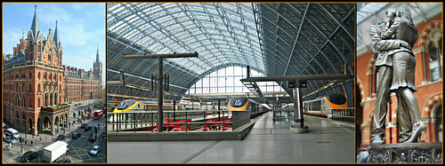
St. Pancras is also home to the Eurostar trains connecting London to the European continent, with decidedly luxury options, but that didn't make the station necessarily more beautiful or successful. (Although yes it is stunning inside and out.)

Similarly, in Liverpool, Lime Street station has longer distance and commuter trains, a "low level" (local underground) station, is adjacent to the main city local transit station at Queens Square, and anchors the adjacent pedestrian district.
The "airport" station is not at the airport but links to it, and has local and long distance train connections, plus local bus transit, and intercity bus transit. It also provides for a dose of redundancy in that the station can be used for long distance trains while Lime Street station is closed for renovation, which was the case when I was leaving Liverpool.
Many of the Liverpool area local train stations have combined ticket office-retail stores run by Merseytravel and the "automatic" coffee dispenser at the Airport station ticket office (the coffee shop was closed by the time I got there) made excellent coffee!
(Note that I also visited the Victoria Coach bus station in London and the Liverpool One inter-city bus station in Liverpool. The Victoria station is beautiful art deco outside and terrible inside. I learned that the problem inside is multiple landowners and the inability of Transport for London to take control of the design, planning, and operation for the service. The Liverpool One station is outdoors, but has good information and wayfinding systems, excellent platform shelters, and a ticket and information office run by the local transit authority.)
"Old" books on train stations. I hate to admit that it wasn't until I saw a book by John Droege, Passenger Terminals and Trains, at an antique mall, that I realized it would be helpful to bone up on the historical literature on railroad station design and architecture.
The Droege book dates to 1916 but has been reprinted. Carroll Meeks' The Railroad Station: An Architectural History dates to the 1950s.
The past blog entry "Transit, stations, and placemaking: stations as entrypoints into neighborhoods" (2013), discusses how, especially in the urban context, transportation infrastructure's aesthetic elements have often been ignored and this can have deleterious impact on quality of life.
After I wrote that piece, because the Wall Street Journal mentioned a 100 year old article on "railroad beautiful" I tracked down some early planning writings from the early 1900s on the aesthetic qualities and design elements of railroad systems, concerning both station grounds and the right of way and yard facilities. The Boston and Albany Railroad was a leader in adopting such an approach.
See "A Railroad Beautiful" and "The Treatment of City Squares--III; The Square Before the Railroad Station," House and Garden (2), 1902 and "Railroad Gardening," Standard Cyclopedia of Horticulture. (These resources have been scanned for online access by the Hathi Trust.)
Transit station reviews. I have written reviews of the Silver Spring Transit Center and the Takoma Langley Crossroads Transit Center, as well as submitted comments on the redesign and expansion of Union Station.
-- "Updating my review of the Silver Spring Transit Center: a few things I missed in 2015," 2018
-- "Takoma Langley Crossroads Transit Center: a critical evaluation," 2016
-- "DC Union Station EIS FRA -- Comments due November 9th," 2016
Clearly station designs today have a lot to learn from the station designers of yesteryear. As do I.
Note that the Network Rail train station design manual is superior.
-- Guide to Station Planning and Design, Network Rail
But the US Federal Railroad Administration publication is good on the underlying principles, but provides limited direction in terms of specifics, and it doesn't give examples of supra-best practices, which would raise the expectations of planners and riders both.
-- Station Area Planning for High-Speed and Intercity Passenger Rail, Federal Railroad Administration, US DOT
Similarly the SEPTA guide for their light rail/trolley stations is a useful resource, but for a much different scale of transit service
-- Modern Trolley Station Design Guide, SEPTA
Labels: architectural history, bus stations, civic architecture, railroad stations, station area planning, transit infrastructure, transit stations, travel planning/tourism, urban design/placemaking


1 Comments:
Train station renovation key to revival of White Plains neighborhood
https://www.lohud.com/story/news/local/westchester/white-plains/2019/04/16/metro-north-white-plains-transit/3403491002/
Post a Comment
<< Home