Big Data--extremely large data sets that are analyzed by computer to reveal patterns, trends, and associations that may not be readily apparently if analyzed on a smaller scale and with a narrower analytical framework--is the rage, getting lots of media coverage, and a lot of focus by government officials.
-- "
The power of government big data: It's all in the use cases,"
Government Computer News
-- "
Big Data Could Bring Governments Big Benefits,"
Government Technology
Yes, it's important to use such approaches to do "deeper dives" into issues and problems, in an attempt to develop better responses that have a greater likelihood of success.
But I have maintained for a long time that most of the time the roadblock in community improvement it isn't a lack of "good" or "better" or "big" data, but is a failure to use the data we have, a failure to properly present the data, or the approach is problematic.
Design method vs. rational planning. For example, in "
All the talk of e-government, digital government, and open source government is really about employing the design method" I wrote about the difference between the design process and rational planning approaches and allowing for iterative learning and prototyping, rather than favoring a more static and constrained approach that defines rational planning. But at the same time I pointed out that if a government or agency isn't interested in opening up, "Apps for Democracy" won't make a difference.
Process design approaches. Similarly, in "
Creating the right program vs. the hype of big data" I discussed what I see as the broad "failure" to take a process design approach in terms of analyzing how government agencies "produce outcomes," and how we don't ask the right questions on whether or not the outcomes are desired, have we created the right programs and processes, are we providing the necessary resources, and do we remain committed for the many years it will take to right the problem?
It's a structural, systems, and systematic approach to social and behavioral change that seems to elude the thinking of the typical politician.
Government mostly ignores policy research. I also discussed this general problem in "
Helping Government Learn," For a variety of reasons, elected officials aren't too interested in policy analysis, and government officials can be very constrained and parochial in their analytical frameworks too. Often, governments repeat the mistakes they've made before, or refuse to learn from other experiences.
For example, one of my favorite quotes is from Bismarck:
"Fools learn from experience. I prefer to profit from the experience of others."
That's why I read so much, to absorb the lessons from other people and places, with the aim of bettering practice here as well as generating meta-theory and frameworks for analysis and practice.
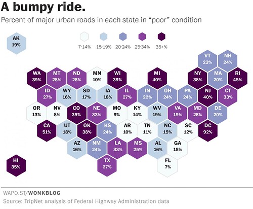 Road Condition Index summary data, state level, US. Washington Post graphic.
A report says that DC has the worst roads in the US
Road Condition Index summary data, state level, US. Washington Post graphic.
A report says that DC has the worst roads in the US. DC's Department of Transportation isn't happy because
a study reported on in the
Washington Post, "
Where America’s worst roads are — and how much they’re costing us," states that DC has the worst roads in the U.S. From the article:
The numbers from TRIP show that 28 percent of the nation's major roadways -- interstates, freeways, and major arterial roadways in urban areas -- are in "poor" condition. This means they have so many major ruts, cracks and potholes that they can't simply be resurfaced -- they need to be completely rebuilt. ...
The worst roads in America are in Washington D.C., where 92 percent of our major roadways are rated as "poor." Conversely, zero percent of D.C.'s roads received a "good" rating in the Federal Highway Administration data analyzed by TRIP. There is almost literally not a single good road in D.C.
But D.C. is a special case, since it is not a state and doesn't have vast stretches of highway like most places in the U.S. do. So among the real states, the worst roads are in California where 51 percent of the highways are rated poor. Rhode Island, New Jersey and Michigan all have "poor" ratings of 40 percent or more. Dang.
But the report seems questionable. My personal experience as a cyclist, which provides a much more fine-grained experience with road condition quality, makes me think that the data collection and interpretation framework for the report is likely problematic as there is no way that 93% of the city's main roads--freeways and "federal route designated" arterials like Rhode Island, Wisconsin, Connecticut, or Georgia Avenues, or 16th Street, etc.--are in absolute horrid condition.
It's just not true, even if as a cyclist I do ascertain many problems with road condition and quality that would elude a motor vehicle operator cushioned by bigger wheels, weight, air conditioning, and springs.
DC doesn't do a good job of presenting (or using) the data it collects. This is definitely an issue with the road condition data set. I have written about my frustration with DDOT's "dashboard," because the majority of the buttons, including the one on road condition quality, fail to provide deeper or actionable data ("
Show us the data! DC Government metrics (and comparing DC's presentation to the City of Los Angeles)").
Los Angeles does a much better job. By contrast, the City of Los Angeles maintains, presents and interprets data (map view, below) on road condition quality for every block of the city's roads, although the data is updated on a three-year cycle.

--
2011 State of the Streets Report, LA Bureau of Street Services
--
City of Los Angeles Road Condition webpage
With complete data, you can develop an objectively defined action agenda to address road quality and the street improvement program in a systematic way. Although Los Angeles is so poor, one Councilmember proposed a system of neighborhood road improvement districts, to be called "beautification assessment districts," to come up with extra money ("
Los Angeles Times).
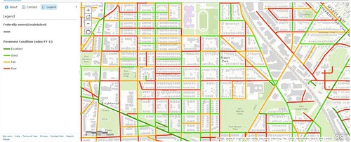
It turns out that while the DC Transportation Dashboard still doesn't provide actionable or updated information on road conditions--in fact the button hasn't been updated since I wrote the above-cited entry , DDOT has begun to put road condition information up on their website, in the same exact manner as Los Angeles.
--
Pavement Condition Index Map, DC Department of Transportation
But it's just the GIS data on the map, and no interpretational or summary information is presented, including failing to provide summary scores for the different categories of roads. The newest data presented within the Dashboard is from 2010 (... and it doesn't add up).
However, looking at the map, it doesn't appear as if the FHWA data on DC as reported on by the
Washington Post is correct.
What happens in the city now is that we put a wee bit of money towards road reconstruction and resurfacing--not enough to deal with 1,000 miles of roads--and each of the Ward's City Councilmembers fight over who gets what, rather than for the "good of the city" addressing the monies to the worst roads, as determined by an objective and complete measurement system of which the PCI is an example.
Design thinking and information presentation. This isn't a question of needing "big data." The "little data" we already have is plenty good to use. It's just poorly presented.
-- "
Information and Presentation Design: Gleanings From a Course With Edward Tufte," Civic Action blog
--
InfoDesign: Understanding by Design blog
For example, the live map ought to allow people to click on a full street, streets should be categorized (arterials, collectors, etc.), so that summary scores can be generated simply and easily.
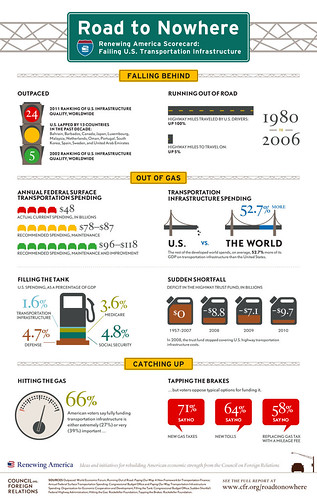
The infographic below (from the Council on Foreign Relations
Renewing America Project) is an example of how data can be better communicated. WRT road condition data in DC, a similar nfographic would display data by type of road and ward/neighborhood.
I remember after 9/11 the
Wall Street Journal had an important article about the intelligence report given to the President and how the design and organization of the report at the time didn't adequately highlight and call out the most important information.
That article is discussed in a very old Design Issues column from
Communication Arts Magazine, "
Guns, Butter and Ballots: Citizens take charge by designing for better government,"
It's great that DDOT provides the GIS data, but because it's a display of all the data without the ability to analyze it (unless you have a copy of ArcGIS and download the file), it isn't fully useful. For example, while you can look at the whole map, and figure out that the study quoted by the Washington Post isn't probably accurate with regard to DC, you can't respond definitively to the assertions.
Obviously, the explosion of the use of infographics are an expression of this point, that to be useful, data must be summarized and presented in a manner that can be absorbed.
Labels: design method, government organization, performance metrics, roads, transportation infrastructure, transportation planning