Rebuilding Place in the Urban Space

"A community’s physical form, rather than its land uses, is its most intrinsic and enduring characteristic." [Katz, EPA] This blog focuses on place and placemaking and all that makes it work--historic preservation, urban design, transportation, asset-based community development, arts & cultural development, commercial district revitalization, tourism & destination development, and quality of life advocacy--along with doses of civic engagement and good governance watchdogging.

Wednesday, September 14, 2016

Rome 2 Rio is an incredible website integrating all forms of mobility to get from one place to another--globally!

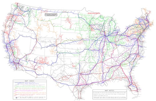
US intercity bus service map produced by Michael Buiting.AIBRA bus and Amtrak map, 2014-01-15

In a back and forth set of comments spurred by Larry Littlefield's post which in passing discussed inter city bus service in New York State, we were talking about bus route network maps.

In the old days, railroads and intercity bus systems like Greyhound and Trailways published complete maps of their route systems.

Now it's very hard to find such maps. Michael Buiting produced one on his own.  See the past blog entry, "Inter-city bus services are typically a gap in transportation planning."  The entry references some academic research and other writings on the subject.

Larry said you can't find these kinds of maps for Coach USA/Megabus services at the scale of a state or region, let alone a complete network map.

Yes you can plug in stuff online, but you can't get a sense of the full system and all its possibilities, counter to "the old days."  (Similarly, regularly published complete guides for railroad passenger and airline service provided this function, showing all available services.)

Mein Fernbus/Flixbus, Germany.  I mentioned that when I was in Germany, I saw a variety of intercity bus companies in service, near train stations in Essen and Hamburg.  (In Hamburg the Intercity bus terminal, ZOB, is in close proximity to the train station.)

Because some of the Mein Fernbuses I saw had rear-mounted bike racks, I looked into their services more--note they have since merged into Flixbus.

They publish route maps comparable to the maps once published by Greyhound and Trailways, even differentiating between their day and night networks, but I like best an earlier version of their night map (below).
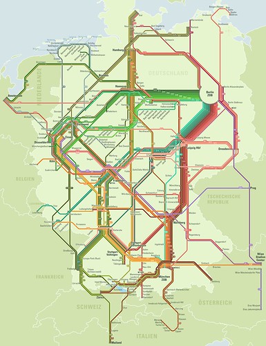
Older version, Mein Fernbus night bus network map
It turns out their website and computing systems are developed by stfalcon, a Ukrainian firm.

Were I in charge of finding a programming team to set this up for a transit system, they'd be one of the contenders, clearly.  This webpage discusses the work stfalcon has done for Mein Fernbus.

Rome2Rio Global Travel Planning website. While tracking done some URLs, I came across Rome2Rio, a travel search and ticketing website that has managed to integrate airplanes, trains, intercity bus, ferry, local transit services, and taxis into one system.

It's pretty remarkable.

US and Canadian inter city bus service map, based on route information collected by Rome2Rio.

But they don't have a function where you can produce and print out master route systems maps as a website user, although on occasion they have blogged about doing it themselves, such as when they added US and Canadian inter city bus coverage to their system.

Wanderu.  Note I have mentioned/used Wanderu to do bus trip planning in the US, as they have a master set of information.  But Rome2Rio takes integration and mode coverage to a whole new level.

Labels: , , , , , , , ,

Wednesday, April 11, 2012

Spatial and other neighborhood conditions and obesity

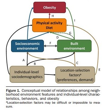
Diagram on factors impacting obesity
Image from "Obesogenic Environments in Youth: Concepts and Methods from a Longitudinal National Sample." Janne Boone-Heinonen, PhD, MPH, Penny Gordon-Larsen, PhD. American Journal of Preventive Medicine, May 2012. 42:5

The May issue of the American Journal of Preventive Medicine focuses on the use of geographic information systems (GIS) data analysis to study neighborhood characteristics and the impact of these characteristics on health, as laid out in the lead article, "Thinking About Place, Spatial Behavior, and Spatial Processes in Childhood Obesity" and "Obesogenic Environments in Youth: Concepts and Methods from a Longitudinal National Sample."

All of the articles are available "for free" online.

ABC News also did a story, "Obesity Linked to Neighborhood Features: Do You Live in a Fat Neighborhood?," on the issue, summarizing findings from some of the articles. From the article:

In one study [Objective Assessment of Obesogenic Environments in Youth: Geographic Information System Methods and Spatial Findings from the Neighborhood Impact on Kids Study], researchers used geographic information to determine which neighborhoods in King County, Wash. and San Diego County, Calif. rated highest in terms of physical activity and nutrition for children ages 6 through 11. A neighborhood received a high rating if there were ample opportunities to walk to places, such as stores and libraries as well as highly-rated parks.

These neighborhoods also had numerous grocery stores or supermarkets where produce and healthy foods were available.

Neighborhoods that rated poorly had few markets available or had a large number of fast food restaurants and also did not offer many chances to walk or play in high-quality parks. There were also neighborhoods rated in between good and poor.

"The biggest difference we found in rates of obesity were in the places where the environment was good for both nutrition and physical activity, the rates were less than 8 percent, but if the nutrition and physical activity were not good, the rates went up to 16 percent," said Brian Saelens, a co-author and professor of pediatrics at Seattle Children's Research Institute.

Saelens added that researchers controlled for other variables that could contribute to obesity, such as income, family status and parental body mass index (BMI).

In an accompanying paper, Saelens and his colleagues used GIS data to define "obesogenic" environments as those that offer little in the way of physical activity and good nutrition. The authors say GIS measures should be used to assess the relationship between physical activity, nutrition and obesity.


So, this sets up a framework to consider a more expansive view of how to do land use, transportation, parks, and public health planning and what to do when you're doing it.

For example, in the (hopefully) soon to be approved Western Baltimore County Pedestrian and Bicycle Access Plan, for which I was the project manager and chief author, there are many more recommendations concerning "programming" and "communications" as it relates to developing "active transportation" as routinized behaviors.

In the field of bike and pedestrian planning, I argue that the next logical direction for improvement in is the tighter integration of infrastructure recommendations with the development and delivery of programming, as well as integrating multiple spatial scales in plans, taking them down from an entire city or county to the sector/community/neighborhood.

You're starting to see this in such plans as the Nashville Regional Bicycle and Pedestrian Study and the Treasure Island Community Transportation Plan in San Francisco, which was not done by a land use or transportation planning agency, but by the Department of Public Health in conjunction with the local bicycle advocacy group.

Labels: , , , , , ,

Monday, March 28, 2011

Civic engagement, redistricting, and who knows what else...


David Alpert of Greater Greater Washington created a nifty application, the "Redistricting Game," that allows anyone with access to a computer to weigh in on the Ward redistricting process in DC.

Others have developed similar applications for use at the state level, such as in Virginia, which likely piqued David's interest. See "Va. redistricting likely to shift power north: Some sitting lawmakers could be drawn out of their territories" from the Washington Post and the Redistricting Game website for state-based redistricting from the USC Annenberg Center.

I used it myself over the weekend (my home computer and wifi system is finally now working again) and found with just a few changes--I can't remember exactly, but moving one block group from Ward 8 to Ward 7, one or two from Ward 6 to Ward 7, and a handful from Ward 2 to Ward 6--Ward 2 has lots of downtown real estate under its domain although just a handful of people live in many of these block groups--maybe 8 in total, you can accomplish all that is necessary for redistricting with minimal changes, without changing the boundaries of Wards 1, 3, 4, and 5.

Sadly, the Washington City Paper's Housing Complex blog reports in "The Committee of 100′s P.R. Problem," that somehow this interesting web application is seen by the Committee of 100 on the Federal City as a toy and demeaning of the seriousness of the civic engagement process--this despite the various iterations of web-based redistricting applications created across the country by universities and other organizations.

I myself am sometimes torn about web-based engagement. It can be deep with great breadth. It can be incredibly glib and pathetic. But there is no question that it allows for greater communication and engagement if the processes are robust. And for applications that are map (GIS) based, there is no better way to do it.

It's sad that the C100 doesn't see this and makes themselves look like Luddites in the process. Generally, I believe it is best for organizations to change with the times. Certainly, NYC's Municipal Arts Society shows that a civic organization can be around for more than 100 years and remain incredibly innovative and engaged.

DC's civil society is weak by comparison, at least in terms of organized groups, and that is a shame.

Labels: , , ,

Wednesday, January 20, 2010

Level of Service and Level of Quality aren't just concepts from transportation planning

Yesterday's Post has a story about the debacle of providing benefits and services to people receiving various health and welfare benefits, "D.C.'s stressed aid centers are a stressor for poor residents." From the article:

City officials say a combination of recent budget cuts and the continued economic slowdown have led to extended waiting times. Last year, the administration of Mayor Adrian M. Fenty (D) closed two of the seven IMA service centers to save a little under $1 million. Although the administration pledged that the remaining centers would be wellstaffed, District officials say those promises have been stymied by the recession, which has limited the city's ability to hire workers.

At the same time, the Department of Human Services is facing a growing demand for services as the city's unemployment rate has climbed to 10 percent; in Ward 8, the figure is 28 percent. According to the U.S. Department of Agriculture, about 103,000 District residents participate in the food stamp program, a 22 percent increase since 2007.

City officials say they are working to hire more people, install self-service kiosks and redesign the Anacostia center.

Apparently DC Government closed at least 2 offices, and there aren't enough people at the other offices to deal with the demand.

Plus people have to travel a long time to get to the offices, because they are located far from where they live.

Plus people are required to come back the next day after waiting all day and not receiving service.

It's appalling. And for all the talk about customer service on the part of local government (which, by the way, usually comes at the diminution of the role of the citizen as a citizen who empowers the process of governance to begin with) clearly there is a major disconnect.

With simple GIS analysis (and the DC Government is replete with GIS resources) you can determine where your "customers" are located, and the level of transit service from those areas, and how long it takes to travel.

Location decisions should be based on the most simple way to serve customers, not on the convenience of government, and hopefully not as part of an unstated policy to deliberately dis-serve people to make government hard to get to, to reduce the likelihood of having to provide service.

And people who are not served and have to return should be receiving priority timed appointments for their return visit, rather than having to wait in a cattle call.

Etc.

Clearly, the "$1 million" in savings will be offset in time losses on the part of service recipients (customers) not to mention the increased cost of required improvements at the extant locations.
http://blog.case.edu/msass/2008/11/11/Poverty_Center_food_stamp_map_series_8x10.jpg
This is a map of food stamp recipients by sub areas of counties in Northern Ohio, produced by a research unit, the Center on Urban Poverty and Community Development, at Case Western Reserve University. Obviously, this type of data can be provided at any level, and must exist within DC, and should be easily obtainable.

Overlaying the data with service center locations is a simple process.

Too bad that the Washington Post didn't attempt to do GIS analysis and the production of relevant map graphics this as part of the article, which would have made the problem very easy to understand and to address. Maybe they didn't think to do it. Maybe budget cuts meant that they didn't have the resources to do it.

One interesting thing about municipally-owned utilities is that it provides a revenue stream that can support the provision of local offices in a city. Seattle Power and Light is municipally owned, and often co-locates payment centers with District Courts and Libraries.

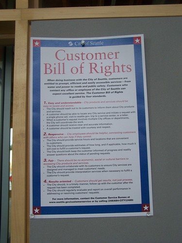
This Customer Bill of Rights was on a bulletin board in the service center connected to the public library in the Ballard neighborhood.
Customer Bill of Rights: City of Seattle
Clearly, "easy and understandable," "responsive," "fair," and "results-oriented" customer service is not yet part of the ethos of DC Government.

Labels: , , , ,

Tuesday, October 13, 2009

Iphone app for Zipcar

Screen image, Iphone application for Zipcar
From Zipcar:

You've probably heard the big news that Zipcar now has an iPhone™ app. But did you hear all the cool stuff you can do with it? You can find and reserve Zipcars while walking down the street. You can honk your Zipcar's horn from across the parking lot. You can even use it to make pancakes! (Just kidding. But hey, two outta three.) If you haven't yet, download the Zipcar App for free.

As you use the app, please keep carrying your Zipcard. That way, if your iPhone runs out of juice, isn't getting service, or gets lost or stolen, you can use your trusty Zipcard to keep on zippin'. Scan your card once at the start of each reservation, then for the rest of the trip you can lock and unlock the car with just the iPhone. (Pssst. You don't need your Zipcard to honk.)

We worked hard on this app and we hope you dig it. If you have a chance, swing by the App StoreSM to rate and review us. Not rocking the iPhone? Check out our mobile page for what you can do with BlackBerry®, Android™ and other high-tech gizmos.

Labels: , ,