Rebuilding Place in the Urban Space

"A community’s physical form, rather than its land uses, is its most intrinsic and enduring characteristic." [Katz, EPA] This blog focuses on place and placemaking and all that makes it work--historic preservation, urban design, transportation, asset-based community development, arts & cultural development, commercial district revitalization, tourism & destination development, and quality of life advocacy--along with doses of civic engagement and good governance watchdogging.

Saturday, March 28, 2026

WMATA's 50th anniversary from the start of service, Part 2a | The Original Approved Metrorail System (1968-1970)

This is part of a series.

-- "Reprint with editing: Today WMATA Metrorail's 50th anniversary from the start of service | Part 1: many lessons can be found, if you look"
-- "WMATA's 50th anniversary from the start of service, Part 2a | The Original Approved Metrorail System (1968-1970)"
-- "WMATA's 50th anniversary from the start of service, Part 2b | Lessons learned: Proposed expansions and the Metrorail system we don't have"
-- "WMATA's 50th anniversary from the start of service, Part 3 | Stations"
-- "WMATA's 50th anniversary from the start of service, Part 4 | Buses"
-- "WMATA's 50th anniversary from the start of service | Part 5: Making a better transit network | Connecting heavy rail + light rail + railroad -- a concept for New York City 

Recently I acquired a copy of the February 1976 issue of "Metro Notes", a tabloid published by WMATA throughout the construction process.  The Approved Plan Map (1968-1970) shows the current system, with 11 potential extensions.  Three were constructed:  (1) two Blue Line stations from Addison Road to Largo; (2) one station from Rockville to Shady Grove on the Red Line; and (3) the Silver Line.  

Two infill stations were later added, NoMA on the Red Line ("Having Turned a Corner, Washington’s NoMa Is Coming Alive," New York Times) and Potomac Yards on the Blue/Yellow Line ("Metro's New Potomac Yard-VT Station Is Open. Here's What to Know," NBC).  

The Map is below and also on my Flickr feed.

Labels: , , , , ,

Thursday, January 11, 2024

Bad mapping: WMATA Metrorail weekend closures

 Via a Reddit post.


The legend doesn't explain the ongoing closure between Clarendon and Farragut West, or the temporary closure between Forest Glen, Silver Spring, and Takoma and on the Red Line.

It explains it in text on the webpage, but not the map.

Blue, Orange, and Silver Line Construction Friday, Jan. 12 - Monday, Jan. 15 *MDOT MTA Purple Line construction to impact Red Line service Saturday and Sunday only, Jan. 13-14, with no service between Forest Glen and Takoma. Silver Spring Station will be closed with free shuttle buses provided.

This stuff is on my mind because I've been working ongoing in part (not as a designer) on a map signage project for Sugar House Park, and clear, explanatory language and legend on the map (sign) has been a big issue.  

More difficult and a much longer process since we are all volunteers, although we started with a basic sign template based on the Salt Lake City Parks, Open Space, and Trail Signage Guidelines, which are quite good (not perfect, but quite good). 

It also shows the value of digital signage, which can be updated with messages and map changes in real time.  

Like what the NYC Subway is doing. with digital signs both on platforms and outside of the stations.

Labels: , , , , ,

Saturday, December 09, 2023

Interesting point about how geography is reshaped by the way train service may be offered and routed

The Guardian has a story, "Europe’s geography ‘kind of reshaped’ as Paris-Berlin night train returns," on the "NightJet" trains -- overnight night train service between major European cities.  The services were dropped a number of years ago and are now coming back.

They mean geography more in terms of between cities, and train versus airline travel.  But the way the train line is routed changes how people may think about geography too.

I read that article around the same time as an article about newly proposed train service in the Detroit area, which will be set up to serve Detroit Metropolitan Airport, which is in Western Wayne County, and currently doesn't have train service ("Proposed train route would connect Detroit to Toledo & Cleveland, add DTW stop," WXYZ-TV).  From the article:

The proposal would start in Pontiac and go through Royal Oak and Detroit to the airport before heading down to Toledo and east to Cleveland. It will use CN, Conrail, NS, CSX and Amtrak railroads, according to Amtrak.

By routing it this way, it uses tracks emanating from Ann Arbor to reach Toledo.  But interestingly, it won't connect to a more northerly line serving Flint, Port Huron and other Michigan cities.

To me, it's not routed "directly", the way you would think, from Flint to Toledo, providing multiple connections to existing or proposed lines.

OTOH, it may be the least expensive way to provide service to the airport.

(Also note that in the "old days" train service to Toronto was routed through Port Huron, Michigan/Sarnia, Ontario, and the new proposed routing provides different connections, without connecting Sarnia to the new route.)

At the same time, the point about reshaping geography is similar to criticisms about transit diagrams, which aren't really maps per se as they can be distorted from how things are actually laid out distance-wise, but are organized in a manner to make getting around by transit more legible and easier to understand ("London Underground Maps," Edward Tufte, "Mind the Gap: The London Underground Map and Users' Representations of Urban Space, Social Studies of Science, 2008).

Labels: , ,

Tuesday, October 10, 2023

Really cool real time display of the NYC Subway system

 -- Real-Time New York City Subway Map

Labels: ,

Friday, July 07, 2023

Digital ad screens in NYC Subway stations display weekend service closure maps

Reddit photo from r/nycrail.

In 2018, I had a meeting and walking tour of part of London with Ivan Bennett, who had been product design manager for the London bus system--it was a fabulous experience, about 6 hours.  

-- "Thinking systematically about bus transit service improvements: spurred by Columbia SC, Edmonton AB, and Baltimore," 2017
-- "Branding's (NOT) All You Need for Transit," 2018

One of the points he made along the way was about digital screens being able to display different kinds of maps much more easily.  

For example, at night, the display of a digital bus system map could be limited to the night time bus route network.  

This is another example of the positive opportunities offered by digital display screens for transit system maps.  

Previously, NYC Subway used posters to present this information, which had to be printed and put up.

Labels: , , , , , ,

Saturday, October 30, 2021

Downtown is not a word without meaning: renaming the Largo Town Center to Downtown Largo is without meaning

Wikipedia photo.

Prince George's County Maryland wants to rename the Largo Town Center station as Largo, Downtown Largo, or Downtown Prince George's County.

-- Proposed Station Name Charge, Largo Town Center, WMATA

Comments are due by 5pm Monday.

The definition of the word Downtown is 

of, in, or characteristic of the central area or main business and commercial area of a town or city.

While PGC is somewhat center-less more generally, the closest it has to a center is New Carrollton, and I've suggested for years that if PGC wants to truly become a "transit oriented development" kind of place, it should re-center its government functions there ("Setting the stage for the Purple Line light rail line to be an overwhelming success: Part 4 | Making over New Carrollton as a transit-centric urban center and Prince George's County's "New Downtown"," 2017, first published 2014).  

Instead, it has the belief it is doing so around Largo and the Largo Town Center Metrorail station, and it has moved a bunch of government agencies there, but few that are citizen-facing.  

Most football stadiums are surrounded by a sea of parking lots and FedEx Field is no exception.

But for the most part, the land uses are de-concentrated, there is a failing retail center ("Redeveloping Largo shopping center aims to be the Pike & Rose of Prince George’s," Washington Business Journal), a new hospital ("University of Maryland could seed a complementary biotechnology and medical education initiative in Prince George's County"), and the FedEx Field stadium is a 1.5 mile walk away.


Rendering for an intensified Largo.

The hospital building is the tallest, but there is nothing that speaks of a concentration of business activity.  

Although to be fair, there is a long term plan for intensification, and the reality that such a plan is a couple decades away from realization -- for example, PGC Planning created a transit oriented development plan for the West Hyattsville station that 25 years later, still hasn't been realized.

I suppose from the standpoint of "rename it and they will come," a name change could be justified.

But it seems incredibly premature.

The reality is that renaming the station by including the word "Downtown" diminishes the meaning of  the word.

The core of Silver Spring's shopping district is branded as "Downtown Silver Spring."

By comparison there are many conurbations in the metropolitan area besides Downtown DC -- Rosslyn, Crystal City, Tysons Corner, Reston, Bethesda, Silver Spring, some parts of Alexandria, even the Southern Towers apartment complex in Fairfax County -- that have the kind of density and concentration that justifies being called a Downtown, but is lacking in Largo.

In order to promote "legibility" and accuracy within the Metrorail system, using the word Downtown to describe station areas which have few if any of the characteristics "of the central area or main business and commercial area of a town or city." should not be countenanced.

Labels: , , , ,

Thursday, March 25, 2021

I guess the San Francisco Bay region needs a German style "transport association" too

The San Francisco Chronicle reports ("Chiu re-introducing bill to integrate Bay Area transit — and create universal Clipper Card") that State Assemblyman David Chiu wants to pass a bill that requires all the transit agencies in Greater SF to create an integrated map of all the transit services, and require that all transit agencies accept the Clipper card.  From the article: 

The Bay Area Seamless and Resilient Transit Act would establish deadlines for the Bay Area’s 27 different transit operators to create an integrated transit map for the region. 

It would also require the region’s Metropolitan Transportation Commission to create a pilot program for a unified fare pass that would allow commuters to travel across different transit operators while paying a fixed fare. Currently, some Bay Area transit agencies don’t rely on the widely used Clipper Card system, including ACE and Capitol Corridor trains.

The funny thing is that the SF Bay area is a leader in terms of transit service integration, and their transit fare media card, Clipper, is used on most services, even Caltrain, the regional commuter railroad, and they publish a bunch of good maps, and work towards service integration, such as their night transit network -- both are national best practices.


But apparently there are gaps.  And probably the gaps are bigger than Assemblyman Chiu realizes.  I'd recommend the creation of a German style transportation association, they are already a long way towards this, despite the gaps. 

I wrote about this a few years ago, in response to SF area advocates grousing about the Clipper card, and I said they weren't thinking big enough.

-- "Chicken and egg transit planning: Greater San Francisco and the Clipper Card upgrade

German transport association as a model of transit service integration.  In "The answer is: Create a single multi-state/regional multi-modal transit planning, management, and operations authority association," focused on DC, and "Branding's not all you need for transit," more generally, I discuss how the German transport association model should be adopted in those US metropolitan areas where multiple agencies are responsible for transit delivery, especially across jurisdictional borders.

--"Verkehrsverbund: The evolution and spread of fully integrated regional public transport in Germany, Austria, and Switzerland," Ralph Buehler, John Pucher & Oliver Dümmler, International Journal of Sustainable Transportation (2018)
-- Transport Alliances - – Promoting Cooperation and Integration to offer a more attractive and efficient Public Transport, VDV, the trade association for German transport associations.   

In the VV or Verkehersverbund model, the master transport association is in charge of planning for all modes, with a focus on creating a fully integrated set of services and fares.  (Transit in Greater London and Paris operates similarly.)  

All the operators are part of the association, and can be a mix of government-owned and for profit operators.  Who does what is hidden from the rider--all they see is that everything is connected and one fare media card is required.  

Note that this can be done collaboratively, without a formal mandate, the way that transit agencies in Raleigh-Durham, North Carolina have rebuilt their transit system over the past 10-15 years ("Will buses ever be cool? Boston versus the Raleigh-Durham's GoTransit Model").

And it can be difficult to integrate for profit mobility services that are more self focused, like car sharing firms, or bike share, especially if they compete with mass transit and/or government-provided services, like bike share.

Mobility as a service and transit farecards.  The piece on SF from a few years ago, "Chicken and egg transit planning: Greater San Francisco and the Clipper Card upgrade," focuses on how advocates wanted there to be seamless use of Clipper across mobility services including ride hailing and others.  I argue that while that is ideal, it may not really be necessary, and for profit entities aren't always good partners when it comes to this kind of integration.

It is happening more frequently, and in Berlin, the transit agency BVG actually took the initiative to create such a system, called Jelbi, contracting it out to application developer Trafi, which has developed similar apps for ride hailing firms like Lyft ("BVG Jelbi — world’s most extensive MaaS solution in Berlin").


BVG was successful in getting non-transit vendors to participate in the program.

To me,  it seems as if BVG decided to be the first mover in developing an overarching app figuring it was the best way to keep their place at the transit table, remain the top of mind leader in mobility innovation, and to keep their customers in the face of serious competition from private mobility providers less concerned about the viability of mass transit ("Berlin's new transit app Jelbi connects all modes in one place," Fast Company).

Over time, my sense is that transit media cards will be discontinued in favor of smartphone apps, and integration will either be easier or less of an issue.

Labels: , , , , ,

Thursday, February 04, 2021

"New" MARC Commuter Railroad system map, Maryland

I guess I had forgotten (because looking in my Flickr files, I found a similar map from 2019) that MARC, the Maryland commuter railroad, has updated its system map, using a design style more common to subway systems, and much more modern than previous iterations.  It's quite attractive.


The old map was quite dowdy.

It also includes long distance commuter bus routes.  Which is great because it puts "regional" long distance transit services on the same map.  Previously, Maryland MTA published a separate commuter bus map, which other jurisdictions in the area don't really do. And that map wasn't dowdy.

c. 2016

Interestingly, the new maps include commuter bus services that MTA doesn't run, such as the service between York County, Pennsylvania and Baltimore County.  And the WMATA B30 bus from the end of the Green Line Metrorail's Greenbelt Station to and from BWI Airport -- this service was very important for times outside of the MARC service, especially when the Penn Line didn't used to operate on weekends.

Two other cool elements about MARC.  First, if you have a monthly train pass, it entitles you to free use of local transit services in Greater Baltimore, as well as Montgomery County RideOn bus service and WMATA Metrobus service.

Second, the MTA CharmCard transit media fare card is really just a differently branded version of the DC/WMATA area SmarTrip card.  Either card is interoperable on transit in the DC and Baltimore areas.  

(Massachusetts does something similar with the Charlie Card.  The same fare media system is made available to other transit agencies across the state.  It's supposed to operate the same way in the Province of Ontario, with the Presto card, but I don't know if it really does.)

Recommendations for Maryland railroad passenger planning

Separately, for the Baltimore-Washington region, I argue for an integrated transit planning and operations "association" based on the German model ("The answer is: Create a single multi-state/regional multi-modal transit planning, management, and operations authority association," 2017).

This would reposition railroad passenger services along the lines of the German S-Bahn "suburban commuter" model, which tightly integrates service with other transit.

MARC fare media should be integrated into the SmarTrip/CharmCard system ("One big idea: Getting MARC and Metrorail to integrate fares, stations, and marketing systems, using London Overground as an example," 2015).

MARC and Virginia Railway Express should merge, starting with the MARC Penn and VRE Fredericksburg lines ("A new backbone for the regional transit system: merging the MARC Penn and VRE Fredericksburg Lines," 2017).

Maryland needs to develop a statewide passenger railroad plan, which goes beyond the current system footprint ("A "Transformational Projects Action Plan" for a statewide passenger railroad program in Maryland," 2019).

While Maryland's current governor is more enamored of pie in the sky maglev than traditional transit services, I recently outlined what I call a "complementary transit network improvement plan" for the maglev service, to drive improvements across the transit network simultaneously.  While the piece is focused on the DC area, a similar piece should be written for Baltimore ("DC, Transformational Projects Action Planning, and the Baltimore-Washington Maglev project," 2021).

Labels: , , , ,

Tuesday, June 25, 2019

Guerrilla wayfinding sign at 3rd and East Capitol Streets SE, City Walker/Eastern Market Main Street

Guerrilla wayfinding sign at 3rd and East Capitol Streets SE, City Walker/Eastern Market Main Street

Don't know what's up with this. This is the only sign I saw going eastbound for many blocks. I do like that they've used the basic "City Walker" template. Some groups do their own thing and usually it's not better. But that could be said for this effort, which is different from the original Walk [Your City] tactical urbanism.

Walk [Your City] style guerrilla street wayfinding signage produced by the SW DC Business Improvement District

I have been thinking for many years that DC's wayfinding signage, created c. 2000 has long been in need of a rethinking.

-- "National Mall 'stuff'," 2009
-- "Florida Market proof of concept wayfinding signage and the need for a wayfinding conference," 2009
-- "The real question is far broader than the state of the DC area subway map," 2010

This piece takes the thinking in new directions:

-- "World Usability Day, Thursday November 9th and urban planning," 20

Of course, the fact that so many other entities, especially the National Park Service and the Architect of the Capitol, and WMATA, the area transit agency, do their own thing, doesn't help.

Cities like London (although it didn't start with them) aim to link their transit mapping systems with their wayfinding systems and extend this to other forms of mobility (like maps at bike sharing kiosks). So that if we were like London, the maps on bike sharing systems would be from the same design family as the maps on wayfinding signage and at transit stations and stops.

Labels: , , , , , , ,

Thursday, November 09, 2017

World Usability Day, Thursday November 9th and urban planning

I was researching something and along the way, learned that there is a World Usability Day.  We most often think of usability in terms of the "user interface/experience" concerning human-computer interaction, but we can think of usability as the key outcome of the design method and process too, especially as it relates to urban planning.

Legibility.  In urban planning, it's fair to say that one of the pioneers of usability was Kevin Lynch, who came up with the term "legibility" concerning urban environments and how people make sense of urban places, which he outlined in his pathbreaking book, The Image of the City (this is the whole book via pdf). From Ingram and Benford, "The Application of Legibility Techniques to Enhance Information Visualisations:
Lynch identified five major elements of urban landscapes which were identified by the inhabitants and used as the main building blocks of their cognitive maps. These features are:

Landmarks. Static and recognisable objects which can be used to give a sense of location and bearing. Examples of landmarks might be prominent buildings or monuments or, on a smaller scale, recognisable shopfronts or roadside installations.
Districts. Sections of the environment which have a distinct character which provides coherence, allowing the whole to be viewed as a single entity. Districts may be identifiable, for example, by the nature of the architecture of the buildings in the area or by their use.
Paths. Major avenues of travel through the environment such as major roads or footpaths
Nodes. Important points of interest along paths, e.g. road junctions or town squares. There is clearly a strong link between paths and nodes.
Edges. Structures or features providing borders to districts or linear obstacles. Examples might be the waterfront in cities built on large rivers, or a major road. Note in the latter case that the road may have a dual nature, being a path for someone travelling in a car but an edge to the pedestrian.
Other concepts: business process redesign.  The method of business process redesign (sometimes referred to as "re-engineering") is a similar approach to usability, although traditionally it focuses on organizational processes and outcomes. 

I use a form of business process redesign when I evaluate systems and write planning documents.  My basic point is that the point of planning and zoning is to "improve quality of life" and when "routine outcomes" don't do this routinely, that's an "indicator" that there is a defect in the process that produces the outcomes. 

What I try to do then is look backwards at the processes that produce the regular but undesirable outcomes, and make recommendations for change. Thomas Davenport's book Process Innovation: Reengineering Work Through Information Technology has helped shape my thinking about process redesign and innovation.

Urban design as a usability approach.  Over the past 15 years, many planning and architecture programs have added degree programs in "Urban Design," which combines urban planning, landscape architecture, and architecture concepts.  The Urban Design website describes the profession thusly:
Urban design involves the arrangement and design of buildings, public spaces, transport systems, services, and amenities. Urban design is the process of giving form, shape, and character to groups of buildings, to whole neighborhoods, and the city.

It is a framework that orders the elements into a network of streets, squares, and blocks. Urban design blends architecture, landscape architecture, and city planning together to make urban areas functional and attractive.

Urban design is about making connections between people and places, movement and urban form, nature and the built fabric. Urban design draws together the many strands of place-making, environmental stewardship, social equity and economic viability into the creation of places with distinct beauty and identity.

Urban design is derived from but transcends planning and transportation policy, architectural design, development economics, engineering and landscape. It draws these and other strands together creating a vision for an area and then deploying the resources and skills needed to bring the vision to life.
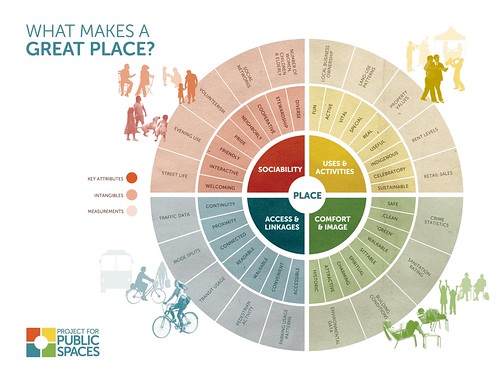
Project for Public Places, Placemaking diagram (flywheel)


Placemaking.  You can argue that placemaking is an approach to usability planning in cities also.

-- "What is Placemaking?," Project for Public Spaces
-- Placemaking articles archive, PPS
-- Placemaking booklet, PPS

Related concepts that I use are "the integrated public realm framework" and "transportation infrastructure as an element of civic architecture."  These concepts are discussed in the organizing framework of what I call "Signature Streets" ("Town-city management: We are all asset managers now").
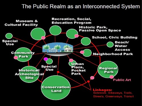
Public Realm as an Interconnected system, Slide from presentation, Leadership and the Role of Parks and Recreation in the New Economy, David Barth

The Street Grid. The grid design for cities, such as the L'Enfant Plan for the City of Washington, illustrates Lynch's argument for legibility and "reading" the city.  The grid is organized at right angles, with streets connecting the various "blocks." 

Some people get confused, believing that DC doesn't have a grid because it also has avenues which bisect the grid.  But radial avenues are a great addition to the grid, shortening the distance between nodes, because you can travel at an angle.

In the design of DC, the key organizing landmarks were the White House, home of the Executive Branch of Government, and the US Capitol for the Legislative Branch.  The greenspace of the National Mall connects these landmarks, although the Mall has since become the home to many more landmarks--memorials and museums--and extends beyond these two points.
L'enfant plan
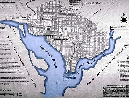
The reservations--circles and parks--were designed to function as nodes, while the city's rivers were primary edges, and the radial avenues the primary paths, complemented by the secondary paths--streets--comprising the city's various subdistricts.

The London Underground as a design artifact. The London Underground is an outlier for transit systems in that it has been a consistent innovator in design and usability for 100+ years. Key to this development was Frank Pick, who started at the agency being responsible for communications ("PR") and who laid the groundwork for corporate branding by coordinating all elements of the program into an integrated and extensive transit system -- advertising, branding, station architecture, vehicle design, and mapping -- with the highest standards for "design."

Today, that legacy is maintained through the creation of "product design managers" for the various transportation modes managed by the successor agency, Transport for London.

-- Product design guidelines, Transport for London

Chancery Lane Station entrance, London Underground, c. 1930s, with posted Harry Beck Tube map
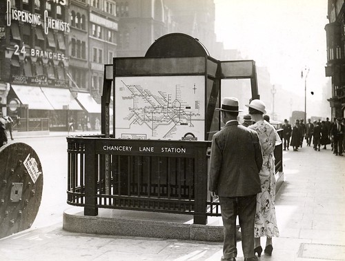
Chancery Lane Station entrance, London Underground, c. 1930s, with posted Harry Beck Tube map.  The new London Underground map seems incredibly modern in the context of London's built environment being dominated by architecture from the previous centuries.

Transit systems and legibility.  The creation of high-frequency bus networks, night bus networks ("Night and weekend transit/subway service: Metrorail edition" and "Slight revisiting of overnight transit service: San Francisco"), the program around the creation of true bus rapid transit lines, such as in Cleveland, or the collaborative integration of transit agencies in the Raleigh-Durham area under the GoTransit brand ("Will buses ever be cool? Boston versus the Raleigh-Durham's GoTransit Model") are other examples of applying usability approaches to transit.
Building a better bus, graphic
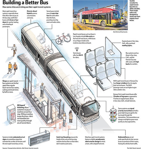
Wall Street Journal graphic.


New systems for providing and presenting integrated transit service information, such as the TransitScreen product are other ways to improve usability and use of transit as a mobility mode.
Real time transit information via TransitScreen and the Orange Barrel Media digital billboard outside Capital One Arena
Real time transit information via TransitScreen and the Orange Barrel Media digital billboard outside Capital One Arena, Washington, DC.

Also see "Making bus service sexy and more equitable" and "Is making surface transit free the best transit investment DC can make?."

In terms of usability, transit stations are are frequently under-developed ("Takoma Langley Crossroads Transit Center: A Critical evaluation," "Multiple missed opportunities in creating the Silver Spring Transit Center," "Brief follow up on the Silver Spring Transit Center," and "Transit, stations and placemaking: stations as entrypoints to neighborhoods").

Connectivity and access as questions of usability in mobility planning.  Some exemplars of  mobility solutions that solve knotty problems of access and connection include:

-- public stairways such as the stairway connecting a neighborhood on a hill to the Weehawken waterfront in New Jersey
-- public escalators in Medellin, Colombia ("Medellín slum gets giant outdoor escalator," Telegraph) and Hong Kong
-- public elevators as part of the horizontal/vertical mobility system of "streets and blocks" in various places, including Monaco
-- funiculars and incline railways
-- aerial trams in Medellín, Colombia ("'Social urbanism' experiment breathes new life into Colombia's Medellin," Toronto Globe & Mail; "Medellín's 'social urbanism' a model for city transformation," Mail & Guardian), Portland, Oregon, Roosevelt Island, Queens, New York City, La Paz, Bolivia ("Largest urban cable car soars over 'desperate' commuters of La Paz ," Guardian
etc.
-- connections between communities such as Johannesburg's "Corridors of Freedom" ("A walk to freedom: can Joburg's bridges heal the urban scars of apartheid? ," Guardian) or the "Connective Corridor" between Syracuse University and the city's Downtown

La Paz cable car system
La Paz cable car system.  Martin Meija, Associated Press.

Wayfinding "monolith," City of Bath.

Wayfinding.  Although they were writing about data management and interface design, in "Getting Lost: A Case Study in Interface Design," Elm and Woods make points relevant to wayfinding, that there are three different ways to be lost:

• Not knowing where to go next;
• Knowing where to go but not how to get there;
• Not knowing a current location in relation to an overall context.

Studies find that wayfinding systems have significant economic return, but some residents may resent the erection of wayfinding information in their communities, although having an integrated system that works at multiple scales is key to be able to place "a current location in relation to an overall context."

It turns out that the very comprehensive system created in Bath, England more than 10 years ago is the model for systems later deployed in London and New York City.  The city continues to refine and extend the system, and has published recently a new set of strategic planning and design documents:


April 2020
New Link for Bath, use it to access the below cited documents


-- Creating the Canvas for Public Life in Bath: Public Realm and Movement Strategy for Bath City Centre
-- Pattern Book: Volume 01 Public Realm Framework
-- Pattern Book: Volume 02 Technical & Operational Guidance
-- Bath City Centre Lighting Strategy
-- Bath City Information System

The Legible London wayfinding system integrates pedestrian and bike share mapping, but the transit system, with its iconic mapping and signage, remains separate.

-- Yellow Book: A prototype wayfinding system for London, Legible London (Transport for London)
-- Legible London system architecture

In the DC-Maryland-Virginia region, three wayfinding programs stand out.  Most recently, the City of Alexandria has implemented a comprehensive program that aims to move people from the Alexandria Metrorail station to the city's waterfront.  While it includes signage at various civic facilities such as parks, there isn't a complementary rung in the system for neighborhoods.

Baltimore has a system covering the core of the city, including signage within districts.  (Arlington County has gateway signs for various districts within the county, centered around Metrorail stations.)
Westside Baltimore (Howard Street)

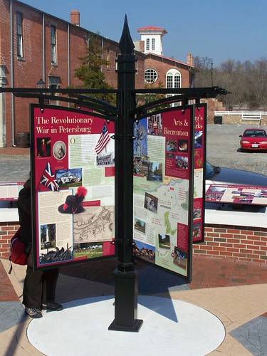
Petersburg, Virginia has signage for its historic districts and downtowns, which includes neighborhood-scaled signage, but also a great deal of historic interpretation signage, as well as "color" coordination within districts (e.g., the Poplar Lawn Historic District is green, the Old Towne Historic District is maroon) and allied treatment of street and traffic signage.
Kiosk, historic/history interpretation, Petersburg, VA

Other communities such as DC or the Anacostia Trails Heritage Area in Prince George's County, have various wayfinding networks, although in the case of DC, they compete (e.g., history trails signage, Discover DC signage, National Park Service signage for the National Mall, a separate system for the US Capitol, etc.).

Overuse of the subway map concept as a way of representing information .  The iconic subway map for London, based on the concept of an electrical circuit diagram, where the map is more conceptual and the transit lines don't map exactly to distance or topography, has influenced transit system mapping the world over.
Inset, London Underground and key sites in London's core, from a 1964 Esso gasoline station road map of London, UK
Inset, London Underground and key sites in London's core, from a 1964 Esso gasoline station road map of London, UK.

For me, the problem with the approach is when it is applied, willy-nilly, to all kinds of other design problems, without regard to the nature of what is communicated. 

The reason that a conceptual map works for transit is that the system of lines and stations is fixed.  Once you enter the system through a station and then enter a train car, you travel a specific, fixed route, you can't deviate from the line (excepting transfers), until you arrive at your final destination.

Despite being lauded ("What if bike maps looked like subway maps?," CityLab), as a practical matter, applying the concept to bike routes doesn't work because they are just lines on a map that don't "map" to actual routes that a mobile cyclist must ride.  Rather than sitting in a seat on a train, a bicyclist must actively cycle and navigate a real route.   In such a situation, conceptual maps don't work.
Spider bicycle map for DC by Michael Graham
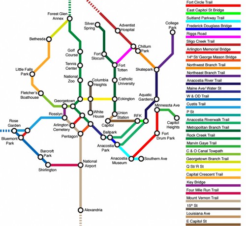
Spider bicycle map for DC by Michael Graham.

One wrinkle: walking between certain transit stations can be faster than transferring.  In systems with many lines, a problem with subway maps not mapping to geography, but being a representation, is that people follow the maps literally, when the reality is that it can be faster to walk between certain stations, rather than going through the effort of transferring from one line to another. 

In London and Singapore, the transit agency has created a walking map showing the distance between stations, while a guerrilla effort has produced a similar map for Toronto.
London Underground walking-tube-map-zones-1-31
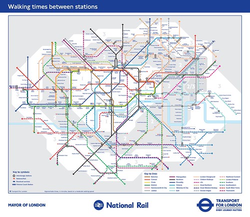
Walking tube map, London.

Interesting legibility/usability initiatives

Walk your city wayfinding. I think this was first done in Raleigh, NC, but was later written up in the Tactical Urbanism Manual. 

-- Walk [Your City]

The Southwest Business Improvement District has used this idea to put up signage marking paths between the L'Enfant and Southwest Metrorail Stations and the new Wharf development on the Maine Avenue SW waterfront.
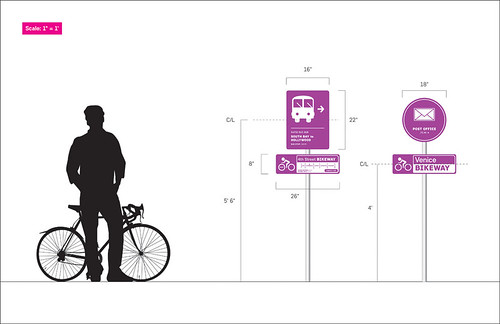
Walk [Your City] style guerrilla street wayfinding signage produced by the SW DC Business Improvement District
Better Bikeways Project.  The project is a set of concepts by designer Joseph Pritchard to better distinguish bikeways and routes. According to Prichard:
Employing a simple yet comprehensive visual language, the Better Bikeways system is an attempt to communicate vital information and warnings to cyclists and motorists alike. The system was designed with the goals of easy legibility and comprehension in mind and is focused on four categories of information.

Navigation: Serves as the prime identifier of a bike route. It can also be used to offer valuable navigational information such as route destination and direction, and distances to major cross streets.

Caution: Conveys warning messages to motorists and cyclists. Because their message needs to be understood quickly and from a distance they are the largest and most basic of the route's signs.

Connections: Highlight intersections with other bicycle routes or public transportation hubs. Their goal is to integrate individual bikeways into a broader transportation network.

Points of Interest: Highlight points on or near the route of relevance to cyclists. By drawing attention to these locations, Point of Interest signs can help make bikeways more attractive recreational routes for cyclists.
Better Bikeways signage by Joseph Prichard

-- "Better Bikeways: Getting Rolling with Improved Signage," GOOD Magazine
-- "Better Bikeways: Guerrilla Improvements and DIY Signage," GOOD Magazine
-- Better Bikeways

Remapping and re-signing the Minneapolis Skyway.  While urbanists tend to prefer people on streets rather than connecting buildings through skywalks, underground and above-ground walking networks, such as Pedway in Chicago, PATH in Toronto, the Underground in Montreal, and the Skywalk network in Minneapolis are examples of important horizontal mobility systems in those communities.

In the City Pages article "Minneapolis' love hate relationship with the Skyway and how to make it suck a lot less," designer Brandon Hundt lays out an approach for remapping the Minneapolis Skyway system and a matching improvement program for the signage system. 

While he doesn't realize it, it harkens back to the new London Tube map of the 1930s, although he references a similar map made much later in the 1970s for the New York City subway system, a map that ended up not being adopted. From the article:
The legendary Massimo Vignelli brilliantly took advantage of this in designing New York’s subway map. You’ll notice he completely ignored streets, distances, and curves, instead using straight horizontal and vertical lines, and the occasional 45-degree angle. Colors signified routes, and stations were equally spaced dots on the map.

Today we couldn’t imagine a subway system mapped any other way.

New Vignelli NYC subway map
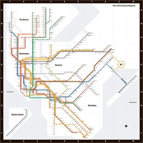
New Vignelli NYC subway map.
 
Let’s apply Vignelli’s principles to the skyway and its jagged edges. First, identify what matters to the skyway user.

1. Buildings, the skyway’s equivalent to a subway stop.
2. Skyways, the routes connecting the stops.
3. Destinations. The skyway walker doesn’t need to know north from south or east from west. (The city’s downtown grid runs northwest and southeast, anyway.) Instead, they should know they’re headed in the correct direction and getting closer to their intended location.
4. Distance. Skyway users are, for the most part, walking. This means we can’t completely ignore the concept of distance. While not needing to provide exact distances, we don’t want to be wildly wrong, either.
5. Streets. The skyway is in many ways an extension of, and connected to the street. Their blocks also form a good barometer of distance.

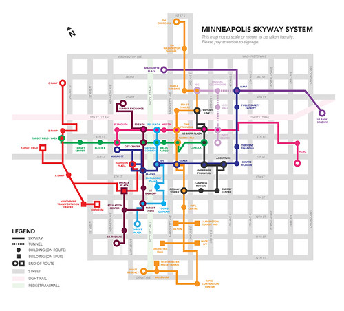
Map, Proposed redesign of the wayfinding system for the Minneapolis Skyway system, by Brandon Hundt


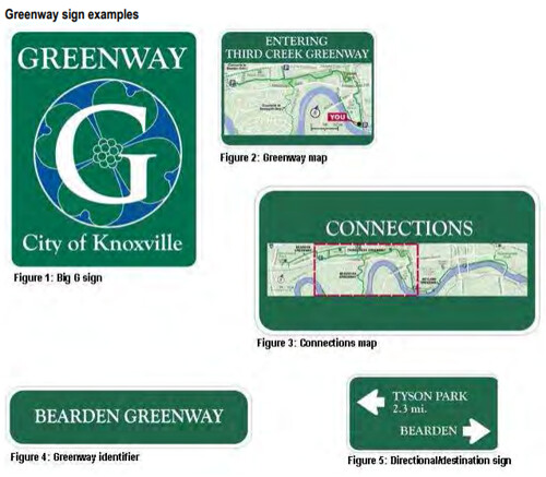
Knoxville Greenways and Blueways maps and signage.  This is an official program, not a concept or a guerrilla initiative.  It's a great model for other communities.

-- Knoxville Blueways
-- Knoxville Greenways and Trails
-- Knoxville Greenways Signage Guidelines, Knoxville Transportation Planning Organization

Knoxville Greenway signage examples

Labels: , , , , , , ,

Wednesday, September 14, 2016

Rome 2 Rio is an incredible website integrating all forms of mobility to get from one place to another--globally!

US intercity bus service map produced by Michael Buiting.AIBRA bus and Amtrak map, 2014-01-15

In a back and forth set of comments spurred by Larry Littlefield's post which in passing discussed inter city bus service in New York State, we were talking about bus route network maps.

In the old days, railroads and intercity bus systems like Greyhound and Trailways published complete maps of their route systems.

Now it's very hard to find such maps. Michael Buiting produced one on his own.  See the past blog entry, "Inter-city bus services are typically a gap in transportation planning."  The entry references some academic research and other writings on the subject.

Larry said you can't find these kinds of maps for Coach USA/Megabus services at the scale of a state or region, let alone a complete network map.

Yes you can plug in stuff online, but you can't get a sense of the full system and all its possibilities, counter to "the old days."  (Similarly, regularly published complete guides for railroad passenger and airline service provided this function, showing all available services.)

Mein Fernbus/Flixbus, Germany.  I mentioned that when I was in Germany, I saw a variety of intercity bus companies in service, near train stations in Essen and Hamburg.  (In Hamburg the Intercity bus terminal, ZOB, is in close proximity to the train station.)

Because some of the Mein Fernbuses I saw had rear-mounted bike racks, I looked into their services more--note they have since merged into Flixbus.

They publish route maps comparable to the maps once published by Greyhound and Trailways, even differentiating between their day and night networks, but I like best an earlier version of their night map (below).
Older version, Mein Fernbus night bus network map
It turns out their website and computing systems are developed by stfalcon, a Ukrainian firm.

Were I in charge of finding a programming team to set this up for a transit system, they'd be one of the contenders, clearly.  This webpage discusses the work stfalcon has done for Mein Fernbus.

Rome2Rio Global Travel Planning website. While tracking done some URLs, I came across Rome2Rio, a travel search and ticketing website that has managed to integrate airplanes, trains, intercity bus, ferry, local transit services, and taxis into one system.

It's pretty remarkable.

US and Canadian inter city bus service map, based on route information collected by Rome2Rio.

But they don't have a function where you can produce and print out master route systems maps as a website user, although on occasion they have blogged about doing it themselves, such as when they added US and Canadian inter city bus coverage to their system.

Wanderu.  Note I have mentioned/used Wanderu to do bus trip planning in the US, as they have a master set of information.  But Rome2Rio takes integration and mode coverage to a whole new level.

Labels: , , , , , , , ,