Exemplary bus livery design: Multiplicity, Luxembourg
From time to time, I've written about the graphic design of transit vehicle liveries as a key element of transit branding and marketing.
 DC later improved its bus shelters, but in the DC area, each jurisdiction is responsible for bus shelters with design chaos being the end result.
I make the point that bus shelters are key touchpoints for marketing and branding transit, and that the quality of this infrastructure communicates whether or not transit is valued by a community.
And also that the system should be legible when you cross jurisdictional lines, but too often it isn't.
-- "Branding's (NOT) all you need for transit," 2018
-- "Transit, stations and placemaking: stations as entrypoints into neighborhoods," 2013
-- "World Usability Day, Thursday November 9th and urban planning," 2017 (section on transit as a design product)
-- "Design as a city branding strategy: transit edition," 2012
I was definitely influenced on this by how Montpellier France commissioned prominent designer Christian LaCroix to create the liveries on its light rail (tram) system.

I've also written about design and branding as an element of local government more generally.
-- "City branding versus identity | Branding versus Urban Strategy," 2019
-- "Part 7 | Using the Purple Line to rebrand Montgomery and Prince George's Counties as Design Forward," 2017
-- "Great concept, but I don't love the videos: Orlando's "Discover Your Urban" promotion campaign,"
Looking up something else, I came across the liveries for the bus system in Luxembourg, which is called Multiplicity. According to the Binsfield design agency:
- The design objective was "To reposition the Luxembourg City bus service and develop a visual identity for mobility and buses in the city."
- The design approach: "The colored bands in the new design represent some of the city's transport routes, and the lines symbolize the roads and paths used to travel from A to B in the city."
- The design result: "Buses bearing a colorful new design based on the "multiplicity" visual identity.
And the design is carried through to the different modes, which use vehicles different from larger buses.


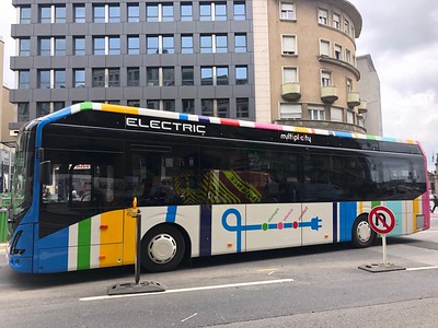
Photo from Twitter by Livio Filice.
Labels: branding-identity, city-regional branding, design method, graphic design, strategic communications and marketing, transit marketing
posted by Richard Layman @ 4:17 PM&Permanent Link
![]()
![]()

0 Comments:
Post a Comment
<< Home