I wrote last week about how the various separate BRT planning efforts around the metropolitan area are an example of a lack of metropolitan-scaled transit planning. The maps displayed in DC bus shelters are another example.
DC has four types of bus transit service. The primary service comes from Metrobus, the bus service delivered by WMATA, which provides the bulk of intra-city bus service on major and minor routes and some transit between DC and other jurisdictions. (Many of the lines end at the boundary between DC and Maryland, reflecting age-old service patterns.)
Unlike the suburbs, DC doesn't provide an extensive intra-jurisdictional bus network separate from WMATA, but the five-route DC Circulator is an example of such a service. (Note that in a couple of instances, RideOn, the bus system for Montgomery County, provides service to DC locations, including a route to Sibley Hospital.)
The third public transit service is inter-city long distance bus commuter service from distant locations in Maryland and Virginia. Maryland Mass Transit Administration coordinates this service on the Maryland side, while Loudoun County, Prince William County, and the Fredericksburg area each provide commuter bus services from Virginia.
A fourth service is the various shuttle services provided by government agencies, businesses, and other institutions. Shuttles operate between buildings, campuses, and Metrorail stations mostly. Major examples include universities like American, Gallaudet, Georgetown, and Howard, the Smithsonian, and Washington Hospital Center. These systems are not fully public, and are open only to employees, students, patients, etc.
Except for WMATA-owned station properties, the bus shelters in each of the local jurisdictions are run by the respective jurisdiction. So DC is in charge of the city's bus shelters.
 Transit shelters as a marketing touchpoint.
 From "
Arlington County's bus shelters and a public realm framework of quality":
A point I make is that bus shelters are the primary marketing touchpoints for transit, for users of the system as well as for non-users, who travel by and around the bus system and its physical manifestations. The information posted in shelters about bus service markets the service--or not.
You see this attention to the service as a whole and its marketing and branding aspects, in the implementation of bus rapid transit service, where they tend to focus especially on providing modern, attractively designed bus shelters and quality information services ranging from real-time arrival information, wayfinding in the stations, and marketing of the service.
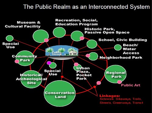
More recently I have extended these arguments about the quality of the physical and wayfinding elements in the transit system, influenced by a concept articulated by David Barth (now of AECOM) which he calls the "integrated public realm framework." ....
(1) transit riders deserve high quality amenities and infrastructure too, such shouldn't be the exclusive province of motor vehicle operators;
(2) transit shelters are an integral element of an integrated public realm framework;
(3) transit shelters are key touchpoints for marketing transit, especially surface transit.
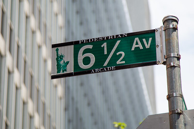
 Proof of concept business district wayfinding signage
. Many years ago, Christopher Taylor Edwards and I created a conceptual business district map that among other elements, showed transit routes using the same graphic design treatment WMATA uses on their own map products.
Even WMATA's bus shelter maps use a different design treatment from the Metrorail map. I think that's a mistake.
Lack of common graphic treatment across different map products. Maps produced by entities other than WMATA don't use the WMATA design treatment, other than the colors of the lines and the M Metrorail symbol. The variety of methods mostly fail--not the Circulator, because it depicts lines showing complete bus routes, but only of its own routes.
The maps displayed in bus shelters that are served by multiple local bus services should include information on all of the bus lines that serve that station and the sub-city district served by the station. For many of the transit stops, this is not the case.
Sub-city transit mapping. When the new system of bus shelters were launched in 2006, local business districts and neighborhood associations were given the option of putting in localized maps and promotional information in the shelters, but outside of the business improvement districts, most haven't had the financial ability to pull it off. DC didn't think to set aside money from the shelter advertising contract to assist local districts in providing such information.
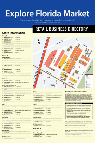
There are three types of maps displayed in DC's bus shelters. Most are provided by WMATA and show bus routes serving the transit stop and the city . The second type are maps of the DC Circulator bus system. The third type are business district maps, mostly created by Business Improvement Districts.
At least in Downtown, WMATA maps don't show Circulator routes, Circulator maps don't show WMATA routes. And the Downtown BID map doesn't show the Circulator either, even though
an entity managed in part by the Downtown BID runs the Circulator bus service!
The Downtown BID map doesn't have bus and subway route lines on the map either, which makes it very difficult for people to get their bearings.
The photos are the Downtown DC BID map at a shelter at 7th and E Streets NW; a WMATA map on 7th Street at the Archives Metrorail station; and a DC Circulator map at a combined WMATA/Circulator bus stop at Massachusetts Avenue NE at 3rd Street.
The maps at the Pronto bike share stations in Seattle show both walksheds and bikesheds--the distance that can be covered from the station in a five-minute walk or bike ride. Photo from Geekwire.
Maps aren't provided at bus stops for the long distance commuter services. Only recently have these services been more consistent in putting up bus stop signs. The presumption is that people who want to use these buses already know about them.
MTA produces a single map showing all their commuter bus services, but there is not a comprehensive map on the Virginia side showing all of their long distance commuter bus services on one map.
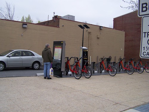 Maps at bike sharing stations end up being used by pedestrians as well.
The area's bike share stations have their own mapping system, while bike share station maps in cities like London and New York are elements of the city's overall wayfinding signage system.
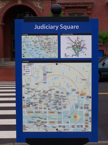
DC's wayfinding signage system is not nearly as comprehensive as other systems, and is complicated by the fact that various federal entities like the National Park Service, the Architect of the Capitol, and the transit agencies have separate systems.
Note that
the comprehensive wayfinding signage system developed in Bath, England is the model and foundation for larger systems in London and New York City.
 Showing walksheds on bus shelter maps.
 Maps in Metrorail stations show the walkshed from the station at one-quarter, one-half, and three-quarters of a mile--5 minutes, 10 minutes, and 15 minutes.
Some signs in the DC wayfinding signage system are posted outside of stations. Intended for use by tourists, these maps include walkshed information.
Bus shelter maps within districts such as the Central Business District/Downtown should also show walksheds. Some people will find it faster to walk to a destination than to wait for a bus.
Conclusion. Sadly, at the intra-city scale, as reflected by transit maps used in the city's bus shelters, transit planning can be as dis-coordinated as it is at the metropolitan scale.
Labels: public realm framework, transit marketing, transit wayfinding, transportation planning, urban design/placemaking, wayfinding signage systems


.jpg)


![Walk [Your City] style guerrilla street wayfinding signage produced by the SW DC Business Improvement District](https://live.staticflickr.com/4581/24421249988_4d5ba39a9d.jpg)


